
Thread Manager
Moderator
- Joined
- Jan 24, 2011
- Messages
- 0
- Reaction score
- 9
- Points
- 1
This is a continuation thread, the old thread is [split]498071[/split]
PM it to me. But, seriously, check the Batman. Because if the Bat symbol looks off and the sharpness of the head and sharpness of the body aren't the same, then it's not real.
You're referring to the image i can't post or the touch up i did of the manip?


Yeah, that's not real. And it's actually relatively old.
So WB requesting the site (watermark) to take it down is not proof enough that this is real? Neither is the resolution of Batman's suit? We'll agree to disagree on this one. :P
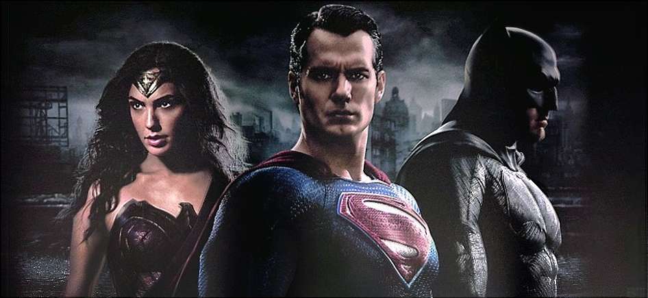
Edit: replied before your edit. The image at the top is the original. Bottom one I removed the watermark and tweaked the colours to make them as close to the banner that was spotted at the licensing expo.


It's. Not. Real. That Batman isn't real. It's taken from the original black and white Batman picture, and was manipped to try to skew it to be as close as possible. Here, I'll show you the bat symbol area of the real picture, so that you can compare yourself and see how I know that it's fake.
I'll PM you if just showing this chest is against the rules.
A portion of the real banner:
The fake one, which you think is real:
Notice the way the Bat symbol curves with the chest in the real picture, and how it doesn't in the fake one.
The Wonder Woman and Superman are taken from their official promo pictures which were released. The Batman isn't real, but is a manip using both the black and white Batman picture (the one with the Batmobile) and the head shot picture that was released at Comic Con.
JPosters sometimes has real poster on their site, but they very often have fan-made posters on their site. Just browse their site, and you'll see that. What JPosters had taken down was the Batman promo picture on white background. This fake poster, if it was taken down, was unnecessary, as it's not real.
Pretty strange. Why would WB request a "fake" to be taken down? Maybe they didn't check it properly and if it was a manip, they got fooled as well?
http://www.jposters.com.ar/2015/02/exclusivo-banner-de-batman-v-superman.html
We should be. The only thing that's from the original banner is the background, but most of that is what's in the Superman picture.That's actually funny. At least I suppose now we're good to post it since it's a manipulated image. I hope we are.
It's the licensing trinity banner in HD and had a watermark on it. I was told that the original source that got hit with the takedown notice, was the same who released the colour Batman frontal shot.
I threw a quick concept together to showcase an opinion/idea i've had for years now. I always thought the Batman cowl should have lenses that are slightly reflective but when you have a close up, you can see his eyes. That would surprised and naturally freak out people when they suddenly see eyes behind the creature like "mask" staring back at them. The one on the left is what it could look like when little to no light is reflected, while the right one shows how's light "reflecting off". Remember, whether you like or hate lenses, don't knock this for lack of refinement. It's just a quick example.
Since the image itself has been posted and modified time and again here, i'm thinking maybe it's ok to post one of the HD image. Tried to make it as close as possible to the licensing one in terms of colours.
Please feel free to correct my post if it's not to be posted (the HQ image of already posted LQ image).
This is not an official image right? Please tell me it isn't, bc it's awful man.

Nice idea and nicely executed, too. I think I prefer the look of whatever technology is behind the types of white eyes that BatFan1979 does in his manips (and that I did in mine, before I started just letting that guy do his thing!), but I would gladly take your idea over what they are doing in the film. Hooray for the gray suit, but I'm annoyed that it's 2015 and people are still on the fence about this signature part of Batman's look.
Folks who always say "it'll never look right on screen" ... but when has it *ever* looked right in the comics to show Batman's human eyes underneath the mask? I can't think of many times. That white eye look is what makes him appear as more than a man - those "windows of the soul" have the drapes drawn and the shutters locked. When BatFan1979, or the other subgroup of us who have sort of shared a similar aesthetic, do a Batfleck manip, that's when Affleck ceases being Affleck for me, and starts being Batman. And *the ideal* Batman. When the first shots of him in costume was released, I was happy, too. But I was really bummed about the eyes.
 t: I still think those Jim Lee-style, emoting slit eyes are still a possibility one day down the line using CGI of course.
BattleAngel, I'd like to see your lenses manip. Sound interesting.

Since the image itself has been posted and modified time and again here, i'm thinking maybe it's ok to post one of the HD image. Tried to make it as close as possible to the licensing one in terms of colours.
Please feel free to correct my post if it's not to be posted (the HQ image of already posted LQ image).


