
Willie Lumpkin
Trophy Husband
- Joined
- Feb 15, 2003
- Messages
- 13,822
- Reaction score
- 2,192
- Points
- 103
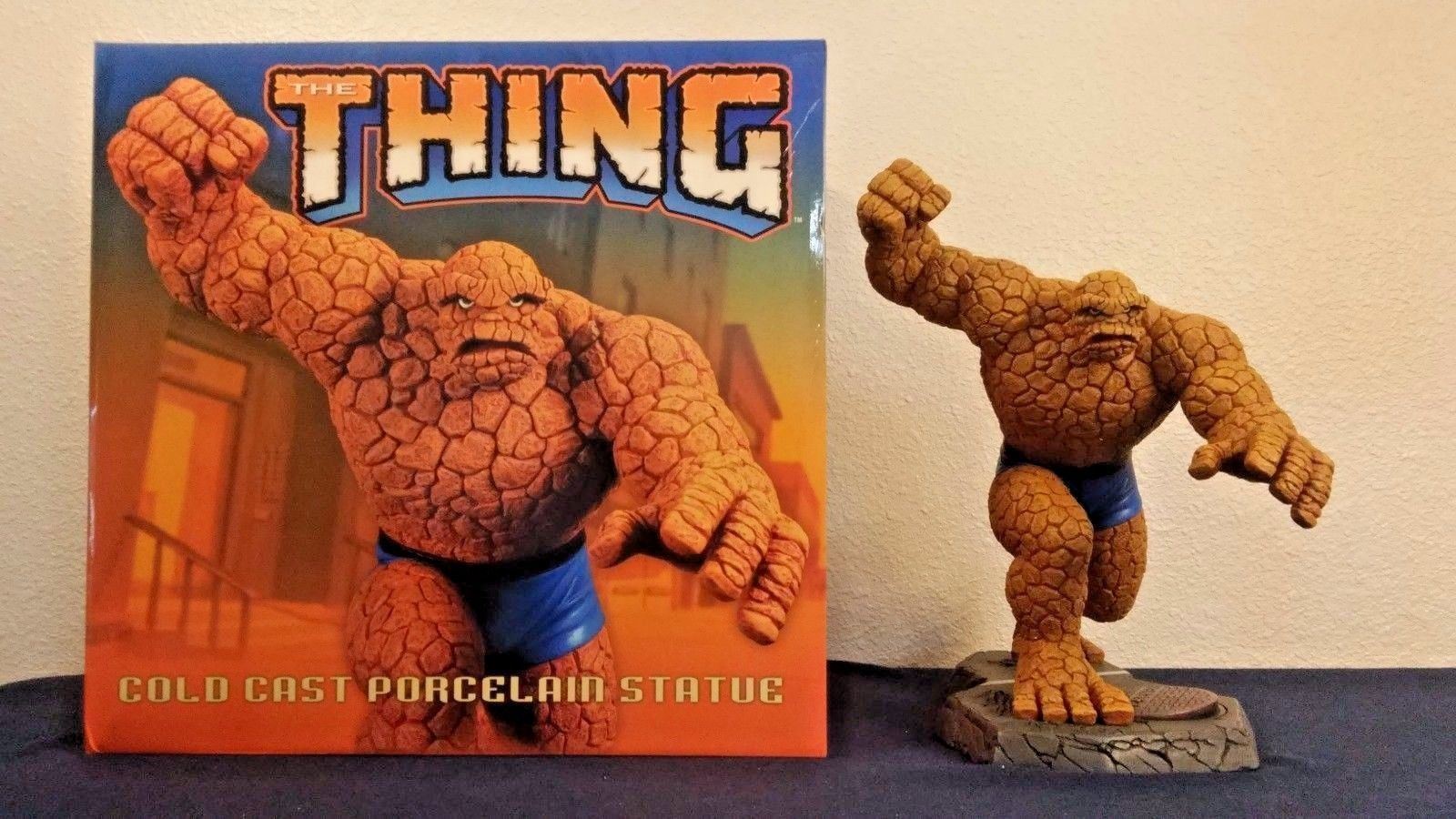
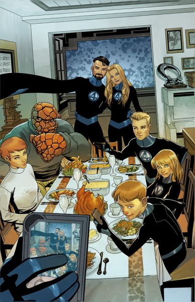
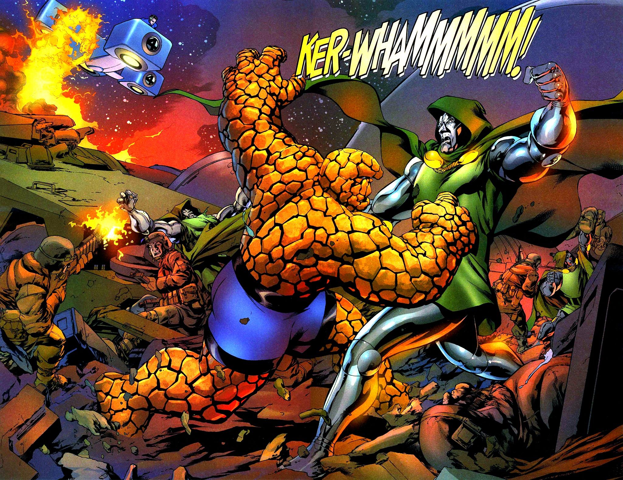
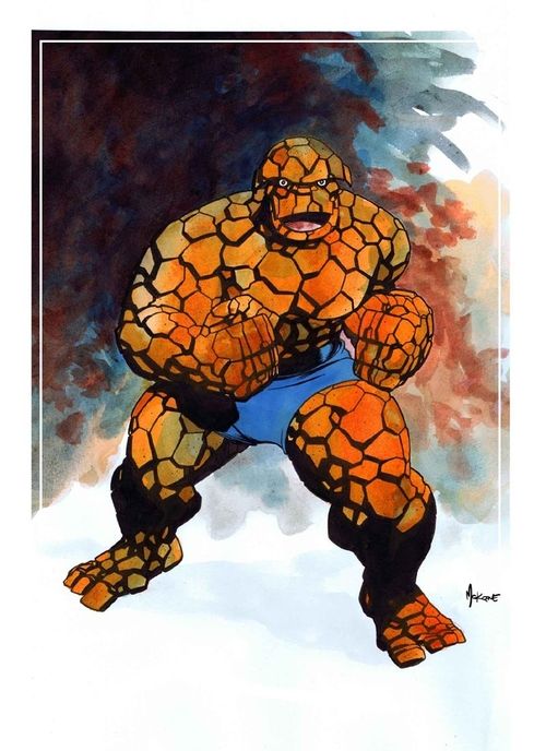
Do you have any specific designs you'd like them to use? I think I'd like to see something similar to how he looked from roughly issues 50 - 200. Maybe a little bigger and a little more refined than what Kirby drew but still with that clear Kirby influence.


What are your thoughts? And please share some images that reflect the design you'd like to see.
What are your thoughts? And please share some images that reflect the design you'd like to see.
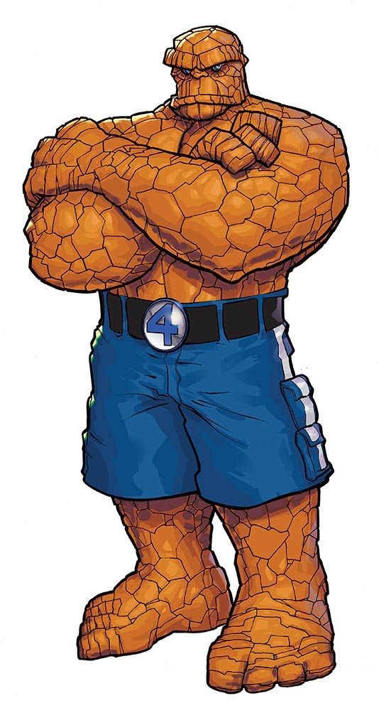
 I feel like the biggest difference between Kirby and the artists who immediately followed him is they added some detail - almost like Kirby was doing a rough sketch and they were finishing it.


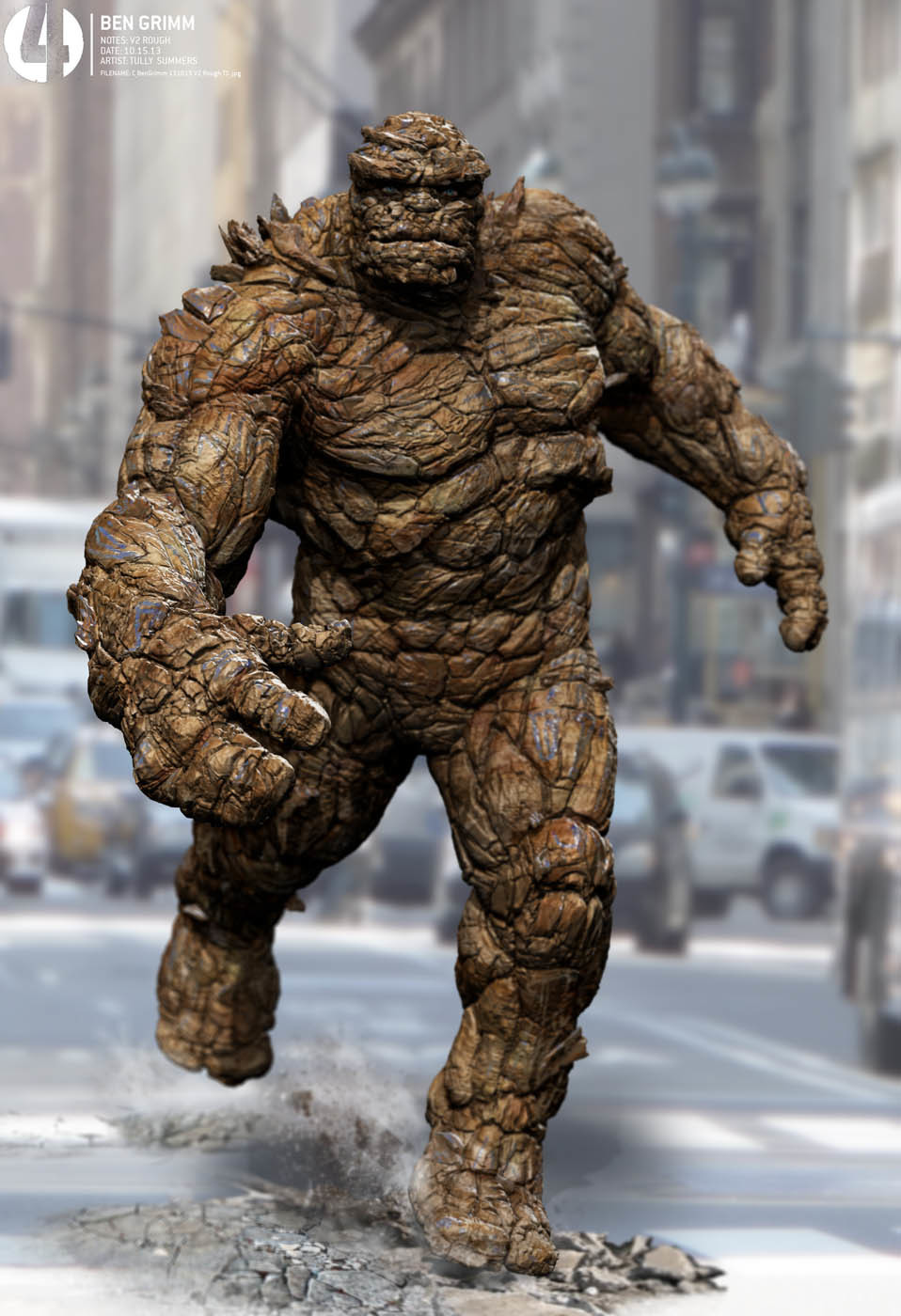
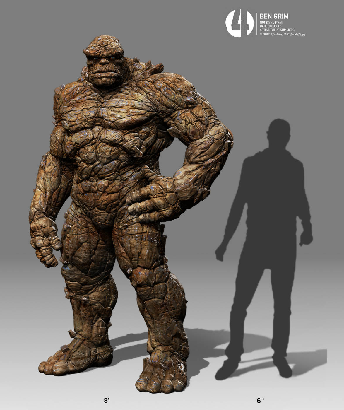
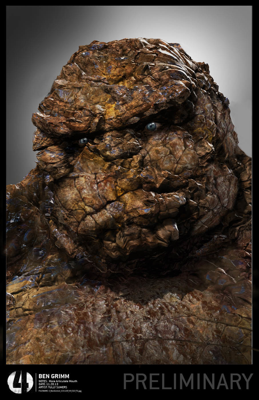
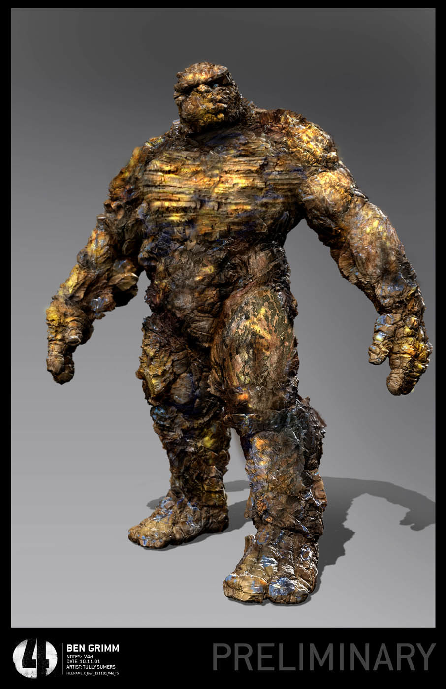

 That first one literally looks like they took Killer Croc from Suicide Squad & Doomsday from BvS and just went