You are using an out of date browser. It may not display this or other websites correctly.
You should upgrade or use an alternative browser.
You should upgrade or use an alternative browser.
How about costume design?
- Thread starter pr0xyt0xin
- Start date
- Joined
- Jul 23, 2004
- Messages
- 70,159
- Reaction score
- 187
- Points
- 73
Fox should do something they have yet to do with the FF costumes - base them upon the original Kirby designs from Issue #3 - loose fitting, high collars, blue and black jump suits.
... and please make the "4" look like it does in the comics, too ...
I really have no desire to see a 1960's style on a group of people that are living in the 21st Century, doing things that are leading us into the 22nd Century. Just doesn't register as something I really think the average moviegoer, for the most part probably people that have never read an F4 comic would really enjoy seeing. There are other ways to give homage to the early comics...POSSIBLY, a version of that uniform when they are in the space ship, going to some far off galaxy, but once their, in fighting mode, etc....that comes off and what we have seen is under it.
As far as the #4, sure ok, but in 2004, I wouldn't have known whether it was this 4 or that 4, it was the #4. So sure, give the Kirby look????? ok.
Alex_Spider
Sidekick
- Joined
- Dec 3, 2005
- Messages
- 2,527
- Reaction score
- 0
- Points
- 31
thanks for posting the Spock/Torch photos - the TREK uniforms are certainly no more elaborate that the original FF uniforms, and the ST movies take place in the future...I do not think any audience would have a problem with any costume design if done properly. Like I always point out, the Spider-Man costume in the '70's t.v. show looked pretty bad while the one in the movies looked fine - same design just one was created better than the other.
Project862006
Avenger
- Joined
- Jun 20, 2008
- Messages
- 21,197
- Reaction score
- 1
- Points
- 31
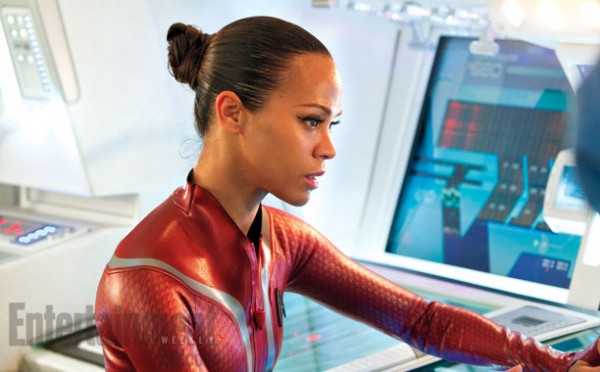
talking about star trek this new photo of uhura's trek 2 costume seems like a solid look material wise for F4


mclay18
Avenger
- Joined
- Dec 6, 2005
- Messages
- 16,690
- Reaction score
- 4,729
- Points
- 103
I actually liked the look of the costumes from the first two movies... shoot me, I know, but they looked good. You could probably mix that with the 'scaly' look of the Superman suit in Man of Steel and the original Spider-Man trilogy.
ThePowerCosmic
Hyped Up
- Joined
- Aug 18, 2011
- Messages
- 19,104
- Reaction score
- 671
- Points
- 73
The White designs are fantastic. They're the way to go.


ThePowerCosmic
Hyped Up
- Joined
- Aug 18, 2011
- Messages
- 19,104
- Reaction score
- 671
- Points
- 73
S
What would you change about their costumes in a future F4 film? I for one say the more practical adornments and accessories the better. Boots, belts harnesses, whatever makes them look more like adventurers and less like ballet dancers. And Torch/Thing should be almost exclusively CGI/Mocap
That's a good idea. I'd like it if they had belts, harnesses, backpacks, thing like that. As long as the accessories looked modern and didn't clash with the style of their suits.
Incrediblejeff
Still Incredible
- Joined
- Aug 13, 2004
- Messages
- 7,239
- Reaction score
- 13
- Points
- 58
That picture made me think,Do you think MARVEL Studios would adapt Mike Allred's FF?Can they do that legally?
- Joined
- Aug 19, 2004
- Messages
- 53,245
- Reaction score
- 7,890
- Points
- 103
I actually liked the look of the costumes from the first two movies... shoot me, I know, but they looked good. You could probably mix that with the 'scaly' look of the Superman suit in Man of Steel and the original Spider-Man trilogy.
Me too! They looked very modern and not too costumey.
- Joined
- Aug 19, 2004
- Messages
- 53,245
- Reaction score
- 7,890
- Points
- 103
No because it looks a sweater.

metaphysician
Not a Side-Kick
- Joined
- Mar 10, 2012
- Messages
- 16,124
- Reaction score
- 5,044
- Points
- 103
That picture made me think,Do you think MARVEL Studios would adapt Mike Allred's FF?Can they do that legally?
I doubt it. The name is surely part of the rights.
Besides, why would they want to?
Lencho01
Shazoogle! Shazoogle!
- Joined
- May 19, 2010
- Messages
- 29,726
- Reaction score
- 3,002
- Points
- 103
Majik1387
Avenger
- Joined
- Jan 30, 2004
- Messages
- 41,629
- Reaction score
- 4
- Points
- 33
Some good designs, really like Johnny's arms on the top one, I just really hate when porn actors are used as bases, and I personally hate when Sue of all characters gets the keyhole treatment. I know the comics did it too, but it's gotten crap there too. Also her boobs look bad in the top pic.
ThePowerCosmic
Hyped Up
- Joined
- Aug 18, 2011
- Messages
- 19,104
- Reaction score
- 671
- Points
- 73
Those are bad. They look like SHIELD agents from the 90's.
The Dr. Doom is particularly bad - and almost along the lines of what we would have gotten in FF 1 if Story had not insisted on using the mask that the costume designer had created.
I did some editing on the FF cover that was posted above and wanted to see how the white suits would look with blue instead.....what do you guys think?


Oh, and the effects on Photoshop had this really awful one called "Subtract," and this is what happened.....


Oh, and the effects on Photoshop had this really awful one called "Subtract," and this is what happened.....

Last edited:
spidergeek232
I'm Not A Loser
- Joined
- Aug 23, 2012
- Messages
- 406
- Reaction score
- 0
- Points
- 11
I did some editing on the FF cover that was posted above and wanted to see how the white suits would look with blue instead.....what do you guys think?


Oh, and the effects on Photoshop had this really awful one called "Subtract," and this is what happened.....

Wow! The second one looks great!! Awesome job!
Similar threads
- Replies
- 66
- Views
- 5K
- Replies
- 81
- Views
- 24K
- Replies
- 60
- Views
- 4K
Users who are viewing this thread
Total: 2 (members: 0, guests: 2)
Staff online
-
SwordOfMorningSuper Moderator
-
DKDetectiveElementary, Dear Robin (he/him)
-
OnTheAirWakandan Ambassador


