I have a general question about covers...

Chris Wallace

LET'S DO A HEADCOUNT...
Joined
Jul 13, 2001
Messages
35,629
Reaction score
3
Points
31
Introductory covers, to be precise. Like, I was noticing that on a lot of the Golden Age comics, the first issue has a very telling cover; you see a lot of detail of the hero's costume, powers-sometimes even their mentality.
Examples:
cap1.jpg

Here you can clearly tell that Cap is anti-Nazi, his shield is bulletproof & you even know about his sidekick. All this you learn without even picking up the book.
Action_Comics_no1_1938.jpg

In a time when there were no other heroes to compare him to, we see Superman lifting and smashing a car with the greatest of ease. Obviously he's a very powerful man.
batman_detective_comics_27.jpg

Here, we see that despite what the name suggests, Batman swings rather than flies. His chokehold tells us that he takes it to the bad guys in a brutal way.
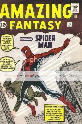
amazing_fantasy_15.jpg

Granted, this doesn't tell us jack about his powers other than the fact that he swings-it's not even obvious that he's on a web-but we see the details of his unique costume, while the copy gives us a peek at the man behind the mask.
By contrast:
Spawn1.jpg

A cover such as this doesn't tell us much of anything. And yet it flew off the shelves. Although admittedly, name recognition probably helped.
Gravity-01.jpg

Also not a very telling cover image. But it still worked.

My question is, if you were seeing a character for the first time ever, which would make you more inclined to pick up the book-a detailed cover such as I've just described or a minimal, "less is more" approach?
 
Last edited:
I've always preferred the old style of covers, but that's just my preference and I have no real reason for it.
 
I'm trying to decide which approach is best for me; knowing what the average (or in SF's case, slightly above average :D) comic fan thinks on the matter will be a big help.
 
I'm trying to decide which approach is best for me; knowing what the average (or in SF's case, slightly above average :D) comic fan thinks on the matter will be a big help.

:heart:

What do you prefer? I'm assuming we're talking about comics of your own, so the best advice I've been given on creative projects is that the most important thing is to please yourself first. Make sure you like what you're doing, otherwise you'll be standing behind something you're not happy with.
 
I will NEVER stand behind something I'm not happy with. BUt the truth is I'm kinda torn. Sometimes less is more. The cover to Ant #1, for example, doesn't tell you s*** except that she sticks to walls & has a big ass. BUt it did make me ask questions. However, it, too had name recognition going for it as the cover art was done by Campbell.
Now, referring again to the old school method,
Sensation001_01_fc_repr.jpg

this gave us an idea of what she was like in action. I can see it being a compelling sell to a superhero fan, regardless whether they knew or cared who was behind it.
 
I would like to see covers in the more old school style. I was never fond of plain covers, with the hero/villain in a dynamic pose, like Ultimate Spider-Man covers were in the beginning.
 
More & more, we seem to be showing inclination toward the old school. I do think that when it's all said & done, this is more the avenue I would like to go. I personally think that covers such as this
Spider-man.jpg

or this
Batman.jpg

or even this
IncredibleHulk377.jpg

are fine-once in a while-if the character is established & well-known. But not the way to go if you are introducing him/her for the first time. I think that the market was more competitive in the old days; now we fall for every gimmick they throw our way.
 
Last edited:
I agree. They're alright for a special issue, but it gets tired fast when used all the time. I think the
6391new_storyimage9121020_full.jpg


I think that this cover was well done, little bit of both.
 
But if you knew nothing about the Spot, this cover wouldn't be a lot of help.
 
The Spot has a cool power but nothing else, IMO, going for him.
 
Cool power, lot of potential. I thought that issue did a decent job making him more of a threat. Would like to see him completely unleashed though--wonder if he could transport an entire planet?
 
According to TAS, he'd destroy it in the process.
 
According to TAS, he'd destroy it in the process.

That was actually a good episode... But I never understood why he didn't open his own transport business. Goods need to be from point A to B in the next 24 hours? *opens portal, 24 seconds later* goods delivered. Or to be a little darker why not use it for the drug trade or getting illegal immigrants over the border? No pesky customs checks or passports needed.

This has bugged me alot over the years :p

The Spot is kind of like the Justice League/JLU version of Green Lantern. All this potential, but no imagination to do anything beyond the basics with it. The panel from the issue up there though, where Spider-Man punches him in the stomach, and his arm comes out of Spots face so Spider-Man really punched himself, was amazing though.
 
Sorry, but again I really don't want this to turn into a Spot appreciation thread.
 
What about multi-image covers? Or is that too much?
 
I liked with annihilation how the last issues of the four mini's made one giant picture. or with Mighty Avengers did the same which was pretty cool. I one of my favorite all time covers is the first issue of the Hulk. Because you don't really see much but yet it's a mystery with the silhouette.
 
I like covers that give a depiction of what the story is inside. I only like the pin-up ones if they're A) Done by an incredible artist or B) Reflect the tone or mood of the story inside. If I wanted posters, I'd buy posters not comics.
 
Excellent point, Wolverine 25. And that "pin-up" cover can, and often does, contain a crap story. SOmetimes with crap art.
 
Gravity-01.jpg

Also not a very telling cover image. But it still worked.

I think this is a very telling cover. Yes, it doesn't say much about his powers, but there are other details. The suitcase, with the I heart New York sticker tells us that he's new to the city. The look on his face, as well as the fact that there is a shirt sticking out of his suitcase, shows a level of over excitement, which helps paint the picture of a young, fanboyish super hero trying to make it big in New York.
 

Users who are viewing this thread

Back
Top
monitoring_string = "afb8e5d7348ab9e99f73cba908f10802"