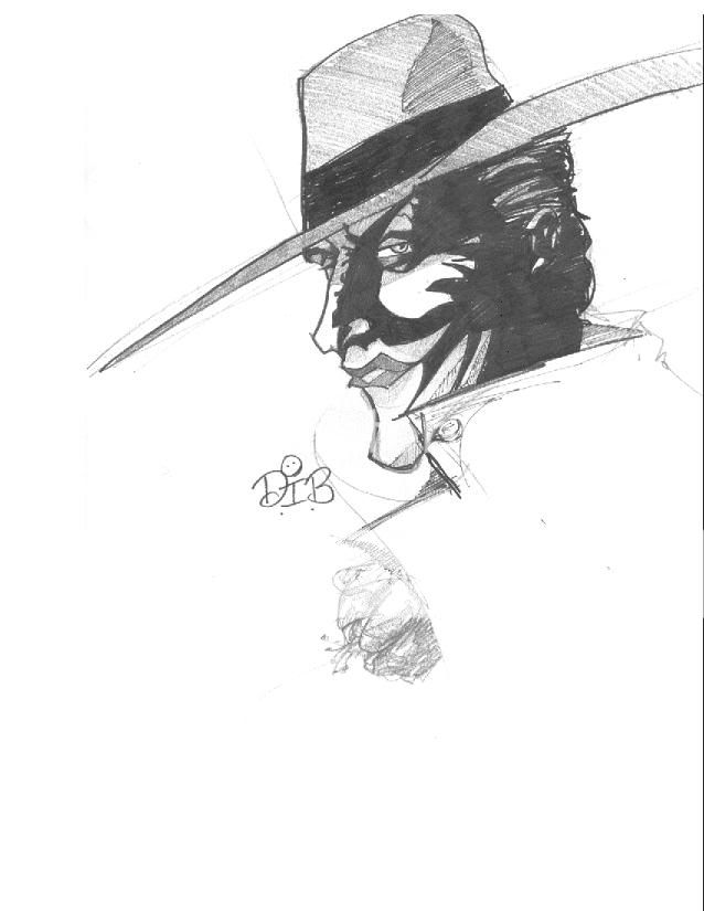
That is diffinitly the Clown Price of Crime... your inkeeping with a more classic look, which is cool. I love it, but I expected soemthing a little more different from the comics.
whoa, I have seen all the drawings on this thread, and I must say: Your work, sir, belongs on published ink. ANY comic company would be foolish to turn you away. I love your concepts. You're like the new Tim Sale or Jim Lee, giving your own interpretation of classic characters. I tip my hat to you sir. Well done!
When it was rumoured Two Face might be in 'Intimidation Game' (Begins) I was thinking that they should go into Dents psychology. Maybe showing that his scarring was'nt too bad (reparable) but whenever Harvey looked at his reflection in a mirror he would see himself horrendously deformed.
Kinda like a phase 1 Harvey then a phase 2.
I'll see what I can do about the design.
whoa, I have seen all the drawings on this thread, and I must say: Your work, sir, belongs on published ink. ANY comic company would be foolish to turn you away. I love your concepts. You're like the new Tim Sale or Jim Lee, giving your own interpretation of classic characters. I tip my hat to you sir. Well done!
This site uses cookies to help personalise content, tailor your experience and to keep you logged in if you register.
By continuing to use this site, you are consenting to our use of cookies.


")

 I'm only speaking the truth.
 DKDetectiveElementary, Dear Robin (he/him)
 OnTheAirWakandan Ambassador