
You are using an out of date browser. It may not display this or other websites correctly.
You should upgrade or use an alternative browser.
You should upgrade or use an alternative browser.
SithXKosan's Arts: Feedback needed and appreicated!
- Thread starter SithXKosan
- Start date
SithXKosan
Civilian
- Joined
- Feb 15, 2006
- Messages
- 358
- Reaction score
- 0
- Points
- 11
Zolland said:I hadn't heard of him so I read up about Mr. Liefeld...what a LOSER!
Yeah... ya prolly already checked his art work, his porpotions are wayyy off... No one in modern comics knows him anymore.. He was well known in 1992, and diminished in 94 or 95..
SithXKosan
Civilian
- Joined
- Feb 15, 2006
- Messages
- 358
- Reaction score
- 0
- Points
- 11
Jack Bristow said:I agree w/ Aquaman; your art is top notch, except I think you get lost in the details . . . if this is how you feel stylistically, though . . . ride w/ it; your likenesses are very accurate, but I feel that some of the imagery gets lost in all the extra marks; if you toned down some of your linework, making other lines thinner than some, it would bring more depth to your pieces; right now the marks are actually making your rendering look more 2-dimensional . . . IMO
Keep it up, though!!
Thanks for your thoughts and feedbacks!! This is one of main reasons I decided to post my arts on this board so I could get different perspectives and attempt to improve myself... I do get lost with the detailing sometimes, and theere have been time where I look at it and wonder where the hell did I get the idea like that..
I'll play around with new pictures and see what I can do! Thanks for your feedback!


And-- thanks for ur support!
")
SithXKosan
Civilian
- Joined
- Feb 15, 2006
- Messages
- 358
- Reaction score
- 0
- Points
- 11
ToddIsDead said:Your artwork looks the best when less of the "lets put as many anitomically incorrect muscles as possible on this guy" technique is used. Afterall, you probably don't want to be the next Rob Liefeld.
Yeah.. No one wants to be next Rob Liefeld... His porpotions are off!! His drawing does creeps upon my skin!! And I don't think he's that creative...
SithXKosan
Civilian
- Joined
- Feb 15, 2006
- Messages
- 358
- Reaction score
- 0
- Points
- 11
Jack Bristow said:A lot of these drawing remind me of R. Crumb a bit, which is a compliment!!!!
I didn't know who R. Crumb was.. I just looked it up.. I do notice that I kinda draw like him but with all those muscular tones.. Ha.. Thanks man! Again I appreicate your support!
All of ya--
I do appreciate all of your supports!! Keep giving me the feedbacks I need, and I know for a fact that I'll keep adjusting my skills it will improve... (You can't sharpen a blade if you leave it alone.) Art is and always have been my hobby and I love doing it for others and my entertainment. I'll keep posting more when I get the chance to draw!
SithXKosan
Civilian
- Joined
- Feb 15, 2006
- Messages
- 358
- Reaction score
- 0
- Points
- 11
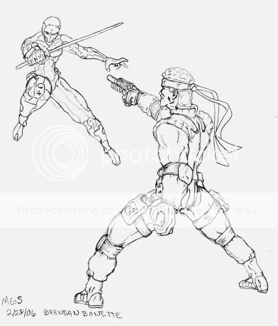
Hey guys.. i did a sketch of Metal Gear Solid.. a friend wanted me to do a picture.. I experimented with a different perspective of a person.. hope you guys like it..
ToddIsDead
Superhero
- Joined
- May 13, 2005
- Messages
- 7,042
- Reaction score
- 1
- Points
- 31
It's not that your work looks like Rob Liefeld, but I think your work would benefit from a little more simplicity and a greater understanding of anatomy. Now, your most recent stuff is a lot better than the early stuff, but I think you need to see how each body part corresponds with each other and their sizes in relation to each other.SithXKosan said:Yeah.. No one wants to be next Rob Liefeld... His porpotions are off!! His drawing does creeps upon my skin!! And I don't think he's that creative...
Making your drawings simple, is an incredibly hard feat in my opinion. If you do less detail, I think your work would look much better. Some of your stuff is just bogged down with lines. Try to pick where lines should go carefully. You can't see every single muscle in the human body, unless their body-builders, and you see even less muscle when they're wearing tights and costumes. Making realistic bulk is a lot harder than making someone ripped.
Then again, I could be all wrong, and that is the style that works best for you.
Silver Sable
Wild Pack Commander
- Joined
- Nov 14, 2004
- Messages
- 27,090
- Reaction score
- 0
- Points
- 31
SithXKosan said:Hey guys.. i did a sketch of Metal Gear Solid.. a friend wanted me to do a picture.. I experimented with a different perspective of a person.. hope you guys like it..
Holy Moly that is great!
Jack Bristow
Civilian
- Joined
- Feb 8, 2006
- Messages
- 479
- Reaction score
- 0
- Points
- 11
SithXKosan said:I didn't know who R. Crumb was.. I just looked it up.. I do notice that I kinda draw like him but with all those muscular tones.. Ha.. Thanks man! Again I appreicate your support!
All of ya--
I do appreciate all of your supports!! Keep giving me the feedbacks I need, and I know for a fact that I'll keep adjusting my skills it will improve... (You can't sharpen a blade if you leave it alone.) Art is and always have been my hobby and I love doing it for others and my entertainment. I'll keep posting more when I get the chance to draw!
R. Crumb is a very interesting guy . . . there' s a documentary that was made about his exploits in the '60's; he invented Fritz the Cat along with a plethora of underground comic movements in the '60's; The doc on him is interesting, strange, and even disgusting at times, and very critically acclaimed; I highly recommend checking it out . . .
Jack Bristow
Civilian
- Joined
- Feb 8, 2006
- Messages
- 479
- Reaction score
- 0
- Points
- 11
Zolland said:I hadn't heard of him so I read up about Mr. Liefeld...what a LOSER!
hahahaha . . . Liefeld; he's so washed up now; In his heyday he was the go-to man for team books like X-men, though . . . I think he invented X-Force, though . . . he's basically just a rip-off artist . . . GOD I hate Liefeld!!
ToddIsDead
Superhero
- Joined
- May 13, 2005
- Messages
- 7,042
- Reaction score
- 1
- Points
- 31
It's knd of hard to believe that Liefeld was one of the highest selling artists in the 90s. He sold millions.
SithXKosan
Civilian
- Joined
- Feb 15, 2006
- Messages
- 358
- Reaction score
- 0
- Points
- 11
Silver Sable said:Holy Moly that is great!
Thanks girl! I wanted to try many different perspectives so i could continually challenge myself and my skills..
SithXKosan
Civilian
- Joined
- Feb 15, 2006
- Messages
- 358
- Reaction score
- 0
- Points
- 11
ToddIsDead said:It's knd of hard to believe that Liefeld was one of the highest selling artists in the 90s. He sold millions.
Yeah.. and he spent them all already.. gee.. Anyhoo.. enough of Rob Liefeld.. We all have agreed that he is a loser, and a style we all should avoid..
Hey Guys-- Here's the hard core truth about me, I ve taken so many art classes after i graduated from high school in 1996, and i vitrually stopped taking art classes in 2000 to focus on getting my BA in history.. Now im done with school and am in between schools because I'm applying for MA at UCSD.. and I do admit that Ive been drawing on and off ever since, and at the new years of 2006, i promised myself that i will never throw my skills out of the window.. so im back drawing like mad.. that is the main reason why some of my arts seems off with the balance of human body..
Here's the sample of my drawing from Anatomy for arts class, you can see where i got the ideas about the muscles..
frontal muscle..

back muscle..

frontal skeleton..

SithXKosan
Civilian
- Joined
- Feb 15, 2006
- Messages
- 358
- Reaction score
- 0
- Points
- 11
and heres picture of arms...
front and back muscles of the arm itself..

side arm muscle.. inside and outside sides..

and one of my sample drawing from life drawing..

Im sure you can see how i got the ideas about the muscles and sort.. I just need to bring my skills back in practice to be able to do anything i want..
front and back muscles of the arm itself..
side arm muscle.. inside and outside sides..
and one of my sample drawing from life drawing..
Im sure you can see how i got the ideas about the muscles and sort.. I just need to bring my skills back in practice to be able to do anything i want..
SithXKosan
Civilian
- Joined
- Feb 15, 2006
- Messages
- 358
- Reaction score
- 0
- Points
- 11
Jack Bristow said:R. Crumb is a very interesting guy . . . there' s a documentary that was made about his exploits in the '60's; he invented Fritz the Cat along with a plethora of underground comic movements in the '60's; The doc on him is interesting, strange, and even disgusting at times, and very critically acclaimed; I highly recommend checking it out . . .
FRITZ The cat?!?! i love that guy!! hes craziest cat ive known!! i didnt know he was created by R Crumb.. thats awesome!!
Silver Sable
Wild Pack Commander
- Joined
- Nov 14, 2004
- Messages
- 27,090
- Reaction score
- 0
- Points
- 31
Your getting better every day hun
Zolland
Civilian
- Joined
- May 14, 2003
- Messages
- 749
- Reaction score
- 0
- Points
- 11
Silver Sable said:Your getting better every day hun
i think those were older drawings...
SithXKosan
Civilian
- Joined
- Feb 15, 2006
- Messages
- 358
- Reaction score
- 0
- Points
- 11
Silver Sable said:Your getting better every day hun
Thanks SS!!! You're such a sweetheart!!!
SithXKosan
Civilian
- Joined
- Feb 15, 2006
- Messages
- 358
- Reaction score
- 0
- Points
- 11
Zolland said:i think those were older drawings...
yeah... The pictures from life drawing and the anatomy classes were old drawings.. right now ive been drawing 3 pictures a day to bring back my ability.. i do know that i should take some art classes to keep up the work..
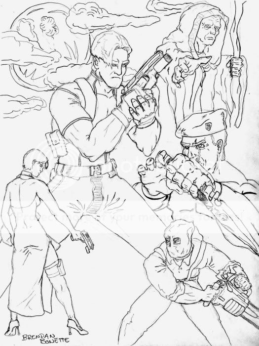
I drew Resident Evil 4 today.. i used all of your suggestions; less marks and less muscle definitions.. it almost made it look cartoon-like.. ha..
Resident Evil 4..
SithXKosan
Civilian
- Joined
- Feb 15, 2006
- Messages
- 358
- Reaction score
- 0
- Points
- 11
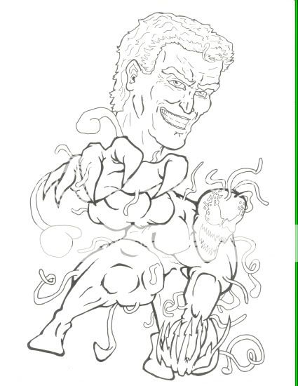
And another inked verison of Carnage..
I tried different lining works, the thickness and sort..
I tried different lining works, the thickness and sort..
SithXKosan
Civilian
- Joined
- Feb 15, 2006
- Messages
- 358
- Reaction score
- 0
- Points
- 11
ampersand said:To make it less cartoony you need to learn to spot blacks
what do you mean by blacks?? FYI, the Resident evil is fully penical.. i used photoshop to make it darker..
I do apologize about the inking of carnage.. it is huge.. i reduced it at photobucket and checked the size.. it still is big.. #@%*@!
Silver Sable
Wild Pack Commander
- Joined
- Nov 14, 2004
- Messages
- 27,090
- Reaction score
- 0
- Points
- 31

Similar threads
- Replies
- 633
- Views
- 94K
- Replies
- 30
- Views
- 3K
- Replies
- 2
- Views
- 17K
Users who are viewing this thread
Total: 2 (members: 0, guests: 2)
Staff online
-
 Hunter RiderRonin