It’s okay. The shield is definitely worse. The material still looks kinda cheap. The belt is worse and looks just as pointless as the last one. The boots look like they might be better, though. The cape attachment is fine, but I never had a problem with the old clasps.
Overall? I’m whelmed. Hopefully they’ll give me something great in season two.
EDIT: Took me a second to realize what I really don’t like about it: the neckline. Way too SR.
Simple and to the point. About as good as you’re gonna get with a TV budget. Although something like what Routh had as KC Superman would’ve been amazing too
I’m SO relieved they maintained the traditional \S/. Those leaked new ones from set that they were using on scripts or doors (can’t remember which) had me really worried about that. Overall, it looks like a great adaptation of the Rebirth suit, imo.
Cant wait to see it action and not so overly photoshopped as the CW just can’t seem to help themselves from doing in these promo pics, lol.
I like the overall texture, seam work, color, and material of the blue suit, though I wish it fitted differently at the wrist. Would've kept the same shield from the previous suit. The belt is ok, but the Superman Returns like collar is a major downgrade for me; it makes the cape attachment look funky. Can't see what the boots look like so I can't judge. Overall not bad.
If you look at the leaked set pics the \S/ is larger than it appears on the official pic and the neckline is a little different too. I wonder why they felt the need to edit it in photoshop.
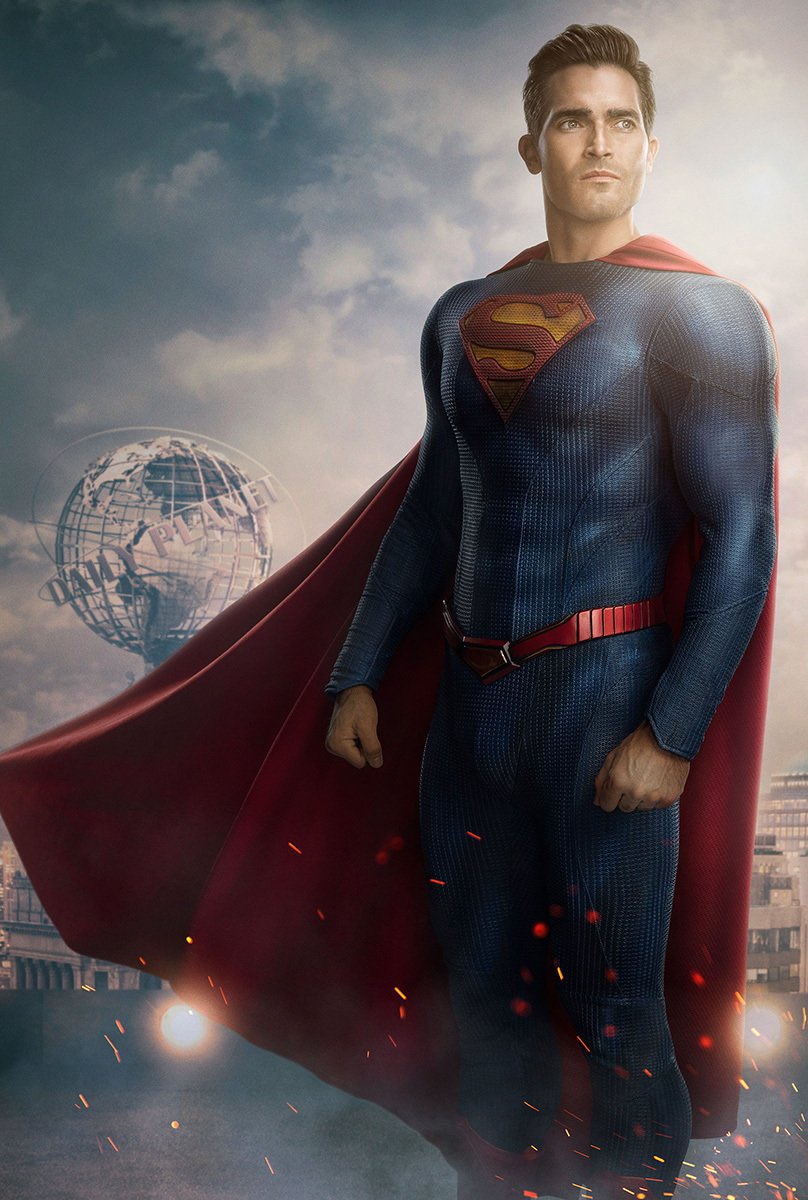
I'm really liking the new suit design! Definitely an upgrade over the prior design, which always came across as "cheap cosplay" to me especially with the cape straps.
I'll have to see the new suit in action, but based on first impressions, I'd say it might just be one of my favorite looking Superman suit designs.
It's modern, sleek, and streamlined, but instantly recognizable as Superman.
I think I’d be more ok with the neckline if the \S/ were bigger, I really don’t understand these designers who keep making the \S/ so small, it’s meant to be large, the symbol of hope! Anyway, I really like the new belt and everything else is great.
This site uses cookies to help personalise content, tailor your experience and to keep you logged in if you register.
By continuing to use this site, you are consenting to our use of cookies.