Age of Ultron The Avengers 2! The Official News and Speculation Thread - - - - Part 39

Status
Not open for further replies.
To be fair, there is only so many ways you can cram 8,000 people into a single poster and have them still be recognizable.

And it is about 1000X better than the first movies poster.
Bingo and a big reason why I don't have a big problem with putting so much onto one poster for a movie with so many stars in it. A poster of possibly questionable artistic value is not going to cause me and others to not see the movie.
 
It has problems from a nitpicky standpoint, but substantially less than the first movies poster. Overall I really enjoy the vibrant color scheme, the dynamic composition, and the ominous silhouettes in the background that are clear enough to hint at danger but obscure revealing details.
It is obviously not photorealistic (nor should it be), it's clearly cobbled together in photoshop, and the lighting is particularly off, but that's something that won't matter at all to your casual movie goer. Most would look at this and think, "Cool, another Avengers movie!"
Better?
I agree it is better then the first poster, much better. But the first poster was horrible. This one is mediocre at best imo. And I honestly am nout a fan of the cop-out of, "well the casuals will like it". Clearly cobbled together photoshop with bad lighting is just not good to me.
 
I think mostly everyone just wants beautiful Struzan quality posters for their walls lol

Which, I mean. Struzan himself might not be affordable but there are thousands of great artists in the net who could be hired to produce great art and then sold to the masses.
 
[YT]teplyY0D9OU[/YT]

That Iron Man in a Donut shot is the best bit in IM2 and always makes me laugh.
 
To be fair, there is only so many ways you can cram 8,000 people into a single poster and have them still be recognizable.

And it is about 1000X better than the first movies poster.
Which is exactly why you go the art route imo.

cvDPnA3.jpg
 
Last edited by a moderator:
Cool poster. Better than the first one.
 
I think mostly everyone just wants beautiful Struzan quality posters for their walls lol

Which, I mean. Struzan himself might not be affordable but there are thousands of great artists in the net who could be hired to produce great art and then sold to the masses.
How much do you think Struzan cost? :woot:
 
Fewer main characters and that's not exactly a top notch poster either. Also, points deducted for the display of Ewok. :o
 
Fewer main characters and that's not exactly a top notch poster either. Also, points deducted for the display of Ewok. :o
IT is a lot better then the AoU poster. And the amount of main characters is irrelevant. You simply come up with a design that fits them in. It isn't like they didn't make more then a few smaller then the others. :funny:
 
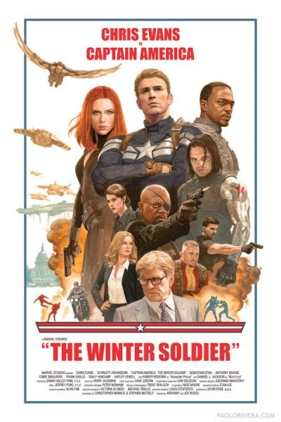
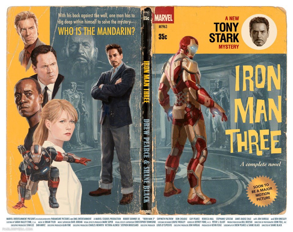
They'd never use them but I LOVE the retro pieces they make for the cast and crew
captain-america-winter-soldier-retro-poster-400x600.jpg


captain_america_the_first_avenger_vintage_poster.jpg


255715_586010638090412_35134938_n.jpg
 
It's alright,I don't care about movie posters and so meh whatever
 
That poster is terrible and looks like they re used the background of ironman 3 poster. So gar nothing from this movie has grabbed attention in the least. Im not saying give everything away but give me
Something that says i got to see that.
 
A shame cap out on front yet chris evans is fourth billed.Winter soldier was
so much better received than Dark world but Chris hemsworth and mark
Ruffalo got higher billing? It makes sense with Robert Downey JR over him.
 
A shame cap out on front yet chris evans is fourth billed.Winter soldier was
so much better received than Dark world but Chris hemsworth and mark
Ruffalo got higher billing? It makes sense with Robert Downey JR over him.

This has been talked about so many times, it's nothing to do with how well the previous film was or how much BO, it is the agents and the contracts, same reason why in sports the best player may not necessarily have the best contract at that specific time.

If it was about BO and reception and hell even fame ScarJo should be second.
 
That poster is terrible and looks like they re used the background of ironman 3 poster. So gar nothing from this movie has grabbed attention in the least. Im not saying give everything away but give me
Something that says i got to see that.

So seeing the Avengers again on a poster + the Twins (no matter how bad they are placed on this poster) and Vision can't get you excited and make you say "I've got to see that" ? The Hulk vs. Hulkbuster fight from the trailers alone should have done that already.
 
That's a hilariously bad poster. Off-looking compositing with inconsistent lighting, composition whose only purpose is getting everything to literally fit, evokes nothing but messiness etc. And why semi-hide Vision in the background like that? Just confusing. Especially since Ultron, who is part of the title, is nowhere

Poster for the first movie is a masterpiece in comparison.

Luckily the movie itself seems great.
 
So seeing the Avengers again on a poster + the Twins (no matter how bad they are placed on this poster) and Vision can't get you excited and make you say "I've got to see that" ? The Hulk vs. Hulkbuster fight from the trailers alone should have done that already.

Hulkbuster looks Cool but i have a feeling vision and the twins Will Have small roles in this. It migjt also be the fact that they just leep showing the same footage over amd over. I chuckled seeing quicksilver look like hes doing a flying kick.
 
Last edited:
Don't you just love the amount of design experts who come slinking out of the woodwork whenever a poster gets released??

:o
 
Don't you just love the amount of design experts who come slinking out of the woodwork whenever a poster gets released??

:o

Including Forbes :woot:

Yes I know I just wrote 700 words based on a single theatrical poster, but both the unintentionally comic overcrowding and the subtle but interesting placement of the key characters compared to three years ago merited a quick essay for those inclined to care. Besides, none of you read those Oscar essays I dropped over the weekend anyway, so you really have only yourselves to blame. Avengers: Age of Ultron, written and directed by Joss Whedon and starring Robert Downey, Jr., Chris Evans, Chris Hemsworth, Mark Ruffalo, Scarlett Johansson, Jeremy Renner, Aaron Johnson, Elizabeth Olsen, and James “the original Mr. Grey” Spader,opens May 1st, 2015 in 2D, 3D, and IMAX 3D. As always, we’ll see.
Rest at:

http://www.forbes.com/sites/scottme...-ultron-poster-gets-comically-claustrophobic/
 
Everybody is just a nerd these days.
 
Don't you just love the amount of design experts who come slinking out of the woodwork whenever a poster gets released??

:o
You don't have to be a "design expert" to see the blatantly terrible photoshop on the poster.

The stink of crap is apparent to people of every denomination and skill.
 
Which is exactly why you go the art route imo.

cvDPnA3.jpg

Well, all posters are art, but I do like the more classic drawing/painting style. That poster has a good style, but the composition below Solo is not good. Especially how they just threw in a couple of scenes that really fails to make it coherent.

I do like the old SW posters but they are in no way examples of posters lacking flaws imo.
 
Status
Not open for further replies.

Users who are viewing this thread

Back
Top
monitoring_string = "afb8e5d7348ab9e99f73cba908f10802"