Age of Ultron The Avengers 2! The Official News and Speculation Thread - - - - Part 39

Status
Not open for further replies.
You don't have to be a "design expert" to see the blatantly terrible photoshop on the poster.

The stink of crap is apparent to people of every denomination and skill.
3tn28r.jpg
 
Don't you just love the amount of design experts who come slinking out of the woodwork whenever a poster gets released??

:o
Says the guy who doesn't even remember the Marvel movies.

tumblr_m4ya8tHOCb1qajc4eo1_500.gif
 
You want crammed? Wait until Avengers: Infinity War! ;)
 
oh, my bad, i forgot two scenes from 10 hours of film, I am sooo sorry

so prickly and pretentious
welcome to my ignore list
 
I hate the poster because no one is wearing there mask, looking indifferent directions amd no shot of the main villian. The Heads and stances
Must be a running gag With someone at marvel because it
Keeps coming up with each new Movie
 
Welcome to every Marvel poster ever lol

It looks great as long as your eyes are focused on Cap. Look away from him and it becomes a photoshop trainwreck.

Word. I was like, YAY THEY GOT CAP RIGHT!!

The rest is... LOL!

I can't wait foR INFINITY WAR to break Photoshop altogether.
 
oh, my bad, i forgot two scenes from 10 hours of film, I am sooo sorry

so prickly and pretentious
welcome to my ignore list
Well us photoshop experts care about the details. :cwink:

Word. I was like, YAY THEY GOT CAP RIGHT!!

The rest is... LOL!

I can't wait foR INFINITY WAR to break Photoshop altogether.
I think Thor and Hulk look pretty good as well.
 
AIYFZ34.jpg


Via Tumblr (with one word PG-13ified)

Also Tony just need to move one hand to Steve's chest and it will fit the theme!

tumblr_inline_nkaiomhJDu1rvctqk.jpg
tumblr_inline_nkaiovXhqL1rvctqk.jpg
 
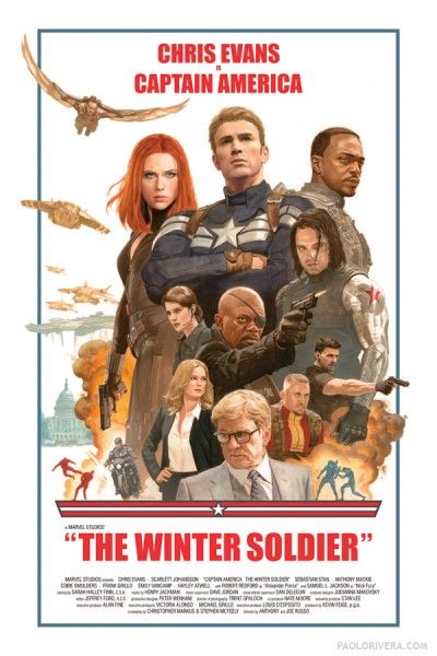
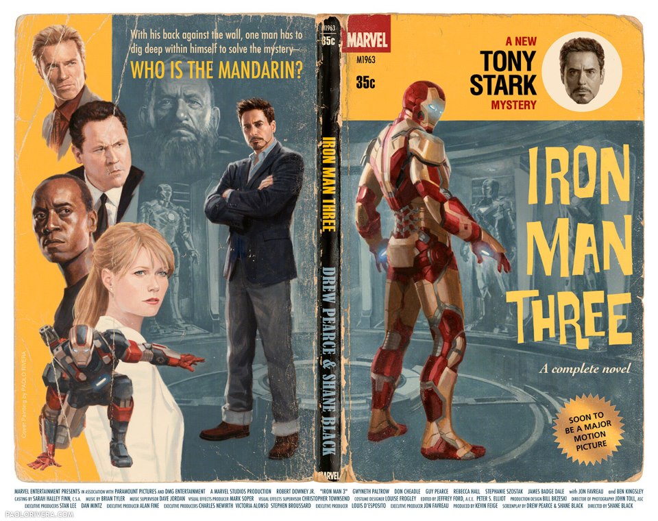
They'd never use them but I LOVE the retro pieces they make for the cast and crew
captain-america-winter-soldier-retro-poster-400x600.jpg


captain_america_the_first_avenger_vintage_poster.jpg


255715_586010638090412_35134938_n.jpg

Right on. They should know that if they released stuff like this as official posters, it'd get more viral attention. Everyone, not just particular fans, love this kind of stuff and media sites love to post it.

Though if they were all retro I guarantee we'd get complaints about how "played out" they are after the first three or so. So just keep creative artwork rolling out.

Hell, fans do better posters for free every time an anticipated movie's coming out. Just pay them a couple grand and watch the public laud it.
 
HQ version (for those interested) 1688x2500: http://i.imgur.com/7b0icih.jpg

So weird, once more the bigger it gets the better it looks. What looked off to me about Tony's suit is now explained by sratches on the paint like Cap's shield. Wanda is clearly doing magic and QS is more obviously blurry because of speed. Also the emphasis on the now Big Four looks more focused instead of squished and the other characters are big enough now not to be marginalized.
 
Status
Not open for further replies.

Users who are viewing this thread

Back
Top
monitoring_string = "afb8e5d7348ab9e99f73cba908f10802"