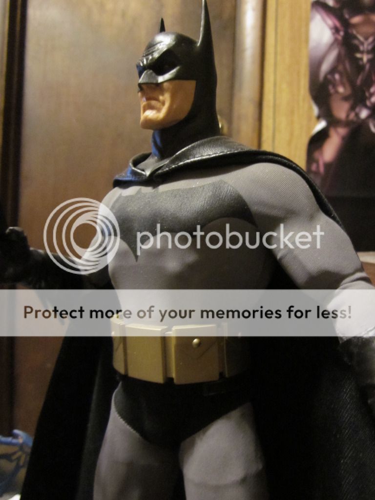
BvS The Batsuit Thread - Part 5

Status
Not open for further replies.
We are exaggerating a little bit, aren't we? Even the symbol, really?

I'm exaggerating if I think the symbol is ugly? It's my opinion. I think the suit is pretty awful.

p0cjmVm.jpg


Yeah i hate that symbol. And the belt. and the boots and the seams.
 
I think its one of the worst looking suits, too.
 
Sure, it's your opinion. But it appears you are projecting your hatred onto every aspect of the suit, because you are unhappy with the general design. I'm surprised you didn't complain that it's black.
 
Sure, it's your opinion. But it appears you are projecting your hatred onto every aspect of the suit, because you are unhappy with the general design. I'm surprised you didn't complain that it's black.

It appears that you would be wrong. Why are you still talking to me about this? I dislike the suit and pointed out the things that I don't like about it. What do I gain from lying about disliking the suit lol? Do you realize how crazy that sounds ahahah?

I genuinely dislike the parts that I pointed out, why is that so hard to believe ahahah?

This post is a waste of my time, I shouldn't have even indulged you in this foolish conversation
 
I think its one of the worst looking suits, too.

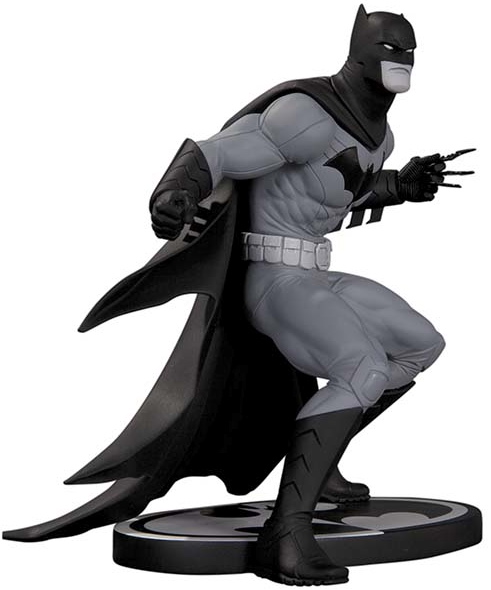
I think some artists can work wonders with it. Like Cully Hammer and Greg Capullo. As much as I like Jim Lee, he doesn't seem to manage to make the busy looking designs too appealing.
 
If Jim Lee, one of the greatest comic book artists of our era, can't make it look good then there's a problem :dry:
 
It's the same suit pre-New 52 but minus the briefs. It has some differences but nothing that would point to a new universe. It looks like a suit drawn by whatever writer that just got on a new Batman book.
 
It's not just Bats though. Pretty much the rest of the League looks the same too. Flash just got some extra lines, Hal's old school, white gloves and all, Arthur has his classic orange chainmail and green tights. I think only Wonder Woman looks really different, with the added pants and the colors red, silver and black, instead of red, gold and blue.
 
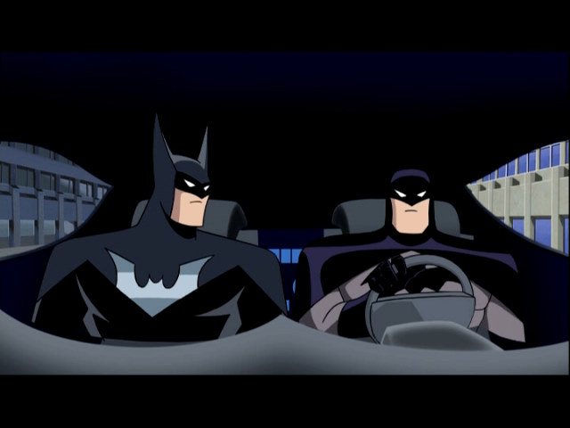
what if the suit was sorta along the lines of the justice lords Batsuit?
26jlrn1.jpg
 
I actually think the new 52 costume is one of the weakest designs I've seen of Batman. I think all the extra seems and lines are ugly.

Batman Inc costume sucks too. So does Earth One.

Thank God, I am so full of seeing the majority praising the new 52 awful costume and thinking what the heck, am I the only one who hates it? Glad you feel the same way I do.

The New 52 suit is literally just the standard black-and-grey suit minus the briefs. Nothing revolutionizing.

Actually it has a bunch of ugly seams, an ugly belt, and an ugly symbol.

Exactly.
 
Thank God, I am so full of seeing the majority praising the new 52 awful costume and thinking what the heck, am I the only one who hates it? Glad you feel the same way I do.


Exactly.

It seems like its just you me and Travesty. The other people are too blind to realize that it's not the same exact suit without trunks. It's not. They took the classic suit and ****ed with the details and made it look horrible.

It's same in the sense that there is a black symbol, a yellow belt, black cowl, grey bodysuit, black gloves, black boots, but just because it retains those basic elements doesn't make it the same. There are some obvious changes and I'm just not a fan of them at all

I'm with you guys too. I think the best way to describe the New 52 suit is to compare it to the Superman Returns supersuit. All of the classic elements are there, but the execution and the details are completely wrong, in particular the materials and the proportions. I think one of the worst parts of the New 52 redesigns is how all of the new costumes appear to be made of the same shiny, metallic armour-like material, right down to the seams from Superman's Kryptonian nanosuit to Batman's human-made batsuit. For Batman, who is supposed to be one of the grittier human heroes, the look makes no sense. It does not project creature of the night vigilante or noir/pulp detective whatsoever. The shininess reminders me of the Schumacher suits, but at least they had proper ears. Don't get me started on Lee's short little DareDevil ears and visible human ears through the side of the cowl.
 
What if they gave him multiple suits? A very heavily-armored suit (potentially with a little bit of kryptonite built in) in order to make him better able to face Superman (so a metal-ish suit designed to increase Batman's strength and speed in major ways), a light suit for quick changes/quick missions, a basic suit for patrol, and then a suit like the one in Dark Knight/Rises or Arkham Origins or something like that for major battles that aren't as hard as battling Superman, but still require require protection against, say, gunfire and stuff?

I honestly wouldn't mind seeing more than one Batsuit. I think that'd be pretty cool, in fact.
 
I really like that idea . For the Superman armor suit, I think it'd make sense for his mouth to be covered
 
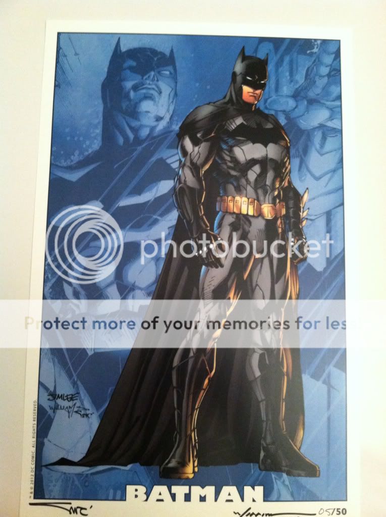
I don't think the Jim Lee version of the New 52 suit should be used as an example when condemning it. It's the worst rendition of it.

bfb287f0.jpg


This is what I'm assuming is what some are basing their opinions off of. And honestly, I understand the complaints about the busy lines and other deviations from the classic suit.

But look at these versions of the New 52.
Batglider_new_52.jpg


costume02.jpg


2589336-b0.jpg


batmanc.jpg


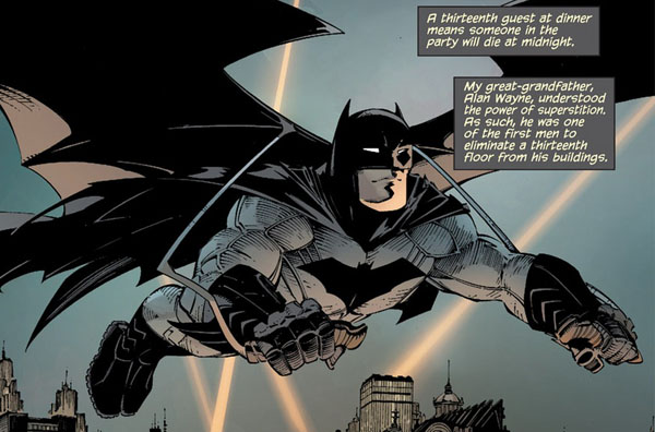
Mainly Capullo's version. Most of the complaints are erased (busy lines, metallic look, etc) and it certainly pulls off the "creature of the night/noir/pulp detective" look. Its basically a better version of the traditional suit, and it looks more modern and armored yet flexible.

I think it would be an excellent choice to model after for Snyder. Especially considering this will likely be the FIRST TIME we get a comic accurate Batsuit EVER.
 
That looks slightly better ^ But I still hate the seams . They're so unnecessary, they add nothing. I especially dislike the way they look in the third picture. Gloves, boots, and symbol look better, and I like the kneepads, still not a big fan of the belt though. But yeah Capullo's version is an improvement, i like the way Jim Lee draws the cowl better though .
 
Why can't anybody draw a good nose on that cowl? Is that some kind of prerequisite to drawing the New 52 suit?
 
That looks slightly better ^ But I still hate the seams . They're so unnecessary, they add nothing. I especially dislike the way they look in the third picture. Gloves, boots, and symbol look better, and I like the kneepads, still not a big fan of the belt though. But yeah Capullo's version is an improvement, i like the way Jim Lee draws the cowl better though .


I actually like the seams, I think they're necessary to compensate for the lack of trunks, and overall I prefer them to the trunks, combine the lines with a sturdy looking texture on the suits fabric and I think it'd be an awesome suit. Though a decent enough suit texture could probably allow the lines to be removed as texture would make the design more interesting and essentially fill the role that the lines are meant to fill, Though I do honestly like the seams.
 
Material has seams. I don't see the issue there. It's the Lee Bermejo influence on the suit. I don't understand how so many people can embrace the Nolan Batsuit, but whine that the New 52 adaption of the classic gray and black look is "too busy". To me its biggest design flaw is the segmented gauntlets and boots, and even that isn't that big a deal.
 
When I say I "kinda" like the new 52 suit, it doesn't mean I think it's perfect. It's just that I think it's the best compromise we're gonna get for those of is who want a grey/black suit. TBH, this is what I would really like to see, but I highly doubt we will:
 
I never liked Alex Ross' cowl, but I love the way he draws the symbol
 
I hope they make the symbol very large, like the picture above. Hated how tiny the symbol was on the TDK(R) suit. And even when you could see it, it was awkwardly segmented in half.
 
I wouldn't want it that big, one thing I dislike about Ross's work is that he often makes the Superman and Batman logos so large that they often get distorted by the characters bodies, however the symbol in TDK/TDKR was way too small, and hidden by the excess of details covering the suit. I think a symbol about the same size as the one we saw in Batman Begins would be good, honestly can't figure out why they changed the symbol for the other movies.
 
I wouldn't want it that big, one thing I dislike about Ross's work is that he often makes the Superman and Batman logos so large that they often get distorted by the characters bodies, however the symbol in TDK/TDKR was way too small, and hidden by the excess of details covering the suit. I think a symbol about the same size as the one we saw in Batman Begins would be good, honestly can't figure out why they changed the symbol for the other movies.

I think the change was sort of forced on them. It may have been a compromise for the type of Batsuit they were going for...

That was perhaps my only complaint about the TDK/R Batsuit; the logo. The chest did not have to be segmented that much. They could have kept the logo intact with a one-piece on the chest. I don't really understand why they didn't.

On a different topic: is there a comprehensive list of all the Batsuits ever featured in every medium Batman's ever been in? You can see a link in my signature where I ask for such images, but no one ever really responded, and the one picture I can find is horribly drawn and missing so many Batsuits! I'm trying to collect pictures of all the official Batsuits ever featured so far, then I want to start on the concepts and fanarts drawn by people. I'm just looking for a collection, and it may or may not develop into a video project, depending on my time. If there's at least a list out there that I can use to do Google Image searches from, that'd be awesome.

Anyone?
 
I agree Ross draws the symbol too large, but a smaller version of his symbol would look great.
 
Status
Not open for further replies.

Users who are viewing this thread

Back
Top
monitoring_string = "afb8e5d7348ab9e99f73cba908f10802"