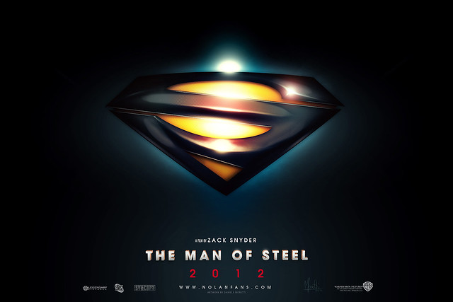
Classic \S/ is waaaaay too dated for a modern film. The Superman Returns \S/ is one of the few things the movie actually got right. It's very clean and sharp looking, while still looking close to the classic S to please almost everyone.
That said, my favorite rendition of the S I've
ever seen was posted here a little while ago, and I'm looking to steal it for all future manips/images I make (with credit given of course):
^It has the sleek modern look of the Kingdom Come shield...whilst also not having the problem of looking like it's telling you not to do something, if you know what I mean.
The only weakness it has is that from a far enough distance it isn't quite as discernible as the other designs (check my avatar for an example).
Still....can't win em all.


 seems to evoke fascism to me.