The Official Superman Fan Art & Manips Thread

Status
Not open for further replies.
Now This is why he is my choice for Superman :D

clark11jg8.png


This suit is nice. It can be improved upon....when it comes to the texture. A bit more muscle defintiion needs to be added. I like the S and the neckline. The colors work well also.
 
^^That's awesome!


This is my choice:


eee5f855dd.jpg


Visually this looke nice as well. The colors are sweet, but the neckline needs to be cut down and the cape needs to be attached closer to the shoulder area. The S shield needs to be bigger and the more muscle definition added.
 
I think that for Live action some changes are required from the classic design that will make superman stand out more in my opinion.


CHANGES MADE:

1. Slanted Belt line. I quite like the slanted beltline from SR but what made it look bad was the fact that they had it so low down on Brandons body that it looked awekward, higher up & were good 'n' go.
icon14.gif


2. Slanted Belt straps. No real reason other than it's a little different but not distracting IMO

3. Lower boots. mainly because ppl complain about superman being a hooker
tongue.gif


4. Longer Cape. Looks more regal & I don't wanna be seeign the back of Superman's legs ala S:TM

5. Darker blue. I think darker blue looks great on screen. Spiderman 2 being the standard to which my opinion is based on. I absolutley loved it, it looked so rich & beautiful.

6. Darker Red. Pretty much same reason as above. Spiderman 2 had a darker & richer red & it looked damn good, especially at night.

7. Darker/more golden yellow. I liked the more golden darker yellow of returns, would like that trend to continue.


Steve


Good Job!
 
That's some awesome art.. if only whoever did it replaced him with Brandon.
 
Last edited:
You see those tires over his right shoulder?

Yeah, probably more talented actors.
 
Apparently you didn't get the meaning. The artwork itself is great, just not who is in it. :o

Oh, and great job leaving out the part of my statement that said that.

mentioning routh wasn't relevant. you tried to twist your opinion in an attempt to be snarky just because I stated that i didn't agree.

You see those tires over his right shoulder?

They are Routh's acting coaches.
 
Last edited:
Guys u don't have to get on a fight on who is better. Come on we all know that Welling runs circles around Routh :D But please don't start a War. Don't hate the player hate the game :)
 
Guys u don't have to get on a fight on who is better. Come on we all know that Welling runs circles around Routh :D But please don't start a War. Don't hate the player hate the game :)
supes-wtf.jpg
 
This would be the perfect transition :)

smallvilleposteraw2.png

I like the art a lot actually. And Welling looks kinda decent as Supes. Good job.


Guys u don't have to get on a fight on who is better. Come on we all know that Welling runs circles around Routh :D But please don't start a War. Don't hate the player hate the game :)

Now that's really funny. :woot:


Yeah. Man, Routh has such a perfect face for Superman!! *sigh* :word:
 
Last edited:
mentioning routh wasn't relevant. you tried to twist your opinion in an attempt to be snarky just because I stated that i didn't agree.

I think I'd be the one to know what I meant, hmm? The job on the artwork itself is great. Just not whom he painted. How can I state that any simpler for you to understand?


Saying it would be "crap" if Welling were replaced with Brandon was saying you didn't agree? It seems you have issues with understanding preferences and opinions. This discussion is finished.
 
This has nothing to do with the reboot but I had no clue where else to put it since I couldn't find any kind of general \S/ fanart thread. So I hope you all like.

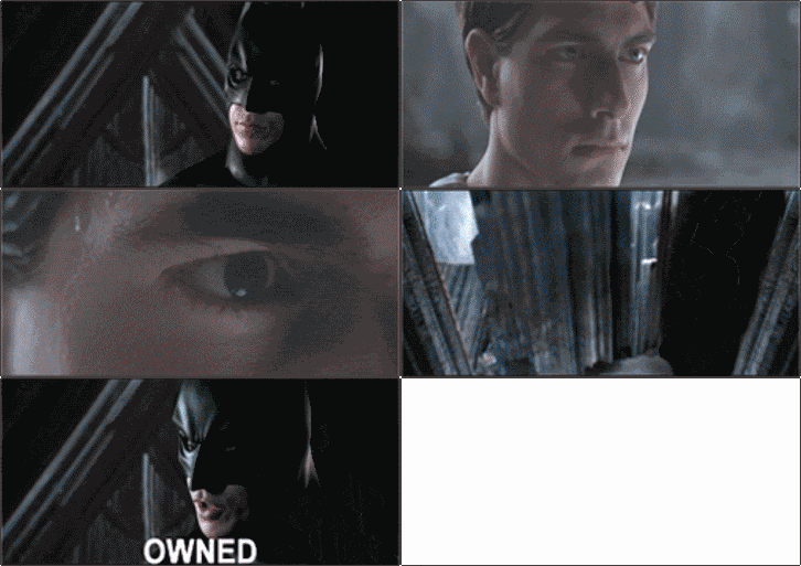
I know you all are very familiar with this .gif
BatmanvsSupermanOwned.gif


I thought it was about time that someone make a reply to it, so I went ahead and made this, hope you all like :hehe: :supes:

SupermanvsBatman-Owned-jd.gif

Excellent that you chose to use the Real :supes: for the reply. :applaud
 
all we need is a gif of welling being owned......

by anyone.

even routh.
 
Status
Not open for further replies.

Users who are viewing this thread

Members online

Latest posts

Forum statistics

Threads
200,537
Messages
21,755,779
Members
45,592
Latest member
kathielee
Back
Top
monitoring_string = "afb8e5d7348ab9e99f73cba908f10802"