
-
You are using an out of date browser. It may not display this or other websites correctly.
You should upgrade or use an alternative browser.The Batsuit Master Thread
- Thread starter regwec
- Start date
- Status
- Not open for further replies.
darklord1967
Civilian
- Joined
- May 30, 2012
- Messages
- 225
- Reaction score
- 0
- Points
- 36
I really like the Batsuit comp posted by Vigilant for use in a Batman feature movie.
I especially like how the textured grey body suit is a nice compromise between not coming off as high-tech armor but still not coming off as simple spandex either.
The eye lenses in the cowl are something i have always wanted to see, so i really dig those. And the leathery texture of the gloves, boots, trunks, cape and cowl are exactly what I imagine them to be.
I made some adjustments to this image using Adobe Photoshop to show what my personal ideal movie Batsuit would be (based upon this design):
1) I made some corrections to the anatomy (which I found a little long and lanky), and to the size of The Baman's face (which was a bit under-sized and lost in the cowl)
2) I brightened the utility belt's color saturation by about 25%, and created an oval-style chest emblem shield (my favorite) in the same yellow to balance the design of the suit.
3) I changed all of the costume's leather components into midnight blue for more visual interest.
4) I made the shorts with a taller waistline and a lower leg opening to make them more traditionally superhero-like and less bikini or thong like.
5) I rounded out the 3 bat-fins on the sides of the gauntlets to make them more traditional.
6) I simplified the belt-buckle and thickened the raised edge border around it. By removing the etched Bat-Emblem on the belt I made the conscious decision to make the belt less ornate and more basic and functional. I also gave the belt a subtle amount of additional overall bulk to make it seem more cumbersome and functional like true battle gear. I also raised the general position of the utility belt by about 4 inches along the lower abdomen. When it is positioned below his navel (as it was in the original rendering), it comes off a bit "fashion-y" and somewhat effeminate to my eyes.
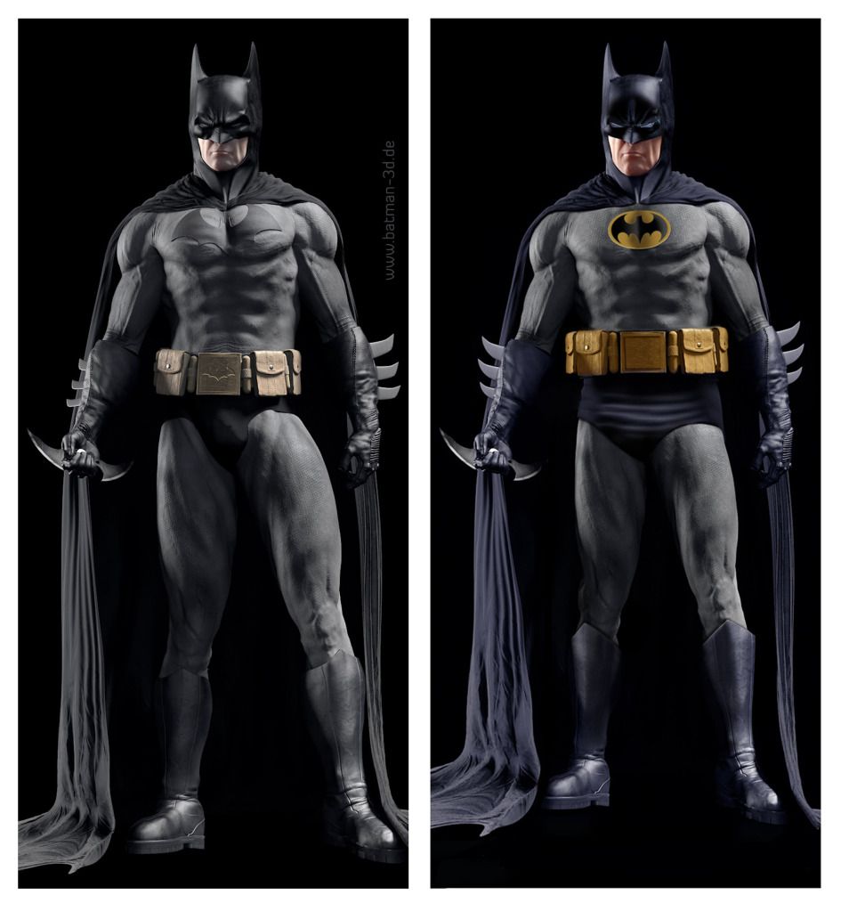
If i ever saw a Bat-suit like this one on the big screen, featured in a film with a really good script and a reverence toward the original comic book material, I would die a happy man.
.Last edited:
Young Superman
The Last Son of Krypton
- Joined
- Jul 17, 2009
- Messages
- 9,609
- Reaction score
- 4
- Points
- 31
That is amazing darklord1967, I'd love to see that on screen.darklord1967
Civilian
- Joined
- May 30, 2012
- Messages
- 225
- Reaction score
- 0
- Points
- 36
^^ LOL! Me too, buddy! Me too! LOL!
It's like I said: If Spandex tights are SO out of fashion (as some people seem to feel), then I think the suit modification I posted above is a good compromise for the big screen.
Also, since I believe that color should be a big part of superhero-based films, I wanted to make this suit a little something more than just grey and black. In fact, I could EASILY see an updated version of Dick Grayson's classic Robin Costume next to this!Last edited:
Llama_Shepherd
Superhero
- Joined
- Dec 26, 2010
- Messages
- 9,713
- Reaction score
- 0
- Points
- 31
It looks pretty, but I wouldn't want to see it in a film. It could've been great in the 80's/90's film series.
But for modern films, I don't like it, it doesn't look modern. Batman has a look in every medium he is in, except maybe cartoons, in the fact that he has some armoured protection. I'd rather see a combination of four suits: Captain America's suit from The Avengers, Superman's suit from Man of Steel, Batman's from the New 52 and Batman's from Batman: Arkham Asylum.
And I definitely don't want to see Dick Grayson's or Jason Todd's traditional Robin costumes on film.darklord1967
Civilian
- Joined
- May 30, 2012
- Messages
- 225
- Reaction score
- 0
- Points
- 36
This thread reminds me of some of the conversations I had way back in '89 when the first Batman film came.
I said how much I didn't like the on-screen bat-suit with its reduced color scheme, reduced contrasts, and basic tendency toward "Robo-cop in a Bat-cape"... no blank eyes behind the cowl... etc. I said how much I wanted to see a faithful translation of the Bat-suit to the big screen. Everyone would respond by telling me how certain details from the comics do not translate over on film.
I find it interesting and ironic how in the LAST Dark Knight film, The Batman actually set his cowl to night-vision mode (with blank lenses in place) and everyone thought that was the coolest thing ever. These were likely some of the same people who told me years before that comic book details don't cross over to film well... even though with The Batman they rarely even tried.
People now tell me that The Batman currently has different looks in different mediums. Well that is certainly true of the current version of the character (which I've already said I do not care for) .
But at the time when The Batman was making his first modern appearances on the big screen, he did NOT have different looks in different mediums. The comic book Batman, looked like animated Batman, looked like gaming Batman, looked like merchandised Batman.
But when toy companies like Toy Biz and Kenner began going hog-wild releasing dozens of different types of Batman action figures wearing different costumes, that all changed.
I was particularly dismayed over the fact that they kept neglecting to include a traditional Bat-suited figure among their dozens of costume variants.
I actually take it as a compliment that the versions of The Batman (and Robin) that I prefer to see on screen "...could've been great in the 80's/90's film series". After all that was the last version of the character that I felt like I could actually enjoy.
The trouble is, on the big screen that is not what I ever got... not even back then.Last edited:darklord1967
Civilian
- Joined
- May 30, 2012
- Messages
- 225
- Reaction score
- 0
- Points
- 36
I think that would just end up being another rubber wetsuit.
I don't quite understand some people's admiration for the "Arkham" Batsuit. I suspect it might just be a product of its association with some great games. The suit itself, in my opinion, is just the modern comic book Batsuit made to look really ugly by a pin-head and absurd gorilla-glove gauntlets.
LOL! Amen, brother. AMEN!! t:
t:
regwec
Make Mine Marble
- Joined
- Feb 7, 2005
- Messages
- 28,473
- Reaction score
- 5
- Points
- 33
It would look fine now, in the right sort of movie. The problem with Nolan's batfilm's, from a purist's perspective, is that he adopted a visual tone first and then adapted the characters and situations to fit it. I have always said that, if you can't fit a bleached white Joker into your visual tone, then you have chosen the wrong one for a Batman adaptation.I actually take it as a compliment that the versions of The Batman (and Robin) that I prefer to see on screen "...could've been great in the 80's/90's film series".
The comicbooks could be adapted on their own terms, with their rich colour palate and outlandish designs treated as a strength rather than something to repress, and audiences would still lap it up. I think that Batfans are often overly simplistic when they say that audiences rejected the Schumacher movies due to their bright colours and campy costumes. I think they rejected them because of their appalling scripts; their insipid, overtly commercialized feel; their paper-thin character development and character design; their feeble set-pieces; and their inappropriate casts. The Riddler wearing spandex was the least of the problems.
I feel sure that critics and audiences would praise rather than deride the visual flair of a movie that looked like this...

...so long as the movie was good.Mr. Finger
Civilian
- Joined
- Dec 17, 2011
- Messages
- 421
- Reaction score
- 0
- Points
- 11
I see where you are going with it darklord...
and I myself would still like to see a suit that gives Neal Adams artwork some screen time.. for sure...
But that said... the belt would have to be different... and the oval as well.
I liked the way that Neal scetched Batman, and that IS the vision that i grew up with. Seeing your pic, made me think that it may work. But let's test your photoshop skills. That, or some one else's on the forum.
The pic above is getting very close, but that big... Alex Ross type belt would have to go. Batman '89 got close to paying tribute to Neal's design... but it was just too thin. Widen that design, and keep the values of the colors down.. and you would be getting there. I do prefer the Black and Grey look... but with a different oval and belt on the one above... I may have an option "B". Neal Adams' artwork will always be some of my favorite, and perhaps it would be cool to his artwork fleshed out. Especially if they do a "Justice League" film like they are planning...
I also liked how Neal drew the oval wider than those used in the films so far. Less round like Adam West's or Burton's oval's..
I would like to see some one take that pic above... stretch out the oval a bit horizontally.. and then change the belt. I suck at these photo-shop things or I would give it a go... as for the belt.. I will always prefer Neal's idea over the big , square, goofy looking pouches...


DaveMoral
Sidekick
- Joined
- Jan 17, 2011
- Messages
- 1,673
- Reaction score
- 1
- Points
- 31
Then in that case, Nolan ****ed up big time with that ending. I'm not saying that I don't want to see Batman and his universe portrayed realistically, but when you come up with something that makes no sense at all, WTF? I still think that Batman Begins is the best Batman film so far, but what you just said gives another strike to TDK for me. But as for the costume, I don't see why if Batman had access to all of this equipment, he wouldn't try to use it to his advantage. A friend of mine on DeviantArt, Nick (A.K.A. BlackDragon85), recently did some concept drawings of Batman and Bane and just a couple of days ago, posted one of both in action:

He also did some Batmobile, grapple gun, and villain concepts (along with some Transformers and Superman stuff) over at his DeviantArt page:
http://black-dragon85.deviantart.com/
I just think his design is, in my opinion, what Batman SHOULD look like on the big screen.
That is god awful. Seriously. And put spoiler tags around an image that egregiously huge.
That looks like one of the numerous variant crappy action figure extra special action and accessories things that is released every time there is a new Batman movie. Over designed, over thought.
While I'm down for simplifying the design and heading to a more comic accurate look for the Batman... doing the basically straight forward versions of the classic comic costume that DL67 has been posting would be a mistake. For me the Captain America manips are still the best template. Obviously you would eliminate some of the more over-designed aspects of that. Take away the zippers and some of the other excess details... but I think it would work best if the costume were fabric, looked more like kevlar, and had a slightly padded(not puffy) look giving the impression that there is body armor underneath the primary body suit. Going the MOS route is, IMO, no suitable for Batman.
What works so well, to me, with the Cap suit in those manips is that it gives a definite echo of the Arkham and the New 52 designs, it also gives a physical look that recalls the Batman of the 1940s and of BTAS. The form fitting, muscle definition showing design of MOS isn't where I'd go with Batman and I think even for those 2 characters to co-exist in a shared universe you need to differentiate them on-screen by their costume design. So making Batman's outfit look too similar to Superman's is a mistake. Superman is impervious to bullets, he can wear some strange material that comes from Krypton that's a millimeter thickness and shows every rippling muscle. Batman's costume needs to be ballistics armor but still easily portable.
I think it deserves constructive criticism if you don't like it, not an inaccurate comparison to something it doesn't even resemble.That is god awful. Seriously. And put spoiler tags around an image that egregiously huge.
That looks like one of the numerous variant crappy action figure extra special action and accessories things that is released every time there is a new Batman movie. Over designed, over thought.darklord1967
Civilian
- Joined
- May 30, 2012
- Messages
- 225
- Reaction score
- 0
- Points
- 36
It would look fine now, in the right sort of movie. The problem with Nolan's batfilm's, from a purist's perspective, is that he adopted a visual tone first and then adapted the characters and situations to fit it. I have always said that, if you can't fit a bleached white Joker into your visual tone, then you have chosen the wrong one for a Batman adaptation.
The comicbooks could be adapted on their own terms, with their rich colour palate and outlandish designs treated as a strength rather than something to repress, and audiences would still lap it up. I think that Batfans are often overly simplistic when they say that audiences rejected the Schumacher movies due to their bright colours and campy costumes. I think they rejected them because of their appalling scripts; their insipid, overtly commercialized feel; their paper-thin character development and character design; their feeble set-pieces; and their inappropriate casts. The Riddler wearing spandex was the least of the problems.
I feel sure that critics and audiences would praise rather than deride the visual flair of a movie that looked like this...
...so long as the movie was good.
As you know, brother, I could not agree MORE!! Well said!Mr. Finger
Civilian
- Joined
- Dec 17, 2011
- Messages
- 421
- Reaction score
- 0
- Points
- 11
I concur... well put regwec.. well put indeed..
DaveMoral
Sidekick
- Joined
- Jan 17, 2011
- Messages
- 1,673
- Reaction score
- 1
- Points
- 31
I think it deserves constructive criticism if you don't like it, not an inaccurate comparison to something it doesn't even resemble.
It's not inaccurate at all. I've been around a very long time and I've had a **** ton of those crappy Batman action figures that design reminds me of. It may not be in technicolor but it's certainly over designed with unnecessary details that are there for no good reason. It also continues the atrocious over design crap that many people are sick of with The Dark Knight trilogy.
I can't constructively criticize something that I think should be scrapped all together.It's not inaccurate at all. I've been around a very long time and I've had a **** ton of those crappy Batman action figures that design reminds me of. It may not be in technicolor but it's certainly over designed with unnecessary details that are there for no good reason. It also continues the atrocious over design crap that many people are sick of with The Dark Knight trilogy.
I can't constructively criticize something that I think should be scrapped all together.
And you're saying that despite the fact most of what is shown is his head and limbs.
DaveMoral
Sidekick
- Joined
- Jan 17, 2011
- Messages
- 1,673
- Reaction score
- 1
- Points
- 31
And you're saying that despite the fact most of what is shown is his head and limbs.
Did you or did you not post a link to that artist's DeviantArt gallery? I looked at his other Batman work, including that sketch you posted a couple pages back. I stand by what I said. That is absolutely not what Batman should look like on tge big screen. It's just another example of excessive design. It's like giving the TDK(R) suit the Schumacher treatment. Added crap for the sake of added crap.
Streamlining Batman makes far more practical sense. My main complaint againat the TDK design is that it's both over designed and ultimately impractical for the functionality that Batman needs it for. Titanium dipped kevlar plates that would happen to hamper the folding of his hip joints if it actuall was what they are supposed to be. The logic of sacrificing an amount of protection for mobility and functionality should have went much further IMO. Which is why I feel that the Cap manips work much better as a template for where they should be going with Batman. It enables a costume design that brings it back to the source material and the functionality of it is maximized while giving the impression of truly realistic protection. Moreover, the design for the sake of design aspect that we have gotten with every Batsuit in every Bat sequel(BR, BF, B&R, and TDK) would hopefully be eliminated.
Mr.?
Sidekick
- Joined
- Aug 12, 2007
- Messages
- 1,069
- Reaction score
- 0
- Points
- 31
I'de love to see a Batman suit on film with these colors but I don't know if it would translate good on film. The darker blue like the one posted above would but idk about the light blue.It would look fine now, in the right sort of movie. The problem with Nolan's batfilm's, from a purist's perspective, is that he adopted a visual tone first and then adapted the characters and situations to fit it. I have always said that, if you can't fit a bleached white Joker into your visual tone, then you have chosen the wrong one for a Batman adaptation.
The comicbooks could be adapted on their own terms, with their rich colour palate and outlandish designs treated as a strength rather than something to repress, and audiences would still lap it up. I think that Batfans are often overly simplistic when they say that audiences rejected the Schumacher movies due to their bright colours and campy costumes. I think they rejected them because of their appalling scripts; their insipid, overtly commercialized feel; their paper-thin character development and character design; their feeble set-pieces; and their inappropriate casts. The Riddler wearing spandex was the least of the problems.
I feel sure that critics and audiences would praise rather than deride the visual flair of a movie that looked like this...
...so long as the movie was good.
Bruce Malone
Superhero
- Joined
- May 23, 2009
- Messages
- 8,216
- Reaction score
- 11
- Points
- 33
I'm never quite comfortable with batman's relationship to the blue color design. Batman's costume was always intended to be black not blue. It was the primitive inking pattern of the early comic days where they couldn't shadow black and had to throw blue into there.
All of a sudden like a gradual snowball the blue started to take precedence over the black over the years when artists started to draw it and get sloppy/make batman more kid friendly.
For the character himself I seriously doubt bruce wayne when thinking of his costume design wanted to dress up as a blue bat.
I'm glad that frank miller was able to bring back the black suited batman. Even now in comics when the suit is more blueish i still assume they have a black suit in mind.Last edited:
Mr.?
Sidekick
- Joined
- Aug 12, 2007
- Messages
- 1,069
- Reaction score
- 0
- Points
- 31
I agree with this but I think seeing the blue suit in a film (if it could be done right) would be a nice change from the black.I'm never quite comfortable with batman's relationship to the blue color design. Batman's costume was always intended to be black not blue. It was the primitive inking pattern of the early comic days where they couldn't shadow black and had to throw blue into there.
All of a sudden like a gradual snowball the blue started to take precedence over the black over the years when artists started to draw it and get sloppy/make batman more kid friendly.
For the character himself I seriously doubt bruce wayne when thinking of his costume design wanted to dress up as a blue bat.
I'm glad that frank miller was able to bring back the black suited batman. Even now in comics when the suit is more blueish i still assume they have a black suit in mind.
Mr.?
Sidekick
- Joined
- Aug 12, 2007
- Messages
- 1,069
- Reaction score
- 0
- Points
- 31
It's a good idea but I want to see the light blue Neal Adam's Batman in live action.The way I think to go is make it so that occasionally the lighting will give the suit a blue appearance. Much like we get in AA and AC.
Young Superman
The Last Son of Krypton
- Joined
- Jul 17, 2009
- Messages
- 9,609
- Reaction score
- 4
- Points
- 31
It's a good idea but I want to see the light blue Neal Adam's Batman in live action.
Your not the only one.
DaveMoral
Sidekick
- Joined
- Jan 17, 2011
- Messages
- 1,673
- Reaction score
- 1
- Points
- 31
It's a good idea but I want to see the light blue Neal Adam's Batman in live action.
Never gonna happen.
This is one of the biggest contradictions by a Batman fan I've seen in my entire life. You might say that you are supposed to suspend your disbelief in order to absorb all of the outlandish stuff a film might put forth (such as giving Gotham a much more gothic look and allowing outlandish villains like Ivy and Freeze) but start wanting realism when it comes to Batman's costume just so they can hide the fact that they just don't like some designs and want to put some bogus reason behind it.Titanium dipped kevlar plates that would happen to hamper the folding of his hip joints if it actuall was what they are supposed to be. The logic of sacrificing an amount of protection for mobility and functionality should have went much further IMO.Last edited:- Status
- Not open for further replies.
Similar threads
- Replies
- 3
- Views
- 2K
 Revenge of the Fallen Transformers: Revenge of the Fallen, The Official Game Thread
- Replies
- 24
- Views
- 4K
Users who are viewing this thread
Total: 1 (members: 0, guests: 1)Staff online
-
 Lily Adler🥂 Happy New Year 🎊
 -
 squeeknessI'm a poor lost puppy
 -
 Hunter RiderRonin
Latest posts
-
Elon Musk Buys X (formerly Twitter): Just Use Bluesky, Threads, or Mastodon Instead (5 Viewers)
- Latest: Lily Adler
-

-
-

-
Forum statistics

-
This site uses cookies to help personalise content, tailor your experience and to keep you logged in if you register.
By continuing to use this site, you are consenting to our use of cookies.