Whose costume is better? - Part 1

I actual y prefer the 2002 movie costume, not the one from spiderman 2 or 3, but the first one is for me the coolest one
 
img2581o_zps1d741b0c.jpg
 
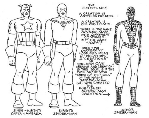
...Kay. When I first looked at this pic, it immediately flashed to me as a fake. The details like the hand, goggles and gun are simply not Kirby's. And with like 20 seconds worth of research, it was confirmed.

http://ohdannyboy.blogspot.com/2012/05/hoax-of-year-jack-kirbys-spiderman.html

You're right, that image is fake. However, the design is not. That is more or less Kirby's design. Only thing that can't really be confirmed is the color scheme, considering this is the only real image of his design that exists:

tumblr_lj57j5pbtg1qc63ooo1_500.jpg


Either way it's still an awful design.
 
In order to be somewhat it has to be even a little bit; the Raimi suit never even had a little bit of black on the webbing to register as somewhat.
 
Navy blue looks better than the one used for Amazing suit on film
And I wanted to see the one used in Webb's film in the Raimi ones :(
 
The poll was closed, but my vote would've gone to the Raimi version.
 
Well, I guess we know which design Webb thinks is better... :D
 
Hopefully the suit looks better than it does in the recent drawing.
 
Granted, Webb is likely only screwing with the fans, and from the waist down the suit could be another abomination. Which is why he's only showing the top. But his adapting the Raimi design (Not as some have argued, the comic design. The comic design never suggested raised webbing or the brick pattern texture) shows that he (Or Sony/Columbia) realized they went the wrong way in the first film.
 
I think "conceding" is also meaning overhauling the entire "realistic" approach Webb was going to go through as well with his films.
 
I think "conceding" is also meaning overhauling the entire "realistic" approach Webb was going to go through as well with his films.

That's reaching a bit for now. A very similar costume to Raimi doesn't necessarily mean he will also adapt Raimi's campy tone for his sequel, as there is nothing specific about the costume itself that makes it unable to be fit into a more gritty approach. We will have to wait for the trailer to see if he's gone full Raimi or not. It'd be funny if he did.
 
Reaching is assuming I am talking about Webb trying to adapt Raimi's campy tone, so I have no idea how you got that from my statement.

The "realistic" approach what I am referring to is the first suit was supposed to be a suit a teenager can make, if you believed that, but this new suit looks nothing like any way a teenager could make. It looks much more sophisticated as Raimi's suit. Which is the approach I am speaking of that's thrown out the window. Webb probably saw that any suit can be shown as a teenager making on film and it'll work.
 
Okay, you referred to the costume only, not the entire film. Fair enough.

By the way, I never thought the first suit looked any more thrown together by a teenager than the Raimi suit. So if they were going for realism from that angle they failed.
 
So there are some set pics that show the full costume and it basically is Raimi's. The only thing that remains of the first film is the spider with the elongated legs, which I still think sucks, but in the overall- hurray!

As to the difficulty in making either suit, if anything, Raimi's was easier. People on these boards have been making reasonable facsimiles since '02. But for a teen to work with that rubbery material of the Webb suit, creating accurate engraving patterns and so forth, that's totally unrealistic.
 
You're right, that image is fake. However, the design is not. That is more or less Kirby's design. Only thing that can't really be confirmed is the color scheme, considering this is the only real image of his design that exists:

tumblr_lj57j5pbtg1qc63ooo1_500.jpg


Either way it's still an awful design.

I know the design was essentially correct. The Captain America structure and web-firing gun. The funny thing is that the design reflects Simon and Kirby's "The Fly" that was published by Archie Comics. Of course, that's why Stan passed on it and handed the character to Ditko. I was only referring to the drawing itself.
 
Looks like Webb's crew just conceded superiority.

That's what I was gonna say. Or to put it another way, "If you can't beat 'em..."
I'm actually not happy about the redesign. Well, I am and I'm not. It looks SUBSTANTIALLY better than that eyesore from the first film, sure, but at the same time I feel like why couldn't they have gone with something like this last time instead of inflicting that hideous rubber mess on the public? And additionally, did they have to take SO MUCH from the Raimi design? If you have to copy it to THAT degree why even bother? It would be like Bale wearing a Keaton-esque suit in Rises. I think they could have done much better with Garfield's suit and not have to rip off TObey's. It's like they're saying they can either be good or they can be original but they can't do both.
 
Never thought I'd see the day that I'd agree with Chris Wallace...

But I agree.

The new suit isn't its own thing at all. No personality.

Raimi suit felt like its own thing.

The first TASM's did, regardless of how bad you felt it looked.

Then we've got the TASM 2 suit, which looks like it's trying to please the Raimi crowd, but is still trying to do its own thing. Barely.
 
Welcome to the club.

The TAS-M 2 suit is such a disappointment. I'd rather have something fresh and new as Webb's first suit(which I really liked) over a suit that reminds me of another Spidey series. It's bad enough that TAS-M as a film made me think of the '02 film, now I'll be seeing a suit that will remind me of Raimi's films again. It's as if Webb doesn't want to try to get out of that 'Sam Raimi shadow'.
 

Users who are viewing this thread

Latest posts

Forum statistics

Threads
200,547
Messages
21,758,046
Members
45,593
Latest member
Jeremija
Back
Top
monitoring_string = "afb8e5d7348ab9e99f73cba908f10802"