Favourite Animated Flash design?

Discussion in 'The Flash' started by ganon51, Jul 12, 2014.

?

Favourite Animated Flash design

  1. The Superman/Aquaman Hour of Adventure(1966)

  2. Superfriends/Galactic Guardians

  3. Superman TAS

  4. Justice League/Unlimited

  5. The Batman

  6. Justice League: New Frontier

  7. Batman: Brave & The Bold

  8. Young Justice/JL: Doom/JL: Crisis on Two Earths

  9. Justice League: Flashpoint Paradox

  10. Justice League War

Multiple votes are allowed.
Results are only viewable after voting.
  1. luis4u Registered

    Joined:
    Feb 13, 2014
    Messages:
    5,423
    Likes Received:
    0
    [​IMG]

    silver age


    [​IMG]


    [​IMG]


    dcau wally fan made
     
  2. Rorschach2012 Batman is my Dad

    Joined:
    Dec 29, 2006
    Messages:
    19,645
    Likes Received:
    2,505
    No. The black ring around the logo looks bad. The JL design is superior, but the red and yellow on the STAS suit are preferable
     
  3. ganon51 Stay Awesome my friends

    Joined:
    Jan 1, 2013
    Messages:
    475
    Likes Received:
    0
    I think the black ring looks better actually. It stands out more than the yellow one.
    [​IMG]
     
    #28 ganon51, Jul 31, 2014
    Last edited: Jul 31, 2014
  4. Rorschach2012 Batman is my Dad

    Joined:
    Dec 29, 2006
    Messages:
    19,645
    Likes Received:
    2,505
    If you have to constantly point that out, you're going to have a really ****** time on these boards
     
  5. Rorschach2012 Batman is my Dad

    Joined:
    Dec 29, 2006
    Messages:
    19,645
    Likes Received:
    2,505
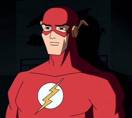
    The black ring is too think, it stands out too much and takes away from the design. Black is not one of Flash's colors. His colors are white, yellow and red. The thickness of the ring around the logo is distracting, it'd look far better if it was thinner, just an outline
     
  6. Rorschach2012 Batman is my Dad

    Joined:
    Dec 29, 2006
    Messages:
    19,645
    Likes Received:
    2,505
    actually now that i look at it again, that design is actually pretty awesome. it's probably the closest to perfection now that i look at it again. The black ring needs to be slightly thinner but the other aspects of the design are so great that it doesn't matter.

    I love the **** out of Justice League TAS but the colors on that show were very muted and boring. Superman and Flash's designs suffered especially from this.
     
  7. ganon51 Stay Awesome my friends

    Joined:
    Jan 1, 2013
    Messages:
    475
    Likes Received:
    0
    My mistake mate, lol. I erased that comment because I thought it came off as *****e-y but I didn't expect you to reply that fast.

    I also posted an image to that comment to show you how it makes the emblem pop out a lot more.
     
    #32 ganon51, Jul 31, 2014
    Last edited: Jul 31, 2014
  8. Rorschach2012 Batman is my Dad

    Joined:
    Dec 29, 2006
    Messages:
    19,645
    Likes Received:
    2,505
    It's all good dude!!

    yeah idk, i'd still make it a tad thinner, but that's really my only problem with the design.

    and that Flash episode of STAS was awesome :D loved the GL one too
     
  9. ganon51 Stay Awesome my friends

    Joined:
    Jan 1, 2013
    Messages:
    475
    Likes Received:
    0
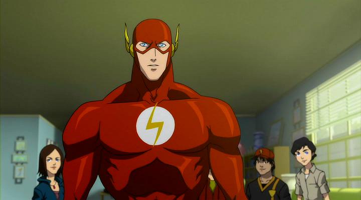
    Had Michael Rosenbaum voiced him in that episode and it would've been even better. Idk about the GL one though, Supes seemed too weak in that one constantly being overpowered by Sinestro and all.
     
  10. Rorschach2012 Batman is my Dad

    Joined:
    Dec 29, 2006
    Messages:
    19,645
    Likes Received:
    2,505
    The power levels are pretty inconsistent in the DCAU. Later, Batman takes Sinestro out with batarangs...
     
  11. luis4u Registered

    Joined:
    Feb 13, 2014
    Messages:
    5,423
    Likes Received:
    0
    I like how brave and the bold makes fun of the batgod [YT]B0aGGabInXM[/YT]
     
  12. Rorschach2012 Batman is my Dad

    Joined:
    Dec 29, 2006
    Messages:
    19,645
    Likes Received:
    2,505
    I love Brave and the Bold in general :up:

    i think most of the people that didn't like it just didn't get it
     
  13. luis4u Registered

    Joined:
    Feb 13, 2014
    Messages:
    5,423
    Likes Received:
    0
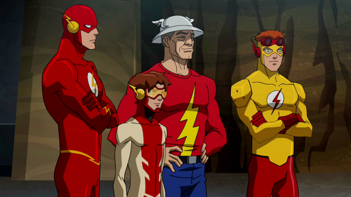
    Definitely my favourite Batman cartoon. It embraced everything that is fun about Batman and is an awesome love letter to the Silver Age. I also loved that it spotlighted a lot of lesser known characters like Guy Gardner and Jaime Reyes.
     
  14. ganon51 Stay Awesome my friends

    Joined:
    Jan 1, 2013
    Messages:
    475
    Likes Received:
    0
    Hmm…. I was gonna include the Justice Lords design, but it was basically Professor Zoom's costume
     
  15. Brian Braddock R.I.P. '96 Y.N.W.A.

    Joined:
    Jun 5, 2005
    Messages:
    15,646
    Likes Received:
    256
    The Young Justice one for me, definately.
     
  16. ganon51 Stay Awesome my friends

    Joined:
    Jan 1, 2013
    Messages:
    475
    Likes Received:
    0
    Wow the JL/U design is destroying the poll!
     
  17. luis4u Registered

    Joined:
    Feb 13, 2014
    Messages:
    5,423
    Likes Received:
    0
    nostalgia is very powerful..
     
  18. ganon51 Stay Awesome my friends

    Joined:
    Jan 1, 2013
    Messages:
    475
    Likes Received:
    0
    Yeah but in the "Favourite animated Superman design" thread it was the STAS design that had the most votes rather than the JL/U ones. I'm starting to think a lot of people don't remember that Flash was in STAS.
     
  19. Lantern Venom Emerald Echo Podcast Co-Host

    Joined:
    Oct 18, 2005
    Messages:
    11,256
    Likes Received:
    518
    I really hated the designs of the characters on that show. The angular torsos and the tiny legs were eyesores.
     
  20. ganon51 Stay Awesome my friends

    Joined:
    Jan 1, 2013
    Messages:
    475
    Likes Received:
    0
    Lol so which one did you pick?
     
  21. Lantern Venom Emerald Echo Podcast Co-Host

    Joined:
    Oct 18, 2005
    Messages:
    11,256
    Likes Received:
    518
    War, although I really liked the New52 look at the end of Flashpoint.
     
  22. gkokujin Registered

    Joined:
    Feb 27, 2006
    Messages:
    2,450
    Likes Received:
    0
    i NEVER noticed that those are no longer wings!!!

    holy crap, thats a damn good design!
     
  23. Human Torch Registered

    Joined:
    Aug 27, 2012
    Messages:
    10,850
    Likes Received:
    2
    I've always hated the white-eyed look for Flash.I think it's probably easier in animation,that's why they kept it so long.

    B&B for me.
     
  24. Young Superman The Last Son of Krypton

    Joined:
    Jul 17, 2009
    Messages:
    9,609
    Likes Received:
    4
    I also like the Flashpoint Flash design.
     
  25. ganon51 Stay Awesome my friends

    Joined:
    Jan 1, 2013
    Messages:
    475
    Likes Received:
    0
    Anyone like his recent Live-Action series costume?
    [​IMG]
     

Share This Page

  1. This site uses cookies to help personalise content, tailor your experience and to keep you logged in if you register.
    By continuing to use this site, you are consenting to our use of cookies.
    Dismiss Notice
  1. This site uses cookies to help personalise content, tailor your experience and to keep you logged in if you register.
    By continuing to use this site, you are consenting to our use of cookies.
    Dismiss Notice
monitoring_string = "afb8e5d7348ab9e99f73cba908f10802"