I said in some other thread that I thought it was on par with the last major update. Neither better or worse. But having spend some more time with it, yeah it sucks. It's
pretty bad. The main menu is okay, but once you go deeper into any of the categories, it becomes a real mess.
The game marketplace is particularly awful. The icons being pretty nonsensical certaintly doesn't help either. "New Releases" is a power button. "Most Popular" is presumably people with their hands raised at a concert. To find the game trailers section (which is vaguely called "videos") you have go through a silhouette of a man's head wearing headphones. Not only do they hide the different categories of games, but you have to go through a photo of some woman jumping (wtf?) to get to them.
Once you get
there, you see the four major categories of games: XBLA, Games on Demand, Indie Games, and Xbox Originals. The icon for XBLA is a pixelated 360 controller. I understand what they're trying to communicate with that, but it's
wildly inaccurate. XBLA hasn't been
that since, like, 2006. Next we have Games on Demand. I don't even know what the **** this thing is. It looks like some sort of engine with a blue laser coming out of it. Moving on to Indie Games, we have a brick wall with some kind of pulp science fiction equipment in front of it. Excellent. Finally, we have Xbox Originals which is signified by a large original Xbox logo. Okay, you know what? Give it up for Micrososft, guys. They managed to make
one icon that actually makes sense and clearly communicates what it represents. Great job.
My ciriticisms don't really matter though, because like I said in that other thread, as with the last update, I will continue to use my guide button menu in place of the main menu wherever I can.
It isn't without its improvements though. Cloud saves are welcome addition, and I really appreciate having Quickplay right there on the main menu.
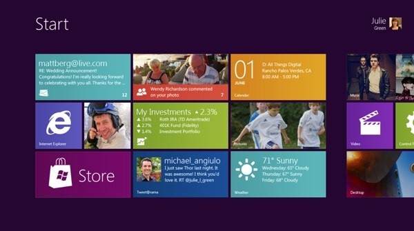
Unfortunately, the biggest thing this new UI accomplished is
completely putting me off Windows 8, as it shares the same design language. :/
Speaking of bad interfaces, I hate the new Google image search on tablets.


 Pressing the bumpers to go from menu to menu and having every option viewable is pretty good. The marketplace will take a little getting used to but overall it's a fine design.