Spider-Who's Fan Art

Spider-Who?

ERMERGERD!
Joined
Dec 5, 2001
Messages
11,346
Reaction score
14
Points
58
Hey guys!

Occasionally (like once a year or so), I try to make one of these threads with the intent of keeping it updated like Mattchew's wonderful thread. This is one of those times.

BUT WAIT!

THIS TIME, I'll be going through some works in progress! I really need to spend more time working on my own pieces (I make my living as an artist, so its hard to come home and draw after doing it at work all day), and I'm hoping that this thread and your guys' encouragement might help. :yay: Hopefully my WIPs might even give some people some pointers or even inspiration.

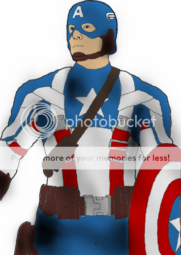
Here's some older fan art I've done in the past:

The Lizard
lizard3-2.jpg

What's in His Eye?!
lizard_spidey_3-1.jpg

Venom
9418785_orig.jpg

I'm also playing around with photo-manipulation. Here's something I did to one of the Mortal Kombat models. I wasn't pleased with how they addressed the costumes, so I removed the booty shorts, added the mask, and made the models proportions a little closer to the video game:

 
Last edited:
I'm currently working on some Mass Effect 2 fan art. I know, its not exactly current, but I've been seeing a lot of fan art being featured on Mass Effect's facebook page recently, so I figured I'd take a stab at it.

I've decided to draw Miranda. I'm a fan of the female form (duh), not just as a guy, but as an artist as well. Chicks are just fun to draw! Here's a VERY rough sketch. I'm just trying to get the pose right. Sometimes I'll look at actual pictures, other times I'll use Daz Studio 3D to make a pose as reference (this helps with lighting and shadow, too). But this time, I just wing it.

I'm looking for a typical "I'm in the middle of kicking some alien ass, but I need to stop and look sexy" pose. After a few thumbnails, I think this one will do. I'm not gonna be concerned with the background right now - its not the focal point, but I'll keep it in the back of my mind as I go on to color later (I'm thinking ship interior with some dead geth lying around).

Miranda_1.jpg
 
Last edited:
Now that I've got the pose, I do another rough sketch over that, trying to block in the shapes. It's all about getting tighter and tighter. Start as rough as possible and gradually clean it up. As an artist, I think it's important to never start an image as if you're trying to finish it as fast as possible. That's how you make mistakes. As you can see, I've noticed that the arms are too long, and the angle isn't dramatic enough.

Miranda_2.jpg
 
Last edited:
Now that I've blocked in the shapes, I feel comfortable enough to start the actual inking process. This is all done in photoshop, so I use plenty of layers. I always create a layer for the outline of the body. Then one for the head. Then one for hair, and several for clothing details/accessories. This makes it MUCH easier to go back and change stuff.

Miranda_3.jpg
 
Here's some more inking. As you can see, I've changed the face dramatically. I noticed that the face in the blocking phase wasn't too good, nor did it resemble Miranda AT ALL. This one looks better, still not quite Miranda-y, but I'll likely adjust that more later on. Miranda's face is wider, so it might just be a matter of playing with the transform tool or the liquify filter (a WONDERFUL tool). I'm also iffy on the hair. Luckily its on it's own layer, so I can erase that at will and try again if I choose to.

Miranda_4.jpg
 
I'm getting a little tired of working on the outlines, so I decide to play around with the color. Sometimes it's good to jump back and forth in the work flow. I'm not sure how exactly I'm going to color the image - should I go with a painterly feel, or something more clean with gradients and sharp color boarders like in a comic book? What do you guys think?

Miranda_5.jpg
 
Last edited:
Here's another update. Finished inking. I also changed the hair, and played with the face some. I like the original face better (mostly personal tastes) but she looked too much like a super model with the long thin face, so I widened her skull and flattened the jaw some. Now she looks a lot more like Miranda.

The next phase was going to be coloring her, but I think I'm going to tackle the background. I normally save that for last, but by that time, I'm bored with the image and never spend as much time as it on I should. So, the next update (if any body is looking) should have at least a sketch of the background.

Miranda_6.jpg
 
What Brush settings do you use in photoshop?
I have elements and my lines NEVER look that smooth.
Example here:
CapColor-1.png


See how shaky my lines are? :/
 
I use a normal, round brush with 100% hardness. I have the pressure sensitivity turned on, so the line is thin or thick depending on how hard I press my wacom pen. The “35” in the image is the size of brush I’m using. Just a little reminder for myself if I change it for smaller detail and need to go back. (note: 35 is pretty big…it only looks small cuz I’m doing this image at a large size and 300 dpi, so I can print it out in a large poster size later on).

As far as the smoothness of the lines, that’s all in your hand/arm. Each curve is an individual line. I tend to zoom in some, so I can use my whole arm/shoulder to “swish” the pen across my tablet. I keep my left hand over the “Ctrl Z” so I can repeatedly undo until the line comes out how I want. Then, if the line overlaps any others, I just erase what I don’t want.

It looks like you’re using either lots of short brush strokes or one long, slow one and using just your wrist. That’s something that I had to fight myself not to do (nots not to say it’s a bad thing depending on the style you’re going for, though). You got your whole arm to work with. Large, quick, bold movement gives you good line work. :)
 
Looking at my last upload, I've decided I hate the face. I should have spent more time thinking about that in the sketching phase. It's just a boring look. I've got an idea for a more dramatic look for the face/head area. I'll try and tackle that tonight after work.
 
I use a normal, round brush with 100% hardness. I have the pressure sensitivity turned on, so the line is thin or thick depending on how hard I press my wacom pen. The “35” in the image is the size of brush I’m using. Just a little reminder for myself if I change it for smaller detail and need to go back. (note: 35 is pretty big…it only looks small cuz I’m doing this image at a large size and 300 dpi, so I can print it out in a large poster size later on).

As far as the smoothness of the lines, that’s all in your hand/arm. Each curve is an individual line. I tend to zoom in some, so I can use my whole arm/shoulder to “swish” the pen across my tablet. I keep my left hand over the “Ctrl Z” so I can repeatedly undo until the line comes out how I want. Then, if the line overlaps any others, I just erase what I don’t want.

It looks like you’re using either lots of short brush strokes or one long, slow one and using just your wrist. That’s something that I had to fight myself not to do (nots not to say it’s a bad thing depending on the style you’re going for, though). You got your whole arm to work with. Large, quick, bold movement gives you good line work. :)

Thanks! Helps a lot! I had hardness set to 82, so that might be part of the problem. ( aside from my actual drawing ability, which is the largest problem.:oldrazz: )
 
Nah, it's not your hardness (whoa, that sounds weird). That just changes how soft the edges of the brush are (ie:blurry or non blurry). I'd just practice working on HOW you make your lines.

Are you using a mouse, or do you have a drawing tablet?
 
Nah, it's not your hardness (whoa, that sounds weird). That just changes how soft the edges of the brush are (ie:blurry or non blurry). I'd just practice working on HOW you make your lines.

Are you using a mouse, or do you have a drawing tablet?
I was thinking it sounded weird too.xD
Tablet. I was working on it earlier and my lines still look awful dangit. I'm using Elements 4 I think.
 
I havent used Elements 4, so I can't really speak much on it. But "practice practice practice" is the mantra for everything. Try just doing random curves and angles. Get the feel for how your pen moves with your arm. Even when you've done if for 20 years, you're not gonna get a perfect line the first time. It's totally normal to go at the same line several times. Over time, you'll be quick about it:

Draw line.
Ctrl Z
Draw line.
Ctrl Z
Draw line
Hey! That one looks good!

The key is doing this process fast. Eventually it'll become second nature. And don't over analyze. If you're zoomed in 200%, NO line is gonna look good. Be mindful of the "true view". You'll notice that things NEVER look perfect zoomed in.
 
Last edited:
Ok, last update on inking Miranda. Next post will be background, I promise :)

I think I've finally got her face to where I like it. What do you guys think?

miranda7-1.jpg
 
Alrighty....I finished inking and started coloring. Just flat colors for now. I'll build up textures and lighting/shadows as I go.

I'm not going to be too concerned with inking details of the background, since I want to keep the focus on Miranda, but I'll color enough of them in so people understand the location.

miranda8.jpg
 
thanks dude.

Here's one more update. This'll probably be it as far as updates go for a little while. I gotta take a few days and work on some tunes for my band (I'm so bad a scheduling my free time!).

miranda9.jpg
 

Users who are viewing this thread

Back
Top
monitoring_string = "afb8e5d7348ab9e99f73cba908f10802"