DaRkVeNgeanCe
An Epic Film Guy
- Joined
- Dec 13, 2004
- Messages
- 13,809
- Reaction score
- 97
- Points
- 33
It honestly reminds me alot of the Avengers Cap suit, for obvious reasons.
Hope you're right...

Why would he have fingernails on his gloves?

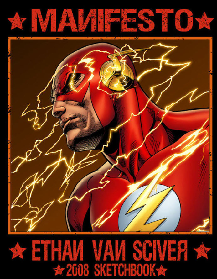
I'm liking the red background on the logo less now that I'm seeing it in action.
It's comparative contrast makes the rest of the suit look too dark.

I think it's absolutely perfect. The logo change makes total sense to me. Doesn't make much sense to have the logo be white if the entire suit is red. Might as well make that red too. Especially in night scenes, a white chest logo may look hokey and may even be a distraction. If anything, I'm surprised they used a circle at all. I was going to bet money that they had just the lightning bolt on the chest.

Yeah it looks better with white

OMG that just improved the suit tenfold. Such a simple change but it makes such a difference.
After seeing those set pics my opinion went from loving it to being slightly underwhelmed by it, now I know why they shot the unveil picture in the angle they did to hide most of what the suit looks like.
Not feeling what I'm seeing in those pictures...
leather pants? really? for the flash?
Kind of a minor and petty thing to complain about.
But it sort of looks like the Flash skipped leg day at the gym.
 .
.