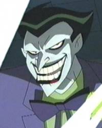
which Joker from TAS do u think is the best?

Discussion in 'The Batcave' started by ganstaman56, Apr 23, 2006.

  1. ganstaman56 Registered

    Joined:
    Apr 9, 2006
    Messages:
    191
    Likes Received:
    0
    k here are the 3 different versions of Joker from the Animated Series. which one of em do u think looks the best and has the best Joker personality u know like not too goofy or is just evil enough? i personally like the one from the Flashback on Return of The Joker best.[​IMG][​IMG][​IMG]
     
  2. trustyside-kick The Marine Marvel

    Joined:
    Dec 6, 2005
    Messages:
    16,127
    Likes Received:
    1
    I like the design for the one drawn in the flashback part of Return of the Joker but I like the colors for the Joker from the old TAS.
     
  3. Mr. Socko Registered

    Joined:
    Mar 27, 2005
    Messages:
    23,325
    Likes Received:
    0
    My favorite were the Mask of The Phantasm Joker and ROTJ Joker.

    I didn't like the look of the New Adventures Joker because he had black lips and beady eyes.

    I always hated that the Joker had no collar, and his tie was floating on his shirt lol
     
  4. ganstaman56 Registered

    Joined:
    Apr 9, 2006
    Messages:
    191
    Likes Received:
    0
    but his personality is more sinister and evil instead of it being just goofy like the old joker on TAS. it wouldnt be as sinister if he did that to robin with his old look. but the old look would be awsome (because he looks like a clown) were it not for the crappy old school animation of WB cartoons. and he was more like the joker in the flashback instead of just a goofy potentially harmless guy who just wants to spread chaos.
     
  5. El Payaso Registered

    Joined:
    Jun 10, 2005
    Messages:
    15,262
    Likes Received:
    3
    Ok, I never got this Joker:[​IMG]

    No red lips, black eyes, no orange. For me is just as bad as the "The Batman" one. Terrible. Any other is better but I was never too fond of BTAS designs (I liked the series just for the stories and tone).
     
  6. Mr. Socko Registered

    Joined:
    Mar 27, 2005
    Messages:
    23,325
    Likes Received:
    0
    I agree. That Joker was more evil and sinister but TAS Joker looked better because he had red lips
     
  7. trustyside-kick The Marine Marvel

    Joined:
    Dec 6, 2005
    Messages:
    16,127
    Likes Received:
    1
    Woah woah woah...no way in hell is that at all as bad as "The Batman" Joker.
     
  8. Mr. Socko Registered

    Joined:
    Mar 27, 2005
    Messages:
    23,325
    Likes Received:
    0
    I concur. That Joker looks dried up with crusty black lips and rat eyes. But atleast he's wearing a purple suit. Don't get me started on The Batman. He was evil and sinister but looked bad in the flashbacks. TAS Joker was too corny and kiddy. MOTP Joker was perfect for a normal day Joker, atleast he killed. At first I didn't like the look of the ROTJ Joker but now I like it. He's got the jumpsuit, slick back hair, dark red lips, and all. Thats why those 2 are my favorites.

    Oh, I like alot of the TAS designs. I think Batman from TBNA looked better because of the suit, Two Face looked great IMO, and Gordon nearly was perfect.

    There were some I didn't like too.
     
  9. trustyside-kick The Marine Marvel

    Joined:
    Dec 6, 2005
    Messages:
    16,127
    Likes Received:
    1
    I think Gordon in TBNA looked too skinny. Better then him looking buff in the older TAS but he looked almost too skinny...or at least the neck and face was drawn that way.
     
  10. Mr. Socko Registered

    Joined:
    Mar 27, 2005
    Messages:
    23,325
    Likes Received:
    0
    Lol, I liked Gordon in TNBA. He got one of those tummy tucks like Star Jones. Thats why his head looks bigger then his body.

    [​IMG]
     
  11. Silver Sable Wild Pack Commander

    Joined:
    Nov 14, 2004
    Messages:
    27,090
    Likes Received:
    0
  12. trustyside-kick The Marine Marvel

    Joined:
    Dec 6, 2005
    Messages:
    16,127
    Likes Received:
    1
    Yea..it was the neck. I remember in the episodes when he moved his head they like did the neck wrinkles I guess you could call em a bit much.
     
  13. ganstaman56 Registered

    Joined:
    Apr 9, 2006
    Messages:
    191
    Likes Received:
    0
    that was the new design for joker in BTAS season 2 the Mask Of The Phantasm set the stage for season 2 because there was a deleted scene where it shows that joker survived. i do agree though that this joker was terrible.
     
  14. TheGrayGhost Registered

    Joined:
    Jul 15, 2005
    Messages:
    1,683
    Likes Received:
    0
    They are all great, but the ROTJ/JL/JLU Joker design is unquestionably the best.
     
  15. trustyside-kick The Marine Marvel

    Joined:
    Dec 6, 2005
    Messages:
    16,127
    Likes Received:
    1
    ^Ya, that is what I said. But what if they did the colors for the TAS Joker and put it on the ROTJ one? :up:
     
  16. TheGrayGhost Registered

    Joined:
    Jul 15, 2005
    Messages:
    1,683
    Likes Received:
    0
    Technically, so does The Joker design in ROTJ and JL/JLU.

    Also, I agree that the ROTJ was more sinister than what we've been seeing regularly in the actual episodes of the DCAU, but I say that he was still threatening, only a little more manic.
     
  17. TheGrayGhost Registered

    Joined:
    Jul 15, 2005
    Messages:
    1,683
    Likes Received:
    0
    All the colors are essentially the same except for the orange under-shirt. And that's a good thing by my book.
     
  18. trustyside-kick The Marine Marvel

    Joined:
    Dec 6, 2005
    Messages:
    16,127
    Likes Received:
    1
    Well also the ROTJ Joker's lips are more of a dark red...iono..lol.
     
  19. Mr. Socko Registered

    Joined:
    Mar 27, 2005
    Messages:
    23,325
    Likes Received:
    0
    ROTJ Joker had red lips.

    Want a pic?
     
  20. trustyside-kick The Marine Marvel

    Joined:
    Dec 6, 2005
    Messages:
    16,127
    Likes Received:
    1
    Yea they were red lips just the shading made it look black since the small part that was noticeable was red.
     
  21. Mee 2 E's are better than 1

    Joined:
    Dec 31, 2005
    Messages:
    18,896
    Likes Received:
    3
    JLU one looks the best, they all have the same personality being voiced by the same guy.
     
  22. trustyside-kick The Marine Marvel

    Joined:
    Dec 6, 2005
    Messages:
    16,127
    Likes Received:
    1
    The design is JLU is the same as the one in ROTJ I believe which was done first.
     
  23. Joined:
    Mar 30, 2006
    Messages:
    14,720
    Likes Received:
    8
    The JLU/ROTJ flashback Joker is my favorite, but when I think about the Joker from Gotham Knights, I'm reminded of the Batman/Superman crossover special and Joker was awesome there.
     

Share This Page

  1. This site uses cookies to help personalise content, tailor your experience and to keep you logged in if you register.
    By continuing to use this site, you are consenting to our use of cookies.
    Dismiss Notice
  1. This site uses cookies to help personalise content, tailor your experience and to keep you logged in if you register.
    By continuing to use this site, you are consenting to our use of cookies.
    Dismiss Notice
monitoring_string = "afb8e5d7348ab9e99f73cba908f10802"