::x:: VOTE! XMC 6: TAS ::x::

Neto Magnus

Superhero
Joined
Sep 11, 2003
Messages
5,123
Reaction score
0
Points
31
I know this was a very hard theme but you guys did a great job. Congratulations to everyone!

The voting will last for 3 days and end on Wed. at 5PM.
 
Darkxorn:
leejeanfercompfy8.gif


storm-x-fan:
818499e8e4.jpg


La_She-Beast:
477066192_b7cb5c7cf0_o.jpg


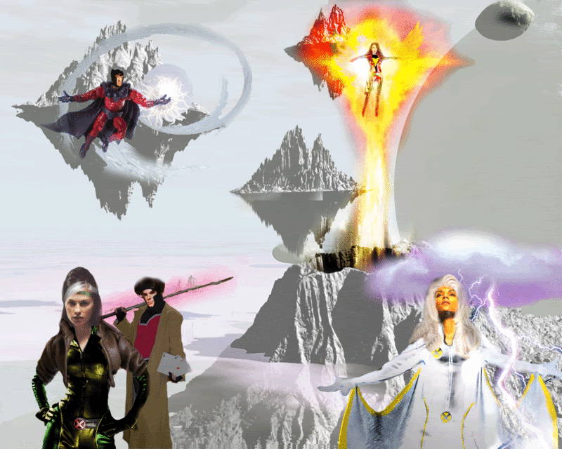
neotheone:
project2dt2.jpg


flavio_lebeau:
tastp3.jpg


Le Diable Blanc:
bloodlinesoe6.jpg


fluffysellscars:
549tbaw.jpg
 
_BB_:
final3dbe0.jpg


britrogue:
astral-plane-tas.gif


Neto Magnus:
tascyclopsvg1.jpg


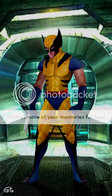
spidey-dude:
wolvieanimated.jpg


Angamb:
archangel1abu6.jpg


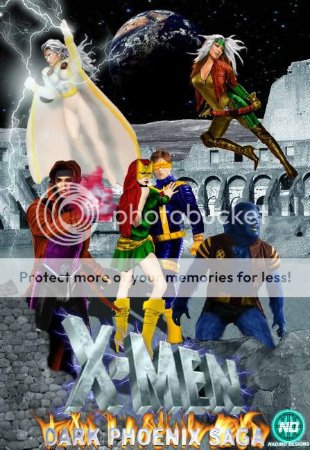
Nadino:
animatedxmenvsshiar03finala.jpg
 
hard to vote, but i gotta vote for Neto, dude, what a great entry, if you are making more characters, i cant wait to see them.
 
Don't know if it's my internet, but I think you forgot britrogue :hyper:

My vote goes to _BB_, for actually having the guts to risk a completely new technique.

SOS (ShoutOutS)

Le Diable Blanc: How the clothes easily adapt to the bodies (though Mystique's hair looks a bit wig-ish :p ) and the whole concept. However... there's something bugging me... I don't know what, heh.
fluffysellscars: Just got to love the bumper-car idea lol.
Neto Magnus : Duh.
 
i'd say my top 3 would be
nadino, neto and flavio

some constructive criticism

Nadino - great job on the pic. love the concept, your use of color reflects the cartoon very well. and i like the fact that you used several characters to make a whole scene - your idea as a whole is good. i can see where you were going. i could see how you could probably enhance it - making your background and forground rocks more similar might have done some good, also some of the characters look a little rushed. a bit blurry (maybe on purpose for a symbol of motion) and it did look a bit out of scale in the over all scene.

neto - you've got some skill - would have liked to seen the background a little more worked so it fit with the character a bit more. the facial features of cyclops a little crisper to match the outfit as well

flavio - great concept as well - love the use of multiple characters - i would have liked the outfits to be a bit more clean or uniform in presentation - some look very cartoonish others look straight cut out. i like the background and placement of characters - it doesnt look cluttered at all. so great job.


and to all the others you guys did awesome as well!!
 
Damn, for me it's a tie between Flavio and Neto, but I'll vote for Neto. It looks really realistic but I agree the background needs some working on.

Le Diable Blanc: How the clothes easily adapt to the bodies (though Mystique's hair looks a bit wig-ish :p ) and the whole concept. However... there's something bugging me... I don't know what, heh.

Hehe, thanks for the advice/criticism :oldrazz:
 
I'll have to give it to Neto. Cyclops looks awesome and blends in well with the background :up:

Honorable mentions: Le Diable Blanc and flavio :)
 
For me it was either Flavio or BB. In the end I voted Flavio cuz I'm a sucker for group pics.
 
Neto, you really need to work on the other characters as well!
 
Where is the Rogue manip, flying in Muir Island?
 
This was a difficult vote. There were five manips that I couldn't pick between. I did an "ini-mini-miny-mo" (or whatever) and Neto ended up being chosen. :p All of the entries are great though - you guys really worked hard on this one. :)

Honorable mention goes to 'Nadino' who really deserves more votes :up:
 
i vote flavio for a few reasons, cyclops looks great, rogue looks great and wolvie is at the back where he belongs
 
Agent Muños;11666819 said:
My vote goes to BB for being bold and trying something new.

Don't know if it's my internet, but I think you forgot britrogue :hyper:

My vote goes to _BB_, for actually having the guts to risk a completely new technique.

SOS (ShoutOutS)

Le Diable Blanc: How the clothes easily adapt to the bodies (though Mystique's hair looks a bit wig-ish :p ) and the whole concept. However... there's something bugging me... I don't know what, heh.
fluffysellscars: Just got to love the bumper-car idea lol.
Neto Magnus : Duh.


wahey, thanks ^_^

That manip took forever

my vote went to spidey-dude, great job man :)
 
This was a difficult vote. There were five manips that I couldn't pick between. I did an "ini-mini-miny-mo" (or whatever) and Neto ended up being chosen. :p All of the entries are great though - you guys really worked hard on this one. :)

Honorable mention goes to 'Nadino' who really deserves more votes :up:

^^Thank you, that was much needed for my dropping esteem levels lol!^^

This was a toughie - I am a sucker for COLOR, wish I had seen more in the actual films :(. But anyways, great job to everyone that entered. This theme came out looking great. It's a neat thing to see us all come up with something new and unique.

But my vote went to.....Le Diable Blanc
I really like the black shadow figure in the back all concealed - I'm so blind I just noticed it now lol. Great job! :cwink:
Neto did an awesome job, but he has enough votes ya?? lol j/k :woot:
 
Who did that Rogue manip flying upon Muir Island? I asked before but none has answered...

I think it was awesome and should have been an entry here. (and my vote too, hehe)
 

Users who are viewing this thread

Latest posts

Forum statistics

Threads
201,162
Messages
21,908,175
Members
45,703
Latest member
BMD
Back
Top
monitoring_string = "afb8e5d7348ab9e99f73cba908f10802"