
You are using an out of date browser. It may not display this or other websites correctly.
You should upgrade or use an alternative browser.
You should upgrade or use an alternative browser.
RW's Artwork Cornucopia
- Thread starter Redwoods Wolf
- Start date
IRON_Lad
Sidekick
- Joined
- Mar 14, 2006
- Messages
- 1,111
- Reaction score
- 0
- Points
- 31

The Shadow
Civilian
- Joined
- Jun 17, 2008
- Messages
- 619
- Reaction score
- 0
- Points
- 11
These are sweet
The Navigator
Avenger
- Joined
- Jul 22, 2004
- Messages
- 15,735
- Reaction score
- 1
- Points
- 31
Okay, time to break out some hand-drawn stuff. Some of these are old, some are strange, some I really like. All work is in mechanical pencil unless indicated otherwise. Let's start with the old stuff:

Easily my least favorite. The horizontal alignment throws off any intended composition and scatters things everywhere. Indy's face and hat are okay. Done in 11/03.

Better, but still a bit cluttered. The faces are hit or miss, with only Hicks, Newt, and Gorman really resembling the actors. Hudson and Vasquez are too poorly defined to matter, and the drop-ship, atmosphere processor, and derelict should have been removed. Still, fairly tight grouping that needs a little more empty black space. I think I'll rework this in some form. Done in 6/03.

I don't know what this is, but I like it. Done sometime in 05.

#$%#ing scanner...anyway, really like this. It's nice and simple, something I try to incorporate into all my work. The "fruit" is supposed to be a black orb, not comparable to an apple or anything. Not crazy about Eve's arm. Done in 6/06.

Slight Batman re-design, trying to steer more towards Mazuchelli and away from Jim Lee. I prefer Batman to be more athletic than muscular. The only thing I dislike is the cape attached to the symbol. Takes away some emphasis and leaves that ugly space between symbol and cowl.
Easily my least favorite. The horizontal alignment throws off any intended composition and scatters things everywhere. Indy's face and hat are okay. Done in 11/03.
Better, but still a bit cluttered. The faces are hit or miss, with only Hicks, Newt, and Gorman really resembling the actors. Hudson and Vasquez are too poorly defined to matter, and the drop-ship, atmosphere processor, and derelict should have been removed. Still, fairly tight grouping that needs a little more empty black space. I think I'll rework this in some form. Done in 6/03.
I don't know what this is, but I like it. Done sometime in 05.
#$%#ing scanner...anyway, really like this. It's nice and simple, something I try to incorporate into all my work. The "fruit" is supposed to be a black orb, not comparable to an apple or anything. Not crazy about Eve's arm. Done in 6/06.
Slight Batman re-design, trying to steer more towards Mazuchelli and away from Jim Lee. I prefer Batman to be more athletic than muscular. The only thing I dislike is the cape attached to the symbol. Takes away some emphasis and leaves that ugly space between symbol and cowl.
The Navigator
Avenger
- Joined
- Jul 22, 2004
- Messages
- 15,735
- Reaction score
- 1
- Points
- 31
Misc. Sketches and Drawings

Aborted colored pencil poster for Long Halloween. Batman was placed wrong, and the buildings look like Teenage Mutant Ninja Turtles backgrounds. But not a bad first attempt. Done sometime in 03-04.

Rough layout (and bad scan) for Red Son poster, based on Mark Millar's story. Really enjoyed putting this together, but haven't gotten around to re-doing it with colored pencils. Probably not yet confident enough. Done 7/08.

Abandoned charcoal pic of Batman and Joker. Too many things wrong with this to continue (chair/legs, Joker's height/hair), but really like the "feel" charcoal gives this. back of Batman looks really nice.
Expirimenting with style

She-Hulk, done 8/08.

Ripley and Newt, done 8/08.
Aborted colored pencil poster for Long Halloween. Batman was placed wrong, and the buildings look like Teenage Mutant Ninja Turtles backgrounds. But not a bad first attempt. Done sometime in 03-04.
Rough layout (and bad scan) for Red Son poster, based on Mark Millar's story. Really enjoyed putting this together, but haven't gotten around to re-doing it with colored pencils. Probably not yet confident enough. Done 7/08.
Abandoned charcoal pic of Batman and Joker. Too many things wrong with this to continue (chair/legs, Joker's height/hair), but really like the "feel" charcoal gives this. back of Batman looks really nice.
Expirimenting with style
She-Hulk, done 8/08.
Ripley and Newt, done 8/08.
Last edited:
The Navigator
Avenger
- Joined
- Jul 22, 2004
- Messages
- 15,735
- Reaction score
- 1
- Points
- 31
Re-Designs/Color work

Rough draft of Hal Jordan GL movie costume. I tried to take some cues from conventional police uniform, hence the stripes, which would denote a rookie status. I think this really worked well, especially with rounding out the symbol. Done 8/08.

Rough draft of Carol Ferris for GL movie. Looking at the comic costume, I thought it was nice and everything, especially that flared collar, but nothing about it said "queen of the zamarons." I re-tuned it to be sort of a Joan of Arc plate armor look, maintaining the flared collar, but turning the mask into more of a crest or diadem, whiting out her eyes, since she's possesed, and giving her a detachable cape. Also, there are gems on the gloves and boots, which is inaccurate but I think more dangerous, since her weapon is not as powerful as a GL ring. Done in 8/08.

Decided to try more professional-looking colored pencil work, borrowing techniques from the Hildebrandts with their two-source lighting scheme. Some parts are nice (her shoulder, the waist-band thing), but overall it's too flawed to be anything more than a stepping stone. Done in 7/08.

Much better. The re-design probably helped, as did adding some sort of background. Costume tweaks include her diadem, which was now expanded to go over the bridge of her nose, arm bands, metallic greaves for the boots, a centurion skirt with what should probably be gold stars, bracelets that are laced instead of a continuous metal--or how would she put them on in the first place?--and a very subtle sheen to the red part of the costume. I didn't want it to be of the same metal as her "W" or bracelets--probably some not-quite chainmail, more advanced and form-fitting. Done in 8/08.
Rough draft of Hal Jordan GL movie costume. I tried to take some cues from conventional police uniform, hence the stripes, which would denote a rookie status. I think this really worked well, especially with rounding out the symbol. Done 8/08.
Rough draft of Carol Ferris for GL movie. Looking at the comic costume, I thought it was nice and everything, especially that flared collar, but nothing about it said "queen of the zamarons." I re-tuned it to be sort of a Joan of Arc plate armor look, maintaining the flared collar, but turning the mask into more of a crest or diadem, whiting out her eyes, since she's possesed, and giving her a detachable cape. Also, there are gems on the gloves and boots, which is inaccurate but I think more dangerous, since her weapon is not as powerful as a GL ring. Done in 8/08.
Decided to try more professional-looking colored pencil work, borrowing techniques from the Hildebrandts with their two-source lighting scheme. Some parts are nice (her shoulder, the waist-band thing), but overall it's too flawed to be anything more than a stepping stone. Done in 7/08.
Much better. The re-design probably helped, as did adding some sort of background. Costume tweaks include her diadem, which was now expanded to go over the bridge of her nose, arm bands, metallic greaves for the boots, a centurion skirt with what should probably be gold stars, bracelets that are laced instead of a continuous metal--or how would she put them on in the first place?--and a very subtle sheen to the red part of the costume. I didn't want it to be of the same metal as her "W" or bracelets--probably some not-quite chainmail, more advanced and form-fitting. Done in 8/08.
The Navigator
Avenger
- Joined
- Jul 22, 2004
- Messages
- 15,735
- Reaction score
- 1
- Points
- 31
All right, since there's no love for the colored/pencil stuff, here's some more paint work:

DreamtheSandman
Civilian
- Joined
- Sep 2, 2008
- Messages
- 27
- Reaction score
- 0
- Points
- 1
Your stuff just kills me. Awesome work.
The Navigator
Avenger
- Joined
- Jul 22, 2004
- Messages
- 15,735
- Reaction score
- 1
- Points
- 31
Thanks. ")
Syncos
ROFLICIOUS
- Joined
- Apr 5, 2006
- Messages
- 3,855
- Reaction score
- 1
- Points
- 58
Much better. The re-design probably helped, as did adding some sort of background. Costume tweaks include her diadem, which was now expanded to go over the bridge of her nose, arm bands, metallic greaves for the boots, a centurion skirt with what should probably be gold stars, bracelets that are laced instead of a continuous metal--or how would she put them on in the first place?--and a very subtle sheen to the red part of the costume. I didn't want it to be of the same metal as her "W" or bracelets--probably some not-quite chainmail, more advanced and form-fitting. Done in 8/08.
Oh boy, I'd missed this. This is lovely.
As for the redesign itself, The silver stars are fine, they resemble the white and blue thong she normally wears. and it would tie in well with the silver bracelets and silver (assuming) plates on her greaves. As for her chestpiece, instead of some chainmail hybrid, it should probably just be red leather. She's basically in greco-roman armor, so a leather chestpiece is pretty standard.
Fantastic colored pencil work, btw.
The Navigator
Avenger
- Joined
- Jul 22, 2004
- Messages
- 15,735
- Reaction score
- 1
- Points
- 31
^Thanks. It wouldn't exactly be chainmail, but something metal that isn't rigid, like plate armor would be. Maybe I'm getting too distanced from the source. Anyway, here's more paint stuff.

darkseid26
Sidekick
- Joined
- Mar 13, 2007
- Messages
- 4,606
- Reaction score
- 0
- Points
- 31
your stuff is great man
Lady Stormcrow
Sidekick
- Joined
- Apr 12, 2005
- Messages
- 2,242
- Reaction score
- 0
- Points
- 31
These pieces are excellent! Plus, that mysterio design is great, though I havent read the spidey comics for a while, so is that your own design or marvel's?
The Navigator
Avenger
- Joined
- Jul 22, 2004
- Messages
- 15,735
- Reaction score
- 1
- Points
- 31
These pieces are excellent! Plus, that mysterio design is great, though I havent read the spidey comics for a while, so is that your own design or marvel's?
It's mine--I never cared for the "plaid" look he has in the comics. Thanks for the comments, guys.

- Joined
- Apr 29, 2004
- Messages
- 75,028
- Reaction score
- 9,492
- Points
- 218
your paint stuff is crazy good
The Navigator
Avenger
- Joined
- Jul 22, 2004
- Messages
- 15,735
- Reaction score
- 1
- Points
- 31
^Thanks, CC.
Okay, my re-designed Justice League (incomplete):

For Superman, I didn't really want to change his costume--it's a classic design that's been a blueprint for every other superhero design ever. So, the only thing I really did was change the color scheme--slightly. I tried to retool his appearance so he looks a little out of our time and place--someone almost out of a 1940s color scheme. Also, he's the only one on the team who has a cape, which helps.

The perfect, self-contained warrior. I wanted him to have an all-black costume, since after all, it helps him blend into the shadows, and since everyone else has colorful costumes, it gives him more of a visual signature. Any bullet-proof level protection would be in a mesh weaver, rather than plate armor pieces(except maybe for those shoulder pads--and the mask is a separate helmet-type thing). Also, added some more pouches without going all Liefeld about it to give him more room for...you know, batarangs and grappling guns and whatever. And ditched the cape, since it would just get in the way in a fight. However, he does have expandable "wings" for gliding and looking scary when he drops down on unsuspecting thugs. They're in a thing on his back--remember TDK? Same storage system. The alternate helmet on the right would be for stealth/underwater uses (that's a rebreather attached to the cowl), with lenses for night-vision, and infared, and looking scary. What (I hope) the costume says is: If any mere mortal could join the Justice League, this guy could.

I did the version on the left with athletic gear in mind, but...I don't know. I always liked the Flash's original look, so I prefer the right version, which tones down the arm/leg/waist lightning bolts to lead the eye to the chest symbol.

A cleaned-up and presentable version of the GL design I posted earlier, with both Hal and Jon versions, along with a pre-evil Sinestro. One of my personal favorite designs.

WW re-design, also the one I posted earlier, but with shoulder straps so her wonder-bra stays in place in battle. And then there's the third-act Amazonian battle gear/WB needs to sell another action figure costume design.") But I think it works.
But I think it works.
Okay, my re-designed Justice League (incomplete):
For Superman, I didn't really want to change his costume--it's a classic design that's been a blueprint for every other superhero design ever. So, the only thing I really did was change the color scheme--slightly. I tried to retool his appearance so he looks a little out of our time and place--someone almost out of a 1940s color scheme. Also, he's the only one on the team who has a cape, which helps.
The perfect, self-contained warrior. I wanted him to have an all-black costume, since after all, it helps him blend into the shadows, and since everyone else has colorful costumes, it gives him more of a visual signature. Any bullet-proof level protection would be in a mesh weaver, rather than plate armor pieces(except maybe for those shoulder pads--and the mask is a separate helmet-type thing). Also, added some more pouches without going all Liefeld about it to give him more room for...you know, batarangs and grappling guns and whatever. And ditched the cape, since it would just get in the way in a fight. However, he does have expandable "wings" for gliding and looking scary when he drops down on unsuspecting thugs. They're in a thing on his back--remember TDK? Same storage system. The alternate helmet on the right would be for stealth/underwater uses (that's a rebreather attached to the cowl), with lenses for night-vision, and infared, and looking scary. What (I hope) the costume says is: If any mere mortal could join the Justice League, this guy could.
I did the version on the left with athletic gear in mind, but...I don't know. I always liked the Flash's original look, so I prefer the right version, which tones down the arm/leg/waist lightning bolts to lead the eye to the chest symbol.
A cleaned-up and presentable version of the GL design I posted earlier, with both Hal and Jon versions, along with a pre-evil Sinestro. One of my personal favorite designs.
WW re-design, also the one I posted earlier, but with shoulder straps so her wonder-bra stays in place in battle. And then there's the third-act Amazonian battle gear/WB needs to sell another action figure costume design.
But I think it works.draculaakumajou
Civilian
- Joined
- Aug 15, 2007
- Messages
- 45
- Reaction score
- 0
- Points
- 1
good stuff.. i really like the 3rd one alot
The Navigator
Avenger
- Joined
- Jul 22, 2004
- Messages
- 15,735
- Reaction score
- 1
- Points
- 31
Wanted to try something a little different. Here's my tribute to my favorite monster movie:

The Navigator
Avenger
- Joined
- Jul 22, 2004
- Messages
- 15,735
- Reaction score
- 1
- Points
- 31
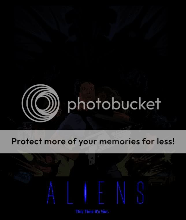
And the inevitable sequel:
The Navigator
Avenger
- Joined
- Jul 22, 2004
- Messages
- 15,735
- Reaction score
- 1
- Points
- 31
If that's too dark, here's a lighter version:

Last edited:
- Joined
- Apr 29, 2004
- Messages
- 75,028
- Reaction score
- 9,492
- Points
- 218
nice job again

Why Are You Crouching Spock?
Avenger
- Joined
- Oct 1, 2007
- Messages
- 10,912
- Reaction score
- 1
- Points
- 31
If that's too dark, here's a lighter version: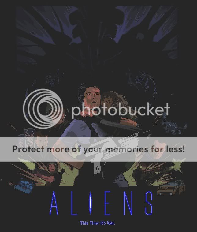
Nice.
The Navigator
Avenger
- Joined
- Jul 22, 2004
- Messages
- 15,735
- Reaction score
- 1
- Points
- 31
Thanks, guys. Can you see the Alien poster okay, or do I need to change the brightness/contrast on it?
Well, just in case:

Well, just in case:
Last edited:
MaskedManJRK
Superhero
- Joined
- Nov 14, 2005
- Messages
- 9,193
- Reaction score
- 0
- Points
- 31
Awesome work, Rabbit.
Similar threads
Users who are viewing this thread
Total: 1 (members: 0, guests: 1)
Staff online
-
 DKDetectiveElementary, Dear Robin (he/him)