K
Kane
Guest
It looks like Burton's Batman belt.
Crisis Superman said:It looks like Burton's Batman belt.
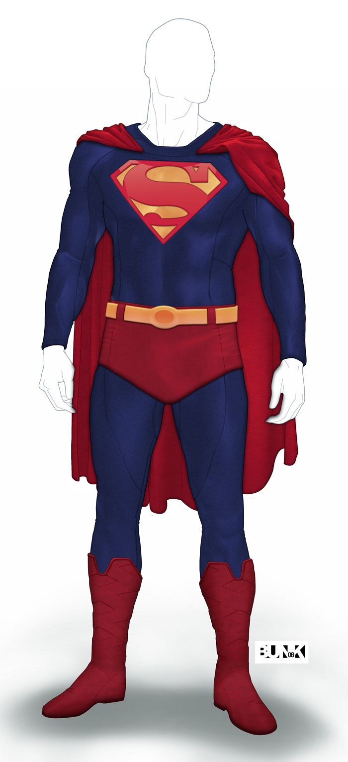
rohitiyer said:This would be MY "ideal Superman suit":

I agree, this is always the best way to go IMHO. Very symbolic and such. Very nice.rohitiyer said:This would be MY "ideal Superman suit":
 up:
up:Lead Cenobite said:I like this. Why can't more artists draw Superman without showing every little nook and cranny between his overexaggerated muscles?

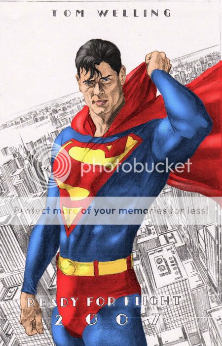
javi1024 said:this is the alex ross drawing of tom welling as superman (who i wanted for the movie). i used colors i wanted singer's superman to look like- only a smaller S. not as bright as Reeves's costume, but bright enough for him to stand out and look like a hero.


kakarot069 said:oh that's Adam Hughes?... oh cool.
It looks great and all, but my only dislike about it is the body... it just looks... so... flat.
") )
)rohitiyer said:This would be MY "ideal Superman suit":

SUPERBENITEZ said:
>ugn< - I cant stand the way Ross insists on giving Supes an 'S' emblem that looks more like a kite!

lujho said:Not only is the S too big, but the red border is proportionally way too thin. I've never seen anyone else point that out but it really bothers me.
Mik El said:Here is my suit redesign...
And my emblem redesign too..