I saw mentions of the 1990 Robin redesigns, thought I'd bring up a few more things.
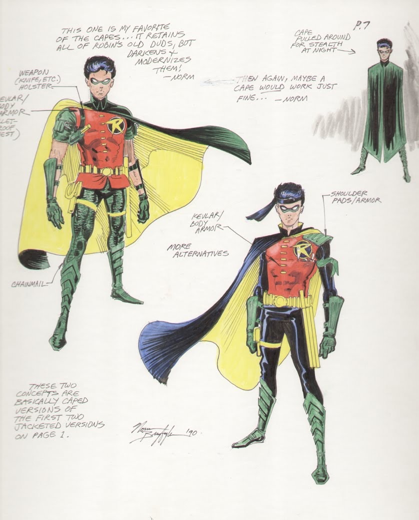
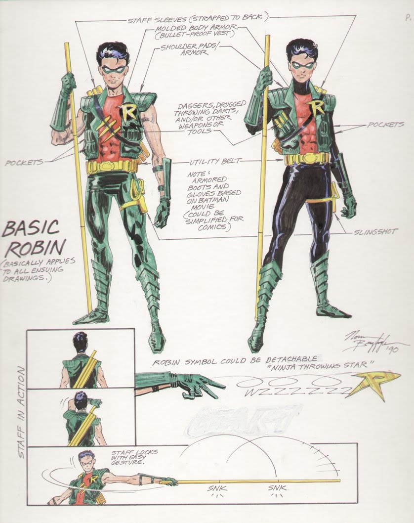
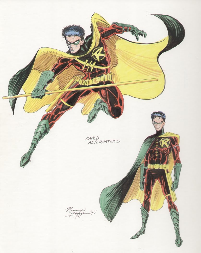
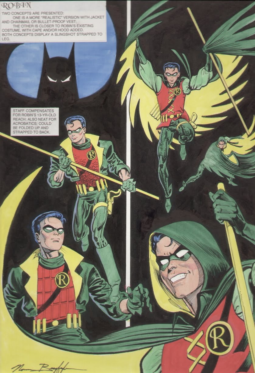
Norm Breyfogle was one of the other artists DC asked to submit redesigns. Breyfogle came up with idea of Robin needing a staff to fight adults. His R logo is also much closer to what wound up on the finalized design. Neal Adams seems very proud about coming with the yellow cape that is black on the outside, but Breyfogle reached that same conclusion without knowing the designs would be shown to Burton's team. In fact, some of them are pretty damn close to what he came up with. His designs have just as much of the "movie problem solving" that Neal Adams gloats about. I suspect he probably thought that DC would want a design more adaptable to outside media, considering it was 1990 and the movie's hugeness. Didn't really need a daughter to pry and negotiate for information over the phone. He must not have hated everything about the movie either, because every single one of his designs features Michael Keaton's gauntlets and shin guards turned green. He even mentions it his notes. He also did an all dark red Robin before Bruce Timm. And there's an all black & gold version to match Michael Keaton.

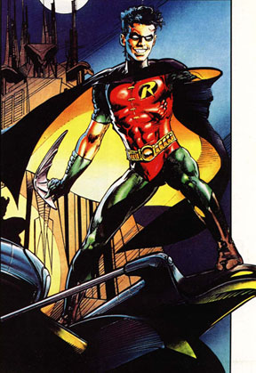
A lot of the Tim Drake artists seemed to ignore the ninja tabi boots that were part of the Neal Adams design. Though sometimes they made it in.
When Adams drew Robin in that image (which I presume is from Odyssey?) it's interesting that he used the mainstream Breyfogle-esque logo (unless a DC editor changed his art) but ignored the staff and brought back the ninja tabi boots. Unless he pops out the staff elsewhere in the story. And he's carrying a traditional batarang.
Breyfogle's Robin logo shurikien made it into the comics too.
Alex Ross wasn't really Alex Ross yet in 1990, I presume that they wouldn't have contacted him yet for designs. But later he proposed a medieval inspired Robin with a hood and scaled leggings, which Breyfogle also thought of back in 1990.
Ross takes all the yellow and replaces it with dark green, yet barely different pixie elf booties remain once again.
The world is ready for ninja tabi boots combined with Keaton's original shin guards. Make it happen Zack Snyder.