
Syncos
ROFLICIOUS
- Joined
- Apr 5, 2006
- Messages
- 3,855
- Reaction score
- 1
- Points
- 58
Finished that propaganda poster assignment. It came out pretty well I think.
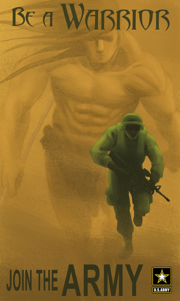
The illustration is fantastic. The text, on the other hand, kills it a bit. I guess it's the designer in me, but the abaddon style text doesn't really fit with the savage/Tarzan warrior you've got going, nor does it fit with the Army. I'm essentially just being picky. But if it's meant to mimic an actual ad, it might be good set up the typography.
I love the concept, and I love the illustration. egarza is right. You've got lots of talent. Even if that means having the ever painful talent for practicing until your eyes bleed.
")
 t:
t:
") Yeah I'm really worried about the remake. I don't really see the point either, just watch the original.
Yeah I'm really worried about the remake. I don't really see the point either, just watch the original.