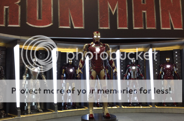
Iron Man 3 Next Armors

Ergh...

I'm not gonna lie, the new suit is throwing me for a loop. Way too much gold..

Hopefully this is a suit that only makes a minor appearance and isn't the official suit of the movie.

Iron Man: Mk III
Iron Man 2: Mk VI
Avengers: Mk VIII
 
I understand people's complaints about the color of the gold, but I don't understand the "too much gold" argument when IM had a gold suit in the comics. Maybe it's the gold as a primary with the red highlights?

Anyway I think the suit looks pretty freaking cool.
 
I think the suit actually does look really cool, it's just that the shade of gold is kind of iffy. I think it would even be more well received if it looked more like the shade of gold that the armor normally had.

But ultimately, I think the chest piece should of been red, that would of fixed my problems with it.

Either way, it'll probably look better in the movie, usually does. Can't wait for IM3 and Winter Soldier.

EDIT: I also don't actually read comics; although I want to get into them..
 
I think if they just made the mid-section red, it'd be pretty acceptable. For example:
RJpnQ.jpg


Nothing fancy, just a quick color swap, but it immediately looks better imo.

Of course, in action, the suit will most likely look better anyway.
 
I understand people's complaints about the color of the gold, but I don't understand the "too much gold" argument when IM had a gold suit in the comics. Maybe it's the gold as a primary with the red highlights?

Anyway I think the suit looks pretty freaking cool.

What works in the comics doesn't necessarily work in live action...

With that being said it's growing on me, I like how techy it looks with the exposed circuitry.

If the gold on the suit is more metallic in the movie like it was in the concept art, which I'm sure it will be, then I'll like this suit even more.
 
I agree with a bit more red either on the chest, or the mid-section would make it flow better. I don't think it's the fact it too much gold, it's that the back has more red than the front, kinda unblalances the whole thing. Ah well sure it will grow on me.
 
I for one like that champagne color with a matte finish.
I still think that the overall design could have been more evenly balanced but at least they took some risk.
 
Never read an Iron Man comic in my life so I'm unsure whether a suit like has been used before (it's actually a part of him now?) and I'm not one to nitpick, but that suit looks dumb and the idea is dumb.
 
I like the new armor, it's unusual but looks cool.
 
I think if they just made the mid-section red, it'd be pretty acceptable. For example:
RJpnQ.jpg


Nothing fancy, just a quick color swap, but it immediately looks better imo.

Of course, in action, the suit will most likely look better anyway.

I agree. Like the shape and colors, very 'bleeding edge' -but i'm just so used to seeing more red so for now it looks odd to me
 
I like to be pretty accepting of changes these movies make and the inevitable artistic licensing therein, but good lord is that an ugly suit. Swapping the dominant color from red to whatever hell that's supposed to be just seems like change for the sake of it. Never mind that the "gold" - tan, really - is just an ugly color plain and simple, and doesn't read well with the red. What were these guys thinking? To me, this isn't even a matter of differing tastes, this suit is an utter failure. It's a shame.
 
I think if they just made the mid-section red, it'd be pretty acceptable. For example:
RJpnQ.jpg


Nothing fancy, just a quick color swap, but it immediately looks better imo.

Of course, in action, the suit will most likely look better anyway.

This I like. Too bad they didn't do something like this instead.
 
I'll go with the theory it's incomplete

All that gold on the Mark 8 could make sense. No time to paint it since his workshop is destroyed. He quickly suits up in the prototype and runs away.

It's a running gag for Tony to quickly get into the final suit of the movie

Mark 6- Not completely painted

Mark 7- ""Cut the spinning rims"


"Avengers 2" will probably have the Mark 9 painted and with shoulder pods. This armor appears to have gotten rid of them.

That could very well be true. He's clearly working on this armor in the "birthing room".

Again I think this may not be the Extremis armor, as it seems like he's working on this early on. I think Extremis may be something that is physically attached to him somehow.

With what's been described at Comic-con, he's clearly trying to find out how to more quickly suit up in the armor. It started back with the Mark V suitcase armor, and continued in avengers with the Mark VII being able to deploy and remotely attach to his magnetic bracelets, and now we see him working on armor that flies across distances to attach to him.

The next logical step is for Tony to have the armor part of him at all times, which is what Extremis was about. Well, I guess it was about having the under armor physically attached to him, but he doesn't wear "under armor" in the films.
 
Nano-tech! Dun, dun dun dun!
 
I like the new design. And while the gold looks a little bland IRL, I think it'll look fantastic on-screen.
 
Considering that this armor is introduced during the beginning or middle of the movie, I highly doubt it's the armor that he ends up wearing at the end.
 
We don't know this. I'm thinking this is the final suit. The suit in the IM3 promo makes me think that was the suit in it.
 
I think if they just made the mid-section red, it'd be pretty acceptable. For example:
RJpnQ.jpg


Nothing fancy, just a quick color swap, but it immediately looks better imo.

Of course, in action, the suit will most likely look better anyway.
Just did my own quick little edit on this image and got:
editIM3.png

I think its much better with just those changes
 
At least it looks different than the previous armors. The previous changes, with the exception of the mkV, were too slight in my opinion. At least this is a radical departure. I like the roundness to some of it, and it does seem a bit streamlined in its size.

Like everybody, I think the gold is too dull. Maybe when he powers up, it becomes brighter, like some anime mecha.
 
And IM only had the all-gold armor in the comics for about a year or so. They quickly moved away from it. But like I said, it's different. If they stick with it (Marvel seems to like making its comic versions synch up with the movie looks), a mainly-gold Iron Man may be popping up in the comics and become the new norm for his look.

It's different, but in time, I may grow to like it.
 
The more I look at the suit, the less I like it.

Coming from someone who was open to the idea of having more gold on the suit, this is way too excessive.
 
ESPECIALLY AFTER HIS COMMENT IN THE FIRST MOVIE ABOUT ALL THE GOLD BEING "A little ostentatious"

-DOOM :doom:
 

Users who are viewing this thread

Back
Top
monitoring_string = "afb8e5d7348ab9e99f73cba908f10802"