ThDWgeek
Civilian
- Joined
- Jun 29, 2011
- Messages
- 752
- Reaction score
- 0
- Points
- 11
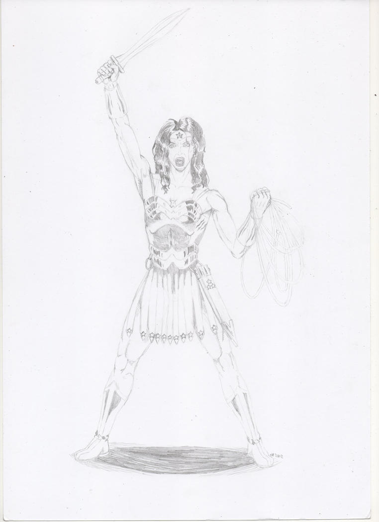
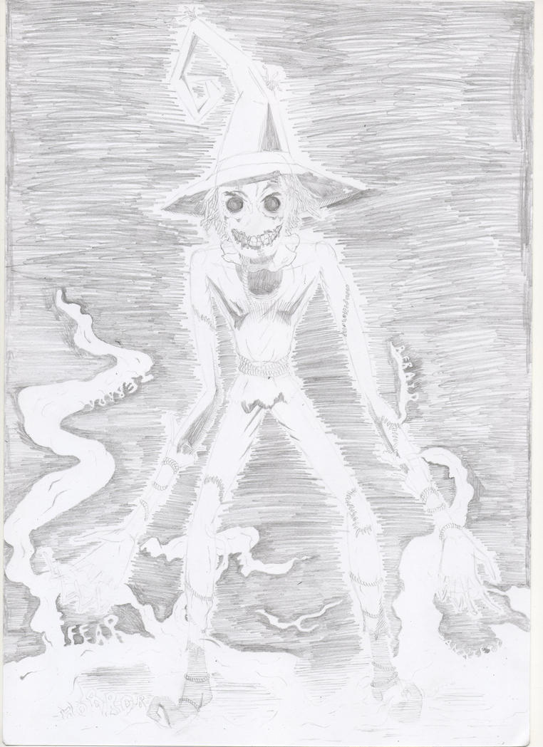
Here's a slight redesign of the Wonder Woman costume. I envisioned it as being the classic costume, but with a couple of additions that would suit a warrior character and add a smidge of dignity. I tried to make it as authentically Greek as possible, though I am aware the skirt is too long for Greek armour in that style. The sword I included is a Xiphos, but I'd appreciate it if somebody who's more well-versed in Ancient Greece could tell me if that's the right choice or not. But enough babble from me, here's the pencil version:
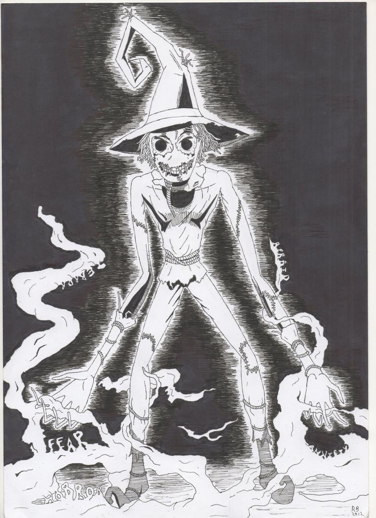
And here's the pen version:
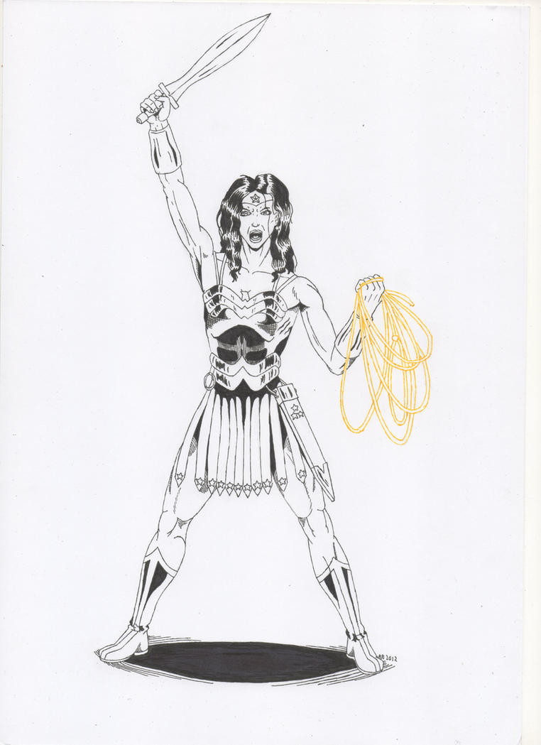
I definitely need to practice hair and stomach muscles.
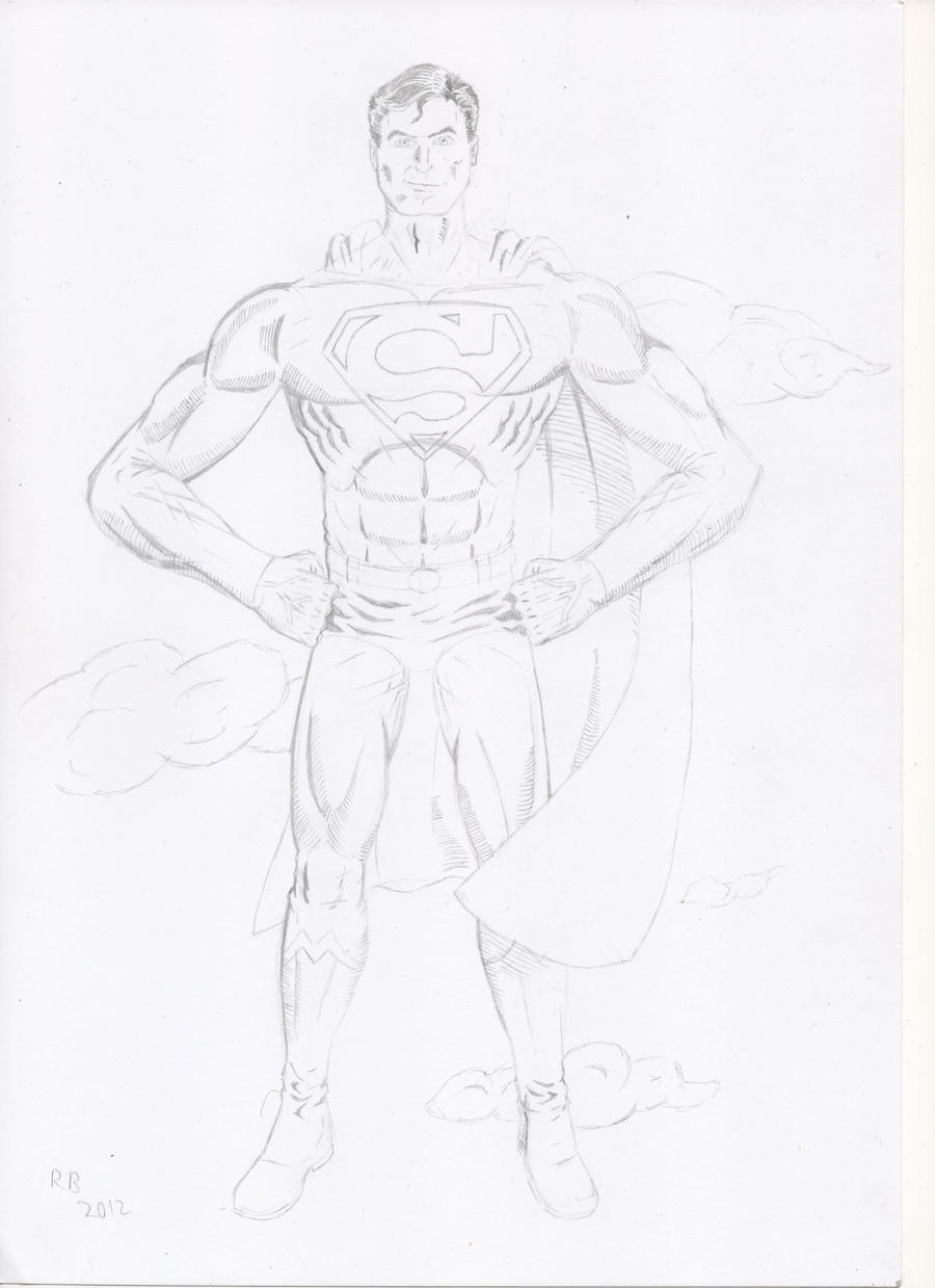
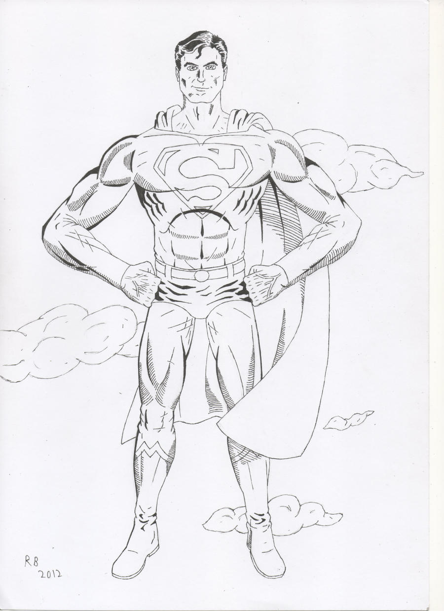
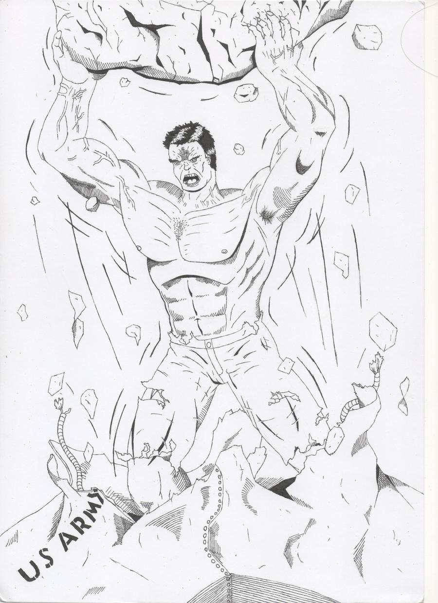
And here's the pen version:
I definitely need to practice hair and stomach muscles.
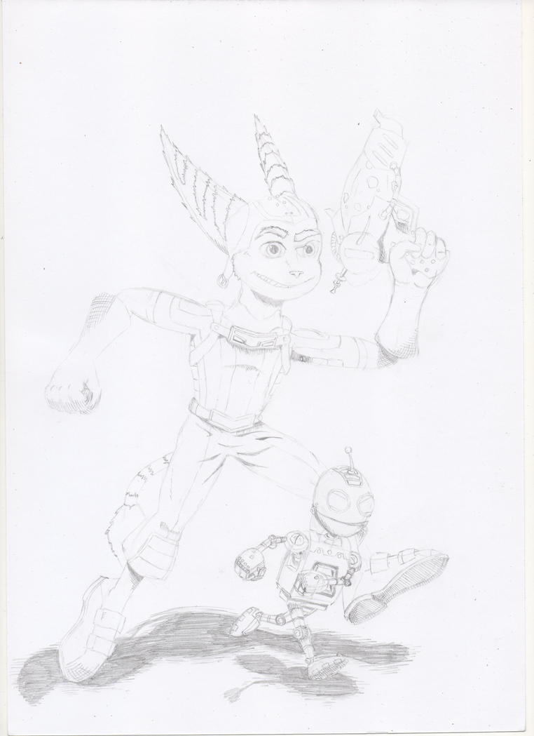
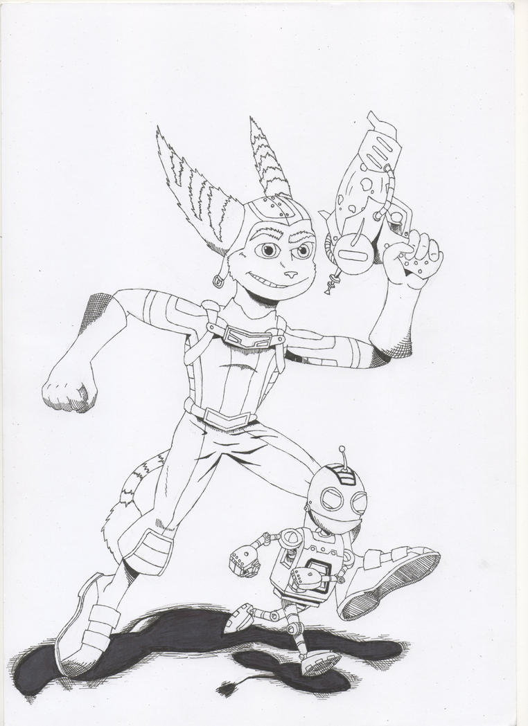
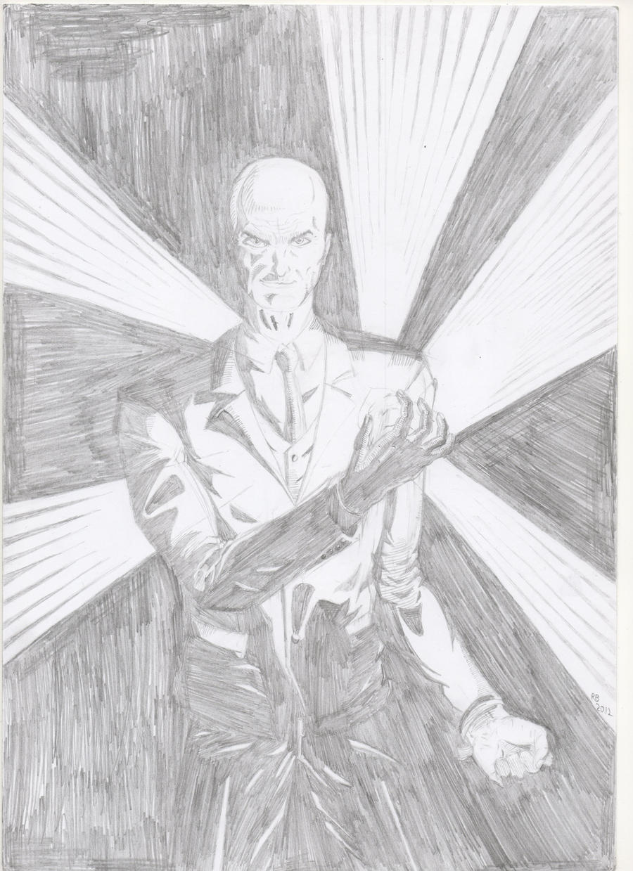
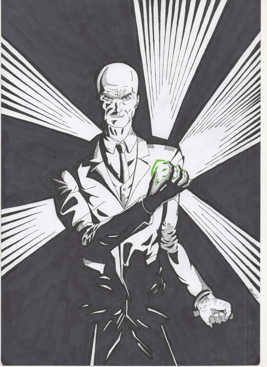
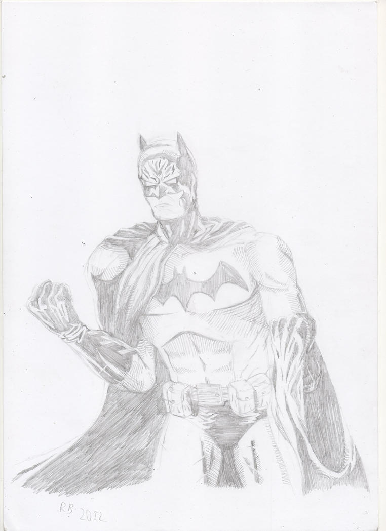
 . Not sure what happened to his face in the pen version, but I definitely screwed up somewhere. He went from "full of rage" to "kinda annoyed". But regardless, here's the pencil version:
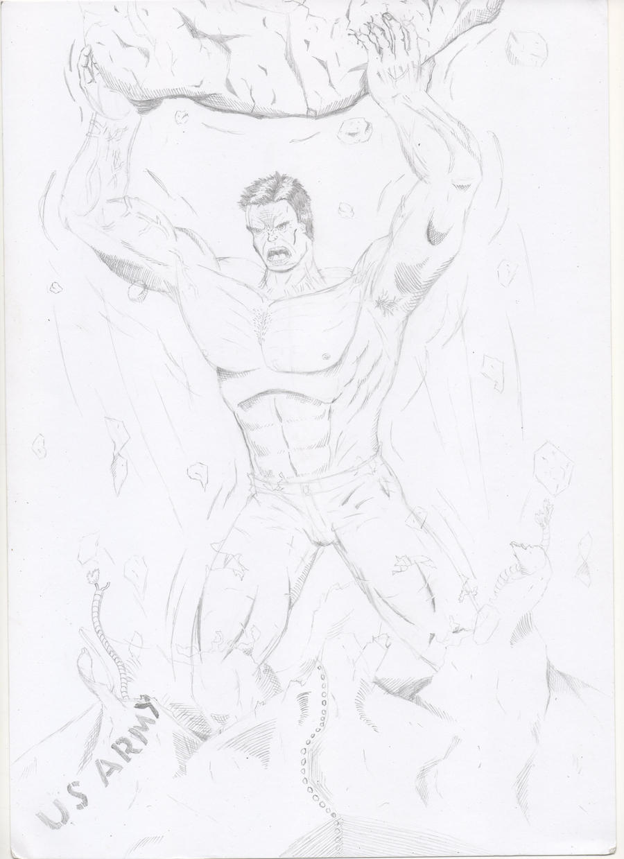
 And as for the red and blue pencils, I've heard about using them before, but I've never been sure about how to get started with them. Have you got any detailed tips on using them?
")
 t: I've already started some stuff, but after that I'm gonna give red pencils a shot.