
You are using an out of date browser. It may not display this or other websites correctly.
You should upgrade or use an alternative browser.
You should upgrade or use an alternative browser.
Batman Begins [fan art] using the new photos, etc... OT [merged x34]
- Thread starter superadam87
- Start date
R
ROBOCOP CPU001
Guest
Exabyte said:Yeah Robo, I think WB should take some pointers from TheBat812 and Barney. These are way better than the F4 posters.
yeah mate,ive said it once and i will say it again barney is wasted working in the cinema!
etrigan69
Skeptical A-hole.
- Joined
- Nov 30, 2003
- Messages
- 1,508
- Reaction score
- 0
- Points
- 31
That's a really good one. You tell a major angle of the story with one image. Talk about a picture saying more than a thousand words! Brilliant concept. Doesn't even need a tagline....Barney said:

P.S. You know what might even work better (IMO) is if you manip the 1st poster with his head down into it.
Comic Book Boy
Producer/Writer/Director
- Joined
- May 28, 2004
- Messages
- 6,093
- Reaction score
- 0
- Points
- 31
cool!Sonki said:I've just been doing some funish cartoonish drawings of batman
Here's one


DOO BEE
The Crimson Saint ®
- Joined
- Mar 21, 2005
- Messages
- 1,069
- Reaction score
- 0
- Points
- 31
Sonki said:I've just been doing some funish cartoonish drawings of batman
Here's one
is that the photoshop option??? or a different program???
lujho
Superhero
- Joined
- Jun 3, 2003
- Messages
- 5,409
- Reaction score
- 72
- Points
- 73
DOO BEE said:is that the photoshop option??? or a different program???
Painted over manually in Photoshop with a tablet and stylus, I imagine.
Not just a simple filter effect.
Comic Book Boy
Producer/Writer/Director
- Joined
- May 28, 2004
- Messages
- 6,093
- Reaction score
- 0
- Points
- 31
U got the date wrong.TheBat812 said:new one:


antmanx68
Superhero
- Joined
- Jun 19, 2003
- Messages
- 6,813
- Reaction score
- 0
- Points
- 56
well for people with a hi res monitor you can see that there is a black rectangle around the date now.... also there is some color partially coloring the "warner bros. picturese presents" part of the credits.... and the manip looks a little funky to me... i think it would work much better as a straight up silhouette.
TheBat812
Superhero
- Joined
- Dec 10, 2004
- Messages
- 6,607
- Reaction score
- 4
- Points
- 58
yea, i posted it, noticed it, then tidied it up.Comic Book Boy said:U got the date wrong.
TheBat812
Superhero
- Joined
- Dec 10, 2004
- Messages
- 6,607
- Reaction score
- 4
- Points
- 58
that's weird, i cant see the black rectangel, and i have a high res monitor...antmanx68 said:well for people with a hi res monitor you can see that there is a black rectangle around the date now.... also there is some color partially coloring the "warner bros. picturese presents" part of the credits.... and the manip looks a little funky to me... i think it would work much better as a straight up silhouette.

Cobblepot
Giant-Size Man-Thing
- Joined
- Sep 20, 2004
- Messages
- 10,628
- Reaction score
- 15
- Points
- 58
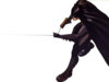
Sonki said:Well what I did was draw the outline just using the polygonal lasso tool and then i colored him manually aswell... Although you could just do an effect on the actual picture.
Heres another one...

These are very nice.
Similar threads
- Replies
- 69
- Views
- 6K
- Replies
- 72
- Views
- 9K
- Replies
- 8
- Views
- 2K
Latest posts
-

-

-

-

-
🌎 Discussion: Online Piracy, AI, Net Neutrality, Killswitch, and Other Internet Issues II (1 Viewer)
- Latest: DJ Kornphlake