You are using an out of date browser. It may not display this or other websites correctly.
You should upgrade or use an alternative browser.
You should upgrade or use an alternative browser.
Majik1387's Art Thread
- Thread starter Majik1387
- Start date
Majik1387
Avenger
- Joined
- Jan 30, 2004
- Messages
- 41,629
- Reaction score
- 4
- Points
- 33
Eh, not to sound like a beyotch, but I don't really care how people feel about the cast I use as the majority of posters here who used to have good fan casting suggestions seem to have disappeared.
And on that note, found more older X-Men manips
Emma Frost again

X-Men team Blue

X-Men team Gold

Young X-Men

And on that note, found more older X-Men manips
Emma Frost again

X-Men team Blue

X-Men team Gold

Young X-Men

keith_v
Sidekick
- Joined
- May 13, 2006
- Messages
- 1,441
- Reaction score
- 35
- Points
- 58
There is some really strong elements of compistion in this pic. The only dead space I see is just to the right of the Phantom's head. This clearly shows you have a good eye for design and layout, something many artists lack.
But while your layout is awesome, you need to work on your anatomy and rendering. The rendering can wait until later, but anatomy is what's important. Don't even look at a computer until you have a pencil drawing that looks great right side up, upside down, backwards, and sitting on its side. When it looks good every which way, then it's time to go the computer.
Majik1387
Avenger
- Joined
- Jan 30, 2004
- Messages
- 41,629
- Reaction score
- 4
- Points
- 33
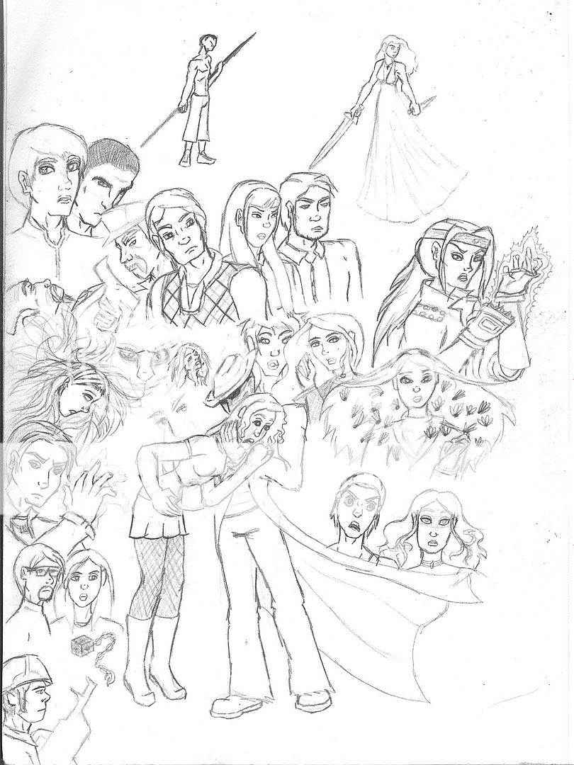
Thanks, the dead space you see is actually just empty space as I finish coloring in the rest of my poster drawing. I thought I uploaded the original piece in the thread but I can't seem to find it so here it isThere is some really strong elements of compistion in this pic. The only dead space I see is just to the right of the Phantom's head. This clearly shows you have a good eye for design and layout, something many artists lack.

Regarding the rendering, I'm not trying to go for a 3D look. Best way I can say what I'm trying to go for is a bit of a more detailed Disney look without being lined in black.But while your layout is awesome, you need to work on your anatomy and rendering. The rendering can wait until later, but anatomy is what's important. Don't even look at a computer until you have a pencil drawing that looks great right side up, upside down, backwards, and sitting on its side. When it looks good every which way, then it's time to go the computer.
Anatomy wise, I know I've gotten notes on the hands, mainly because of their positioning, but I'm able to do the gestures myself so I didn't think it looked off. The only one that I tried giving a weird anatomy to was the Wolf-Man for the very reason that it's my interpretation of the character(I will be redoing his face at one point). If another character's anatomy looks off to you, which one are you referring to, so I know what to fix in my net piece?
Majik1387
Avenger
- Joined
- Jan 30, 2004
- Messages
- 41,629
- Reaction score
- 4
- Points
- 33
So I finally finished my Universal Monsters pic
 http://valor1387.deviantart.com/art/Universal-Monsters-Colored-144136009
(for the bigger more detailed, original version)

(for the bigger more detailed, original version)
Last edited:
Majik1387
Avenger
- Joined
- Jan 30, 2004
- Messages
- 41,629
- Reaction score
- 4
- Points
- 33
And here's Alice Liddell vs the Red Queen of Hearts
 http://valor1387.deviantart.com/art/Alice-vs-Red-Queen-of-Hearts-130509978

Last edited:
Similar threads
Users who are viewing this thread
Total: 1 (members: 0, guests: 1)
Staff online
-
SwordOfMorningSuper Moderator
-
Lily Adler🎃 Pumpkin Spice ☕
-
Hunter RiderRonin


