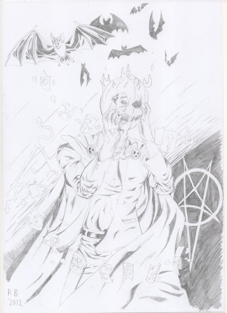
A rather simple classic suit version of Batman. I went easy on the solid dark areas that I would normally include on Batman's cape and everything to give the impression that the cape is blue rather than the black look that I prefer. Also, I went for the old-school belt and logo to complete the entire classic look. Here it is:
I plan on doing some perspective work next, but I'll probably get sidetracked by a sudden urge to draw Wolverine or something XD
Finally got a new piece done. It's a rather basic piece; a perspective study inspired by places like Rochester and Canterbury in Kent, with old buildings right next to very modern ones. I'm pretty pleased with it, but one of the rulers I used to work on it left some black markings on some areas of the paper. Here it is:
Next up: my entry for the October fan-art contest!
And just in time for the end of the month, it's my entry for this month's fan art contest! The story I envisioned behind it is that of an amateur magician attempting some sort of spell, and as punishment or as a mistake, he's now cursed to live with a pumpkin around his head. I'm pleased with the shading on this one, as I feel I generally have some problems with drawing folds in clothing, but that they came out pretty well here. Here it is:
If you like it, head on over to the contest thread after the 31st and vote for my entry! t:
After finishing up the anniversary present I was making for my girlfriend, I decided to draw Wolverine. I'm pretty happy with how it turned out, particularly the folds in the shirt and the look of his hair, though I think the jeans could have been a bit better. In any case, here it is:
Here's a Poison Ivy piece that's admittedly a bit late what with it being winter now, but none the less, it's one I'm pretty pleased with. I'm particularly happy with how the face and hands turned out, though I wish the feet could have been better. Here she is:
Aside from a slightly dodgy head and feet that are a tad small, I'm really happy with this Hal Jordan piece I did. I'm pleased with how it turned out in terms of anatomy, shading, and the speed at which I finished it. Here it is:
What's the general consensus on this and any of my other work?
Batman on a Rooftop. I tried to give the impression that the light source is beneath him, but I don't think it came across too well. But oh well, because I'm quite pleased with the anatomy and the shading on the cape. Here it is:
The first part of a series I'm starting, going through the alphabet one DC character at a time. First up: Aquaman! I think it turned out ok, but I screwed up the right hand even after re-drawing it a number of times. In any case, here it is:
Carrying on my DC alphabet is Bizarro. I had fun with this one, particularly the face, as I drew my rendition of the classic Superman head, then distorted it into Bizarro. Overall I'm pretty pleased with it, though I know the anatomy and composition is a bit off. Here it is:
DC alphabet part 3! This time I went for Catwoman, as she's a character I've wanted to draw for a while. I went for the "lit from bellow" look again, and I think I managed it better here than in my last Batman picture. Also, I added a bit of background just to make it seem a bit more finished. Here it is:
And the fourth letter of the alphabet is D, for Darkseid. I'm pretty pleased with it, though the feet could use some work. In any case, I'm just glad I could draw the Kirby Krackle effect again. Here's the pic:
After D comes E, and with it, Etrigan the demon. I intentionally skewed the proportions with this one, mainly in the hands and upper body, in order to play up the "demon" aspect of the character. Here it is:
Running onto the scene now is the letter F, which is brought to you by the Flash! I'm pretty pleased with this one, though I wish I'd somehow managed to highlight the fact that I tried drawing his legs as being more muscular than most other characters I draw, but oh well. On the whole, I think I managed to do well on this one. Here it is:
Next up it's Green Arrow. I'm pretty pleased with this, but that left arm shows that I really need to practice foreshortening. On the other hand, I'm fairly pleased with what I managed to do in terms of shading and cross-hatching. Here it is:
And now for H, it's Harley Quinn! Who doesn't like her? I went for her classic look here, since it's the one I prefer, and I think it turned out ok. I think I did the anatomy pretty well, but the right hand could use some work. But oh well. On the whole, I'm pretty pleased with this one. Here it is:
For this one I decided to go with Kyle Rayner in his Ion days, specifically in his look right at the start of the Sinestro Corps War. I'm pretty pleased with this one, though I know I've got the right shoulder all wrong. I'm gonna try and work on that in my future pictures. Also, I like drawing stuff in space, but damn is it time consuming. Here it is:
Who else could it possibly be for the letter J? Obviously the Joker was the only choice for this one. I'm pretty pleased with how it turned out, though I can tell I made the head too small. But I think I got a decent evil look on the face, and hey, it can't hurt to have one more thing to practice, right? Anyway, I decided to go with cross-hatching rather than heavy black areas, and I'm pretty pleased with how it turned out. Also, I like what I did with the hair. I'm proud of the hair in this one. Here it is:
For K I decided to do probably the most famous non-human Green Lantern, Kilowog. I'm pleased with how this one turned out, particularly in terms of the anatomy and foreshortening, though I think some of the shading could use some work. And the galaxy in the top left corner could definitely be better. But oh well, on the whole I think this one is pretty good. Here it is:
This one was fun to do. Inspired by the lego set with Lex, Superman and Wonder Woman, I wanted to take the mecha Lex piloted, and change it to more of an Iron Man-style armour. I started with a basic body underneath, in order to get the proportions right, then I added the armoured pieces over that. I think it turned out mostly ok, but that left shoulder looks a bit off. Oh well. Overall, I'm pleased with this one, though not as pleased as I was with Kilowog. Here it is:
This was a pretty fun one to draw. I'm quite pleased with the pose, as I think it's fairly dynamic, and I feel that I've managed the foreshortening on the arm pretty well. I didn't want to go too far overboard with the shading, but I think it came out ok as well. Overall, I like what I've done with this one a lot. Here it is:
For this one, I went with the original Boy Wonder in his adult identity of Nightwing. On the whole, i'm pretty pleased with how it turned out, particularly the abdominal muscles. I think they're the best abs I've ever drawn XD. As for the shading, I think I struck a pretty good balance between dark and light areas, without anything becoming an unidentifiable black mass. That's always one of my fears when I'm drawing, so I try to avoid too many large dark areas. The only real problem I have with this one is the hair, but I don't think it's TOO bad. Overall, I'm pretty happy with this one. Here it is:
For this one I went with the best hacker/information broker in the DC Universe and former Batgirl, Barbara Gordon. I think it went well, as I feel the pose works pretty well, and the detailing on the clothing looks good. The hardest thing about this one was figuring out how to display some computer equipment without it obscuring too much of the character, but I found a way around it. Overall, I'm pretty happy with this one. Here it is:
This site uses cookies to help personalise content, tailor your experience and to keep you logged in if you register.
By continuing to use this site, you are consenting to our use of cookies.