
You are using an out of date browser. It may not display this or other websites correctly.
You should upgrade or use an alternative browser.
You should upgrade or use an alternative browser.
The Flash The Flash Costume Thread
- Thread starter $0UL3$$
- Start date
- Status
- Not open for further replies.
Perfect Cell
I wish you weren't so f***in' awkward, bud
- Joined
- Jul 15, 2009
- Messages
- 10,066
- Reaction score
- 5,424
- Points
- 103
Hooray, this thread exists now.
I will agree that the suit could be a little less baggy, and the colour is a bit off, but I'm optimistic nonetheless. I expect it'll look different on screen, and in motion, than even in the promo pic. I tend to agree with the people who suggest that a white background on the symbol would be better, but I'll hedge my full opinion until I see the first episode. Right now I have a few issues with little details here and there, but overall I'm ok. If I was rating it, I'd give it a 6.5 or a 7 out of 10.
I will agree that the suit could be a little less baggy, and the colour is a bit off, but I'm optimistic nonetheless. I expect it'll look different on screen, and in motion, than even in the promo pic. I tend to agree with the people who suggest that a white background on the symbol would be better, but I'll hedge my full opinion until I see the first episode. Right now I have a few issues with little details here and there, but overall I'm ok. If I was rating it, I'd give it a 6.5 or a 7 out of 10.
I was hyped up when i saw the cowl, but when they released the full body shot, i didnt quite like it. I dont hate it, i just think it could be better. Theres no belt and the logo is red and gold instead of whiteand gold. The boots are red instead of yellow(thank god)
Rorschach2012
Batman is my Dad
- Joined
- Dec 29, 2006
- Messages
- 19,645
- Reaction score
- 2,521
- Points
- 103
Yeah 6 - 7 sounds about right if i were rating it.Hooray, this thread exists now.
I will agree that the suit could be a little less baggy, and the colour is a bit off, but I'm optimistic nonetheless. I expect it'll look different on screen, and in motion, than even in the promo pic. I tend to agree with the people who suggest that a white background on the symbol would be better, but I'll hedge my full opinion until I see the first episode. Right now I have a few issues with little details here and there, but overall I'm ok. If I was rating it, I'd give it a 6.5 or a 7 out of 10.
It could look a lot better with some basic color adjustments though.
The bagginess and the logo are both definitely working against the suit
Kevin Smith
Superhero
- Joined
- Apr 22, 2008
- Messages
- 6,176
- Reaction score
- 0
- Points
- 31
I give the suit a 5.5, maybe a 6 out of 10.
They CW'd him a good bit, here's what needs fixed:
- Needs the white behind the logo instead of red, also the lightning bolts should be symmetrical instead of the bottom end being shorter than the top part.
- Needs the right ear pieces like how Ethan Van Sciver draws them as seen below:
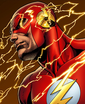
- Needs the gold lightning trim on the forearm area of the costume and the waist/"belt" area.
- Although I'd love to see the gold boots, I know CW doesn't have the balls for that, so gold lightning trim on the top of The Flash's boots right where they meet below his knees would be ideal.
- Suit should look less busy, and that bigass belt buckle NEEDS to go.
- Make the "red" areas on the suit crimson/scarlet instead of burgundy.
Other than that the rest is fine. I really hope this suit is just the Mark 1 and we will see some big improvements in later episodes, there's definitely room for them. Oh and the chin strap doesn't bug me too much, I think it's stupid but I can take or leave it.
They CW'd him a good bit, here's what needs fixed:
- Needs the white behind the logo instead of red, also the lightning bolts should be symmetrical instead of the bottom end being shorter than the top part.
- Needs the right ear pieces like how Ethan Van Sciver draws them as seen below:
- Needs the gold lightning trim on the forearm area of the costume and the waist/"belt" area.
- Although I'd love to see the gold boots, I know CW doesn't have the balls for that, so gold lightning trim on the top of The Flash's boots right where they meet below his knees would be ideal.
- Suit should look less busy, and that bigass belt buckle NEEDS to go.
- Make the "red" areas on the suit crimson/scarlet instead of burgundy.
Other than that the rest is fine. I really hope this suit is just the Mark 1 and we will see some big improvements in later episodes, there's definitely room for them. Oh and the chin strap doesn't bug me too much, I think it's stupid but I can take or leave it.
Last edited:
Rorschach2012
Batman is my Dad
- Joined
- Dec 29, 2006
- Messages
- 19,645
- Reaction score
- 2,521
- Points
- 103
i like the ear pierces on the old suit,

But the new ear pierces don't bother me all that much. If the circular part (the part that fastens that ear pieces to the cowl) was all yellow like the comics, it'd look better though
But the new ear pierces don't bother me all that much. If the circular part (the part that fastens that ear pieces to the cowl) was all yellow like the comics, it'd look better though
Kevin Smith
Superhero
- Joined
- Apr 22, 2008
- Messages
- 6,176
- Reaction score
- 0
- Points
- 31
i like the ear pierces on the old suit,
But the new ear pierces don't bother me all that much. If the circular part (the part that fastens that ear pieces to the cowl) was all yellow like the comics, it'd look better though
Yes to all of this.

And that's what I've been saying - the ear pieces need to be SOLID all the way through in the circle part, not a hollow outlining of a circle to match his chest logo where the "bolts" (
 ) attach to the red, and they need to be gold too.
FeedOnATreeFrog
(A Metal Gear reference)
- Joined
- Sep 17, 2012
- Messages
- 6,440
- Reaction score
- 717
- Points
- 73
I think the bolts look great ")
Rorschach2012
Batman is my Dad
- Joined
- Dec 29, 2006
- Messages
- 19,645
- Reaction score
- 2,521
- Points
- 103
the bolts look great from the front, but from a side view, the circular part looks way better when it's solid goldI think the bolts look great
Kevin Smith
Superhero
- Joined
- Apr 22, 2008
- Messages
- 6,176
- Reaction score
- 0
- Points
- 31
I think the bolts look great


the bolts look great from the front, but from a side view, the circular part looks way better when it's solid gold
I agree.
Last edited:
Kevin Smith
Superhero
- Joined
- Apr 22, 2008
- Messages
- 6,176
- Reaction score
- 0
- Points
- 31
Is it just me or is the bottom segment of the bolt shorter than the top and middle
Nope. It's not just you. It stupidly is unsymmetrical like that. I hate that. It's like the designer looked at it and thought "damn, the logo really is perfect but I have to do something to it and leave my stamp on it somehow...hmm
 ....* chop * ah there we go! Done!".

Completely unnecessary and makes it look weird now. God that's going to bug me while watching it.
....Really grinds my gears.
Rorschach2012
Batman is my Dad
- Joined
- Dec 29, 2006
- Messages
- 19,645
- Reaction score
- 2,521
- Points
- 103
yeah the bottom part of that logo needs to be longer. and the red instead of the white in the logo... just... no...
Nope. It's not just you. It stupidly is unsymmetrical like that. I hate that. It's like the designer looked at it and thought "damn, the logo really is perfect but I have to do something to it and leave my stamp on it somehow...hmm
Completely unnecessary and makes it look weird now. God that's going to bug me while watching it.
....Really grinds my gears.
Hey! Welcome back Kevin!
Your uncompromising ways can be both admirable and infuriating!

I'm with you with most of the issues with the costume. Hopefully this will be a Mk. 1. I already have a bit of a speculation that this costume will be the costume Star Labs will give Barry at the start of the show. Barry and Star Labs will part ways further down the road and we will get a sleeker, more basic version.
I think the word I would give this design would be "over thought". That's the beauty of the Flash costume is in its "simplicity". Even the New 52 suit does not stray away that much from the original design because of the beauty in its simplicity. This is just too busy! Apologies to Colleen Atwood. I know she was just doing her job as per instructions received from the producers and creators. God knows I wouldn't know how to incorporate that solid looking helmet with fabric. But I digress, if you can reverse engineer Spider-Man's costume to The Flash's then you got it.
I would probably give it a 5 out of 10. But A for effort. A lot of people seem to like it.
Here are my nitpicks. The cowl is almost perfect. The lines running across the top of the "helmet" end between the eyes. Almost as if it makes for a scowling face. Why couldn't they end over the eye holes?
Earwings and not lightning bolts... White background against lightning chest logo... symmetrical lightning on the chest logo...
Everything is just too busy. Again "over thought".
God I hope it evolves!
Midnight Black
Defender of the Universe
- Joined
- Jun 14, 2008
- Messages
- 3,269
- Reaction score
- 0
- Points
- 31
I know the photo is on the home page, but why no photo here? You can't talk about the costume and not have a photo lol...
KillerMcQueen
Superhero
- Joined
- Apr 12, 2013
- Messages
- 8,505
- Reaction score
- 2,168
- Points
- 103
Upped the contrast in them a tiny bit for a better approximation of how it'll likely appear on the showI know the photo is on the home page, but why no photo here? You can't talk about the costume and not have a photo lol...


Last edited:
Midnight Black
Defender of the Universe
- Joined
- Jun 14, 2008
- Messages
- 3,269
- Reaction score
- 0
- Points
- 31
My man t:
t:
t:DarthSkywalker
🦉Your Most Aggro Pal (he/him)
- Joined
- Jun 16, 2004
- Messages
- 131,892
- Reaction score
- 78,560
- Points
- 203
So I just saw the suit... 
kguillou
Avenger
- Joined
- Dec 30, 2005
- Messages
- 26,907
- Reaction score
- 25,583
- Points
- 103
I predict once we see the pilot people will love the suit. Lighting and shadowing go a long way to enhancing an image. It's not like we're getting some half-handed attempt at a suit like Smallville used to do. This is 100% THE FLASH through and through.
Hush
Wee Little Puppet Man
- Joined
- Oct 16, 2003
- Messages
- 16,732
- Reaction score
- 9
- Points
- 33
The suit with the adjustments to make the back of the symbol white is awesome. I don't understand how Spiderman is the only hero to have a 100% accurate suit in this modern era of film. It literally blows me away that a sleek costume like The Flash can't be adapted just from what is on the page.
Nathan
Avenger
- Joined
- May 6, 2003
- Messages
- 49,925
- Reaction score
- 321
- Points
- 73
I have to say I like the released Promo pic a lot more, than the set pics. Because it gives you the illusion that it's a form fitting suit, similar to the Spider-Man costumes. But the set pics make it look like red pants and a jacket, and it's way too loose.
Midnight Black
Defender of the Universe
- Joined
- Jun 14, 2008
- Messages
- 3,269
- Reaction score
- 0
- Points
- 31
Yeah, that is weird that more superhero suits can't just be translated to screen like Spidey's. I guess it's just a testament to how timeless his suit is or a testament that that some people really don't get why superheroes are timeless idk.
However, I think the Flash's suit for CW isn't that bad...I just needs some minor adjustments really.
However, I think the Flash's suit for CW isn't that bad...I just needs some minor adjustments really.
king666
Sidekick
- Joined
- Jan 11, 2013
- Messages
- 3,387
- Reaction score
- 662
- Points
- 73
I have to say I like the released Promo pic a lot more, than the set pics. Because it gives you the illusion that it's a form fitting suit, similar to the Spider-Man costumes. But the set pics make it look like red pants and a jacket, and it's way too loose.
This! The material looks great in the promo pic. It fits his body.
- Status
- Not open for further replies.
Similar threads
- Replies
- 85
- Views
- 30K
- Replies
- 16
- Views
- 3K
- Replies
- 42
- Views
- 3K
- Replies
- 12
- Views
- 6K
Users who are viewing this thread
Total: 2 (members: 0, guests: 2)
Staff online
-
 SwordOfMorningSuper Moderator
Members online
Total: 2,014 (members: 10, guests: 2,004)
Latest posts
-
-
Beep beep! I'm a motorist! Cars, trucks and buses have their troubles, too! (6 Viewers)
- Latest: nachtschicht
-
Tim Burton Developing ‘Addams Family’ Series, 'Wednesday' Starring Jenna Ortega (4 Viewers)
- Latest: Isub_Zero
-
-