The Penguin The Penguin on HBO - General Discussion

Listen. James Gunn isn't making this show. So it's automatically the worst.
Ah yes. The visual master that is James Gunn:
adam-warlock-flying-through-explosions-in-guardians-of-the-galaxy-vol-3.jpg
 
Maybe the only decent looking thing in that movie:


Truthfully, Braham has always been extremely hit or miss for me. I've liked his work with Gunn for the most part (not anything to do with Adam Warlock, but other stuff), his Maleficent and Road House work was...fine, but when he misses (The Flash, Tarzan), he really misses. I have hope for Supes because his misses tend to happen when he's going for a "dark and moody" look rather than a colorful one, which it doesn't seem like will be the case here, but I can't say I'm not concerned!
 
Truthfully, Braham has always been extremely hit or miss for me. I've liked his work with Gunn for the most part (not anything to do with Adam Warlock, but other stuff), his Maleficent and Road House work was...fine, but when he misses (The Flash, Tarzan), he really misses. I have hope for Supes because his misses tend to happen when he's going for a "dark and moody" look rather than a colorful one, which it doesn't seem like will be the case here, but I can't say I'm not concerned!
Considering the partnership, I assume Gunn will have a decent influence which eases my concerns.
 
I'm not even the only person that has pointed out this show's visuals actually don't look that great lol. My entire circle of friends thinks it looks bad. It doesn't matter who directed it, point is, like I said before, I'd have rather them created a new look instead of doing a pale and cheap imitation of The Batman which is just incredibly distracting to look at especially because of the way they tried to replicate things like the blur or whatever which looks a lot worse than it did in the film. If they were gonna do this look I'd have rather them either really go out of their way to commit to fully replicating the look (by getting Fraser and Reeves to shoot) or just come up with a different visual style. For now I just think the show looks kinda hideous and I'm hoping the writing is good enough to compensate for that.
 
how about you wait until the show airs and you are able to watch it on your big TV. the only thing that looks off (and it isn't that bad) is the blur, which will 100% look better on the TV
 
I'm not even the only person that has pointed out this show's visuals actually don't look that great lol. My entire circle of friends thinks it looks bad. It doesn't matter who directed it, point is, like I said before, I'd have rather them created a new look instead of doing a pale and cheap imitation of The Batman which is just incredibly distracting to look at especially because of the way they tried to replicate things like the blur or whatever which looks a lot worse than it did in the film. If they were gonna do this look I'd have rather them either really go out of their way to commit to fully replicating the look (by getting Fraser and Reeves to shoot) or just come up with a different visual style. For now I just think the show looks kinda hideous and I'm hoping the writing is good enough to compensate for that.
"Show doesn't look great"

4f0c684a2917e7144969c6a556289f4738f5f4b86d07371b78a03e25fc5750f2.png


"Looks like Secret Invasion"
 
how about you wait until the show airs and you are able to watch it on your big TV. the only thing that looks off (and it isn't that bad) is the blur, which will 100% look better on the TV
Social media compression can make some rather good looking shows and films, look like trash.
 
I'm not even the only person that has pointed out this show's visuals actually don't look that great lol.
You can find people on social media who agree with any opinion. That's hardly the argument boost you think it is.

It's fine. You think it looks like trash. Most here disagree. And ever the Earth rotates on.
 
how about you wait until the show airs and you are able to watch it on your big TV. the only thing that looks off (and it isn't that bad) is the blur, which will 100% look better on the TV
It goes way beyond that for me lol I don't like the colors, the composition of the shots, nothing. I will admit there are some shots that look decent but overall the look of the show is very unappealing on its own in a way that makes me lament it because I had much higher expectations when it was announced.


2024-06-20 11_28_44-The Art of The Batman on X_ _Gotham City in 'The Penguin'. https___t.co_wo...png
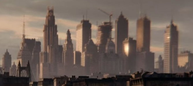
But anyway it was cool to see Wayne Tower in the background.

2024-06-20 11_29_43-The Art of The Batman on X_ _Gotham City in 'The Penguin'. https___t.co_wo...png
And I think this is the batsignal building? The bat-signal must show up in the show at least lol The film made such a big deal about it being a big thing amongst criminals when it shines on the sky, it'd be cool to see it from Oz's perspective.
 
Overall, I quite liked that new The Penguin trailer. It's pretty much what I expected.

Farrell still looks perfect and so does Cristin Milioti. It's very nice to see that Gotham remains atmospheric, even in daylight, and to see the film's visual signature being somewhat conserved. Sure, the vignetting isn't quite as organic and some brief shots look a bit bland to me, but I'm keeping in mind that it's a series, so that should be fine.
Really, I have no real complaints about what's shown in itself, but at the same time... I have to admit that I don't feel all that hyped.

What's shown surely retains the film's distinctive style, yet I'm left with a feeling of... deja-vu?
I suppose I'd have liked a little something extra "crazy" in this trailer like, I don't know, a tease for the Ventriloquist or something... Not that that kind of thing couldn't actually show up in the show! (we seem to have a Karlo who should appear, so I imagine the name isn't chosen by chance and that it won't just be a sterile easter egg).

Anyway, I'll be there for the premiere regardless!

------

About Batman's presence... I have the impression that many are caricaturing the thing a bit, but just to give my modest opinion:
Sure, the show is all about Oz. But considering that the whole thing will deal with Falcone's succession, the empire that was at the heart of the story in The Batman and that, on top of that, is the very organization that made use of the Waynes' fortune, corrupting their name in the process... so then yes, I think it's legitimate to think that Batman must intervene at some point.

Of course, there's no question of him appearing in every episode, but I think his influence, one way or another, on the course of this gang war is inevitable.
And I'm pretty sure that's something the series is actually saving as a surprise...

------

Last thing : that poster is really, really cool.

GQhS-U1WQAAxgFD
 
What's shown surely retains the film's distinctive style, yet I'm left with a feeling of... deja-vu?
I suppose I'd have liked a little something extra "crazy" in this trailer like, I don't know, a tease for the Ventriloquist or something... Not that that kind of thing couldn't actually show up in the show! (we seem to have a Karlo who should appear, so I imagine the name isn't chosen by chance and that it won't just be a sterile easter egg).

It is labeled as Teaser 2 so we'll get another, hopefully more detailed joint at SDCC or something.
 

This sums up some of my general feelings towards the look of the show. I hate how low the standards have become for these mega expensive productions, in this case I find it more egregious because the movie nailed what it was going for really well. (Yes I know some of these photo comparisons aren't the best but still, the general idea is true. The average episode of Sopranos, The Wire, Boardwalk Empire looks better in general. Even stuff like Gen V, Fallout and The Boys also looks significantly better and they're also streaming fare)

And yes, I know they were trying to imitate the look of The Batman, and my response remains that if the result was this they shouldn't have even tried. Would've been completely acceptable for the show to create an entirely different visual identity that made better use of its resources, instead of one that tries to replicate something they can't replicate and in the process basically scream in your face "We don't have the same budget or skills as The Batman" in every frame.
 
I think Fallout looked fantastic. But what's more surprising to me is how much better this looks than a lot of the Disney+ Star Wars shows from a production standpoint. Maybe it's just because they are making sure it fits in with the Reeves film, but I'm honestly surprised it looks THIS good.
 

Users who are viewing this thread

Back
Top
monitoring_string = "afb8e5d7348ab9e99f73cba908f10802"