It's a Bird, It's a Plane, It's the Superman Costume Thread! - Part 2

Status
Not open for further replies.
I would think losing the trunks would improve "balance" if anything. Now there's an expanse of blue, and an expanse of red, highlighted by the shield and the red boots.
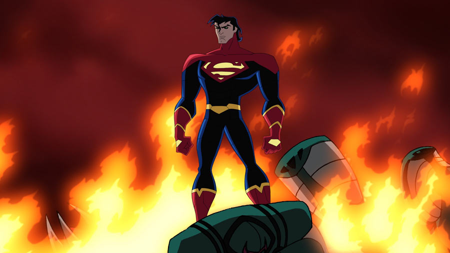
 
I would think losing the trunks would improve "balance" if anything. Now there's an expanse of blue, and an expanse of red, highlighted by the shield and the red boots.
It's more like an expanse of red, huge expanse of blue and another expanse of red. That arrangement of the color spaces to my eyes is imbalanced, like I said, you don't need the trunks but if ya leave them out, I'd say get rid of the red boots too then the color elements are balanced again, imho.

Another way to balance the color distribution would be to add red gloves to the costume like here, that's a balanced design too.

losh_kel05.jpg
 
Last edited:
Then it would look like he's wearing feetie pajamas. It's not really that huge an expanse of blue, because there's the red and yellow S-shield on his chest that draws the eye. The red cape being big enough to drape behind the whole thing kind of inherently balances it all out. It's a constant visual presence behind the blue.
 
It's more like an expanse of red, huge expanse of blue and another expanse of red. That arrangement of the color spaces to my eyes is imbalanced, like I said, you don't need the trunks but if ya leave them out, I'd say get rid of the red boots too then the color elements are balanced again, imho.

Well, the way you've described it, the MOS suit goes (from top to bottom) red, blue, red. That's sounds balanced to me seeing as as the red "bookends" it, if you will.

Also, I'm not sure how a "top heavy" Eradicator suit is considered balanced if its heavy on one side.
 
How about we try this a different way.

Break the suit all the way down to just the color distribution:

ColorDistribution.jpg

Left is classic, right is MOS. Discuss.
 
How about we try this a different way.

Break the suit all the way down to just the color distribution:

ColorDistribution.jpg

Left is classic, right is MOS. Discuss.

Well technically speaking, there are some form of yellow thin lines for the MOS suit.lol
 
Excellent simplistic breakdown. I think it demonstrates that, while the MOS does look quite nice when broken down to its core-most elements, the classic suit has that intangible quality that makes it an instant classic. It's similar to what Mark Millar was saying in reference to Superman art and actors: sometimes you can just tell when an artist draws Superman properly (Curt Swan, Jose Luis Garcia Lopez, John Byrne in his prime) it freaking looks like Superman, and when one doesn't it's very obvious. "It’s just an X-factor or an understanding of the character," he says.

Cavill happens to epitomize that philosophy in a way no actor genuinely has since Routh. During his off days he looks like Superman. It's the same for the costume. The MOS one is good...but the classic is, simply, Superman.
 

This is why I wanted to know what people meant by balanced. Looking at it this way misses something important about fashion: how it applies to the body. Having the briefs isn't really about "balance". Is a plaid shirt and solid pants "balanced"? You dont need balance for an outfit to look right. In fact, trying to balance things can mess up a look.

The only defenses for the red briefs I buy is if the costume is supposed to be flashy and over the top or for nostalgia's sake. It has nothing to do with balance nor is balance necessary.
 
Last edited:
and with that idea of comparing the classic costume to the new...


+Christopher+Reeve+Superman


jd7yo4I.jpg
 
Combine the best elements of the two and it would be perfect imo.
 
^^^

That would actually be the evil superman costume from S3 haha


Evil_Superman.jpg
 
Almost-Bizarro. I like it.:up:

It's funny, Superman III gave us almost-Bizarro and almost-Brainiac.
 
Combine the best elements of the two and it would be perfect imo.

Dont think that would work, depending on what you mean of course.

Clearly from two different eras combining them is dangerous, since the best thing from the Reeve-suit is the colors imo. It could end up looking really bad combining them wrong, man.

I think they both work weel within their own eras. But yeah, they're really different. Has the world really turned this gloomy? :csad:
I wanna live in the 70s then. :cwink:
 
Ha, this is the only manip of the MoS suit that I like.
 
I think it wouldn't be as bad for some if the MOS suit had two different shades of Blue going on for it, with the main bodysuit being more of a lighter blue and the alien lining design being that current dark blue color that we have in order to put more emphasis on its attachment to the suit and putting more details on it as well.
 

The biggest thing for me is that with the MOS suit, my eye goes directly to the shield area. That's not the case for the classic -- my eye is distracted.

For that reason, I think the design of the MOS works and works a little better. I mean what is more Superman than the shield?
 
Last edited:
Excellent simplistic breakdown. I think it demonstrates that, while the MOS does look quite nice when broken down to its core-most elements, the classic suit has that intangible quality that makes it an instant classic. It's similar to what Mark Millar was saying in reference to Superman art and actors: sometimes you can just tell when an artist draws Superman properly (Curt Swan, Jose Luis Garcia Lopez, John Byrne in his prime) it freaking looks like Superman, and when one doesn't it's very obvious. "It’s just an X-factor or an understanding of the character," he says.

Cavill happens to epitomize that philosophy in a way no actor genuinely has since Routh. During his off days he looks like Superman. It's the same for the costume. The MOS one is good...but the classic is, simply, Superman.

Sorry, but I don't find that argument to be valid at all.

Of course, the classic suit looks like Superman because it's the exact suit the was created for him. That is far from being as impressive as Cavill embodying a fictional character because he wasn't created to look like Superman.
 

Like so! This is perfect, imo. It "breaks up the blue" (for which I didn't see necessary) and stays away from giving him trunks (for which stylistically and modernly aren't necessary).

So for those who feel there needs to be a break up, this is more than sufficient. And if those people can't be satisfied with this, then it's nothing more than a fan missing the trunks themselves.

The biggest thing for me is that with the MOS suit, my eye goes directly to the shield area. That's not the case for the classic -- my eye is distracted.

For that reason, I think the design of the MOS works and works a little better. I mean what is more Superman than the shield?

I couldn't agree more. My eyes actually went to trunks with the classic. Were as with the MOS suit I went straight for the shield. From there I went to the red in the cape and boots. I love the classic Superman, don't misinterpret, but I also see the beauty in the New suit and find that it just makes more sense.
 
I think it wouldn't be as bad for some if the MOS suit had two different shades of Blue going on for it, with the main bodysuit being more of a lighter blue and the alien lining design being that current dark blue color that we have in order to put more emphasis on its attachment to the suit and putting more details on it as well.

That would work. But I would prefer silver or black.

That said, in the actual film, I've no doubt that they'll make it all stand out.
 
Status
Not open for further replies.

Users who are viewing this thread

Back
Top
monitoring_string = "afb8e5d7348ab9e99f73cba908f10802"