Le Diable Blanc
Superhero
- Joined
- Aug 21, 2006
- Messages
- 6,402
- Reaction score
- 0
- Points
- 31
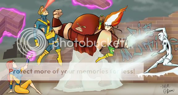
Wow great improvement  But Jean will have to look in Juggs' direction. I like that it looks like she's cornered though.
But Jean will have to look in Juggs' direction. I like that it looks like she's cornered though.
 Coming out great
")
") I have been trying to save the real shaddows and color work to the end, but (to me at least) those bright solid colors are almost hard to look at!
I have been trying to save the real shaddows and color work to the end, but (to me at least) those bright solid colors are almost hard to look at!