The Amazing Spider-Man 2 Rate the NEW ASM2 costume!!!

Rate the NEW costume...

  • Best Spidey costume yet!

  • Slightly better than Raimi's costumes

  • The same as Raimi's

  • Worse than Raimi's

  • Worse than the first ASM's costume

  • Best Spidey costume yet!

  • Slightly better than Raimi's costumes

  • The same as Raimi's

  • Worse than Raimi's

  • Worse than the first ASM's costume


Results are only viewable after voting.
Status
Not open for further replies.
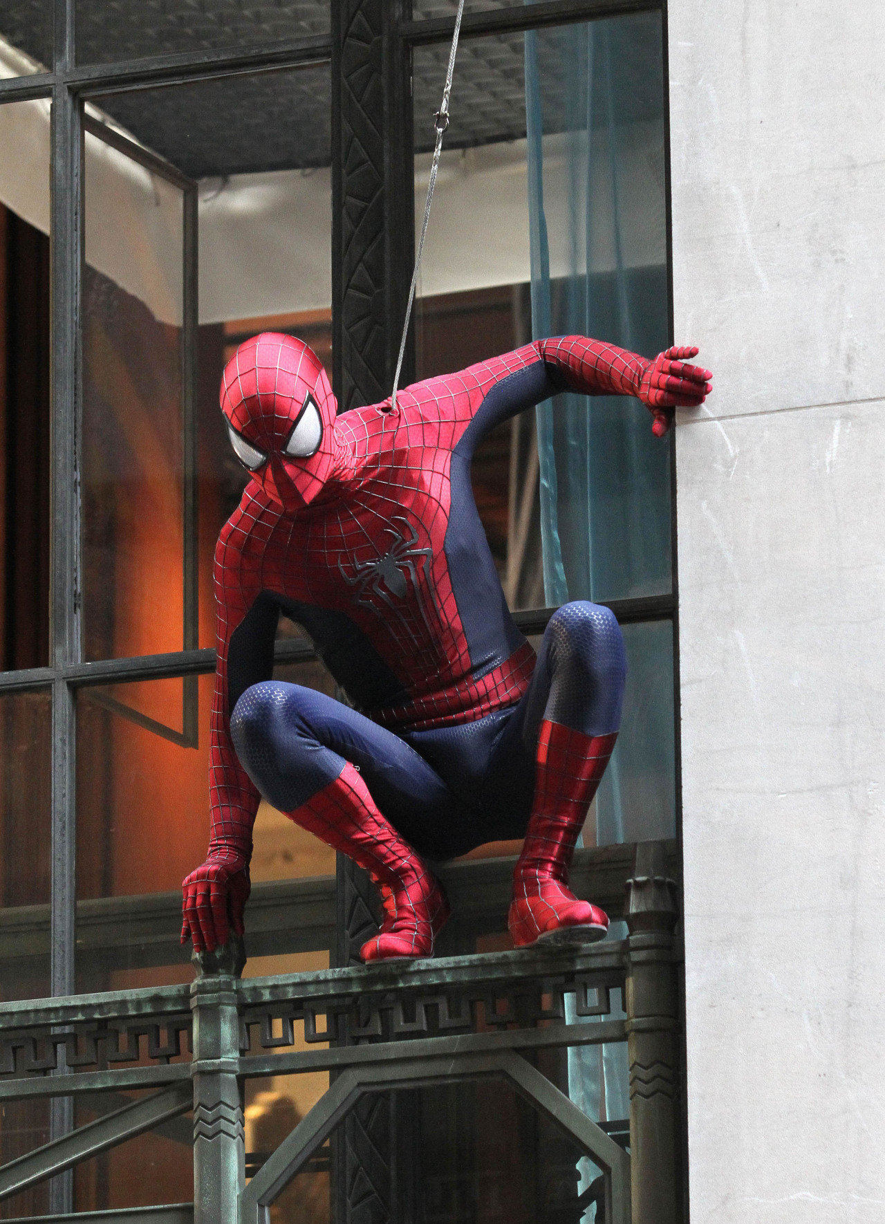
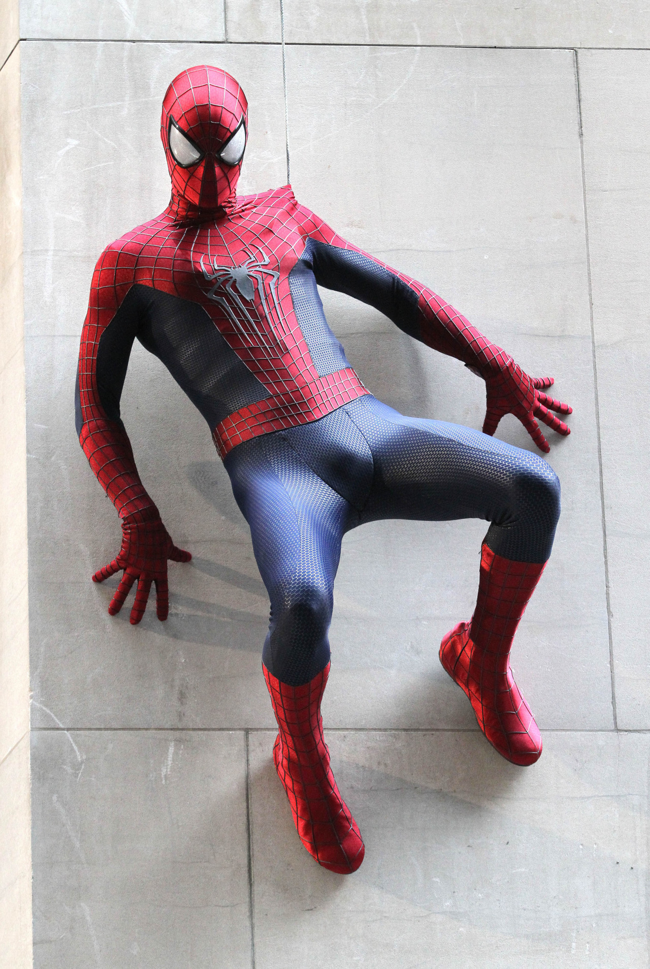
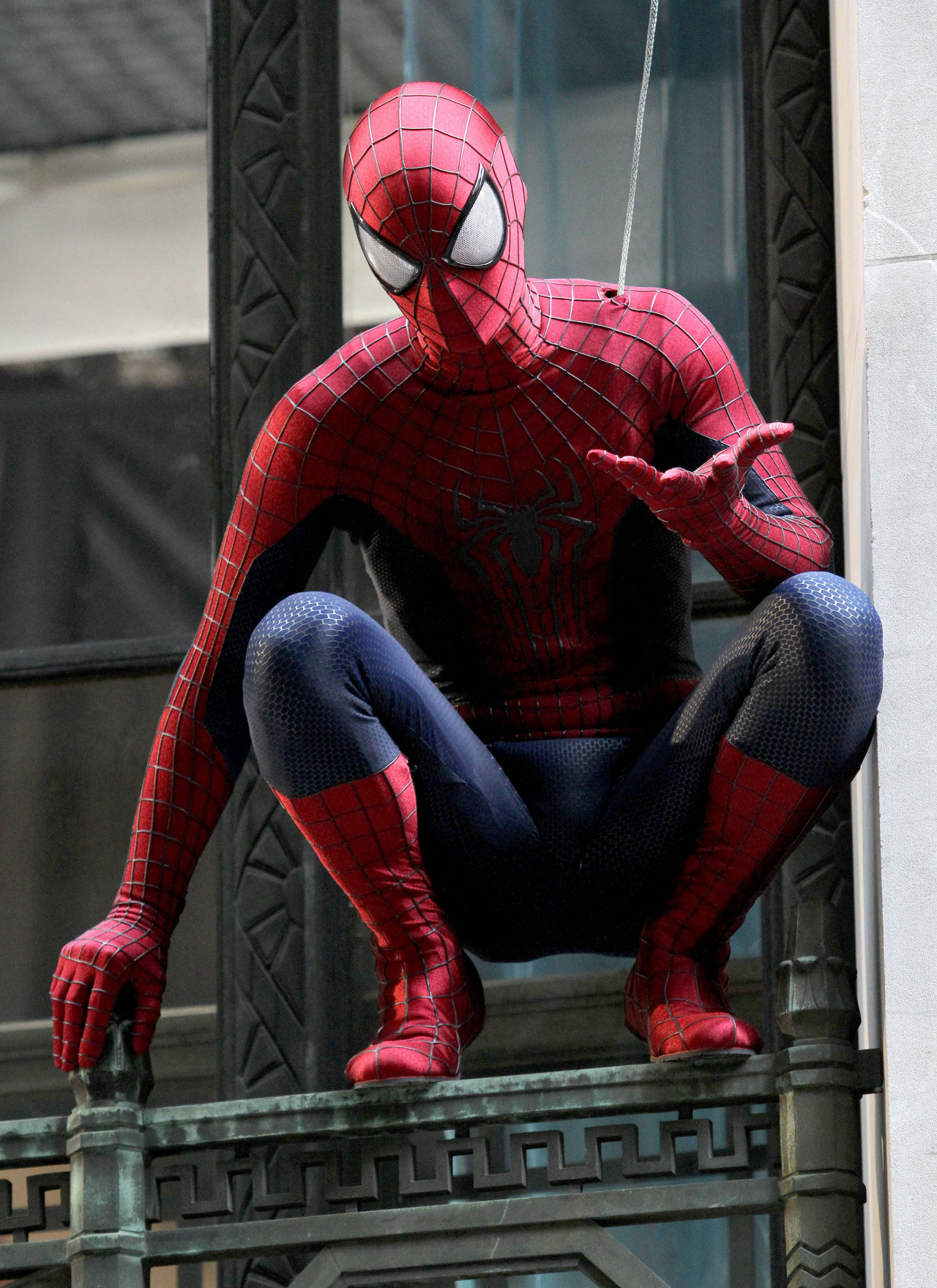
Honestly, I'm still on the fence about the new costume. While it is comic accurate...etc etc, it looks too similar to Raimi's. And while Raimi did have a phenomenal iteration, the Amazing Spider-Man suit grew on me. I personally like that suit more than the original design.

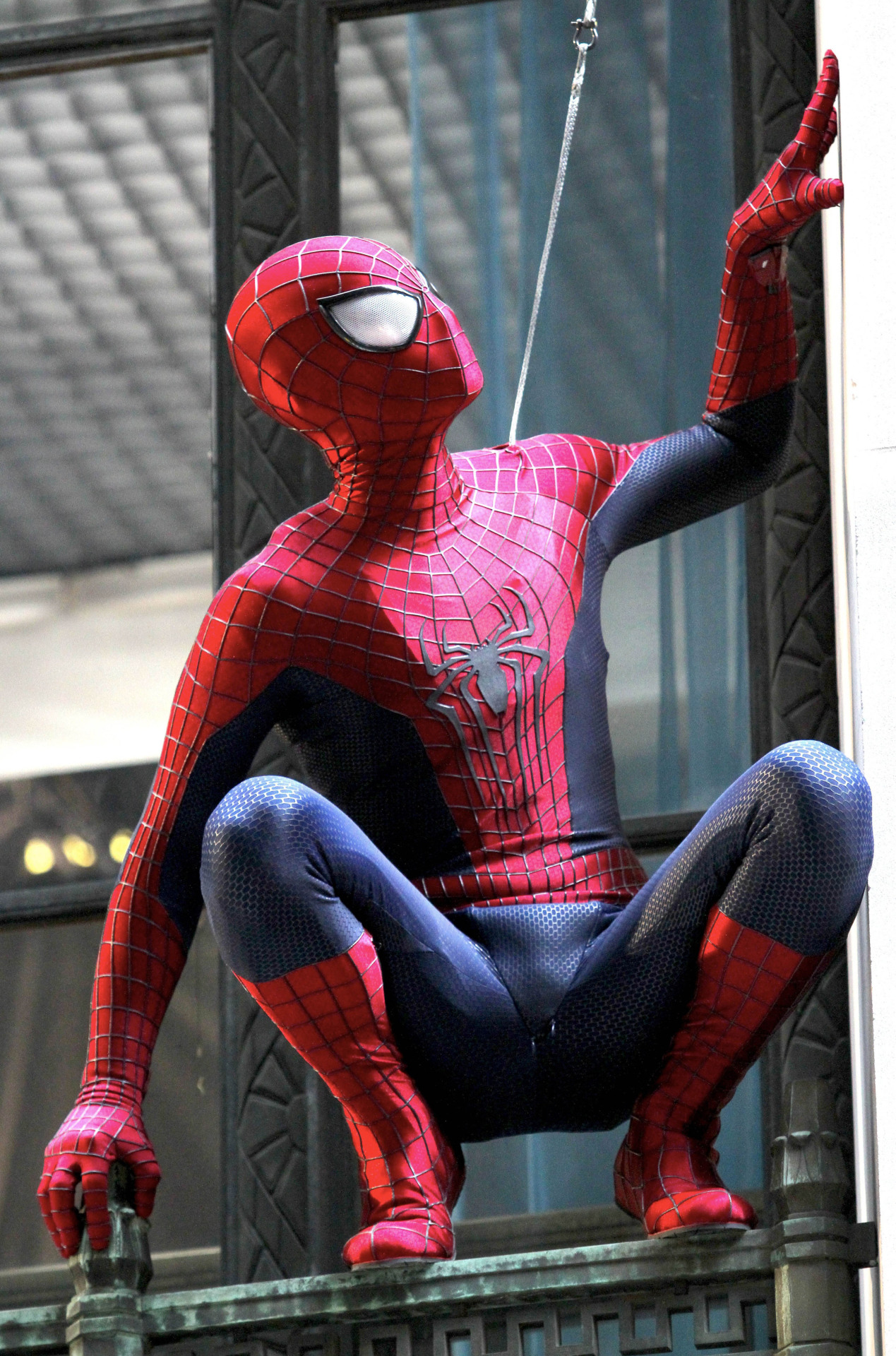
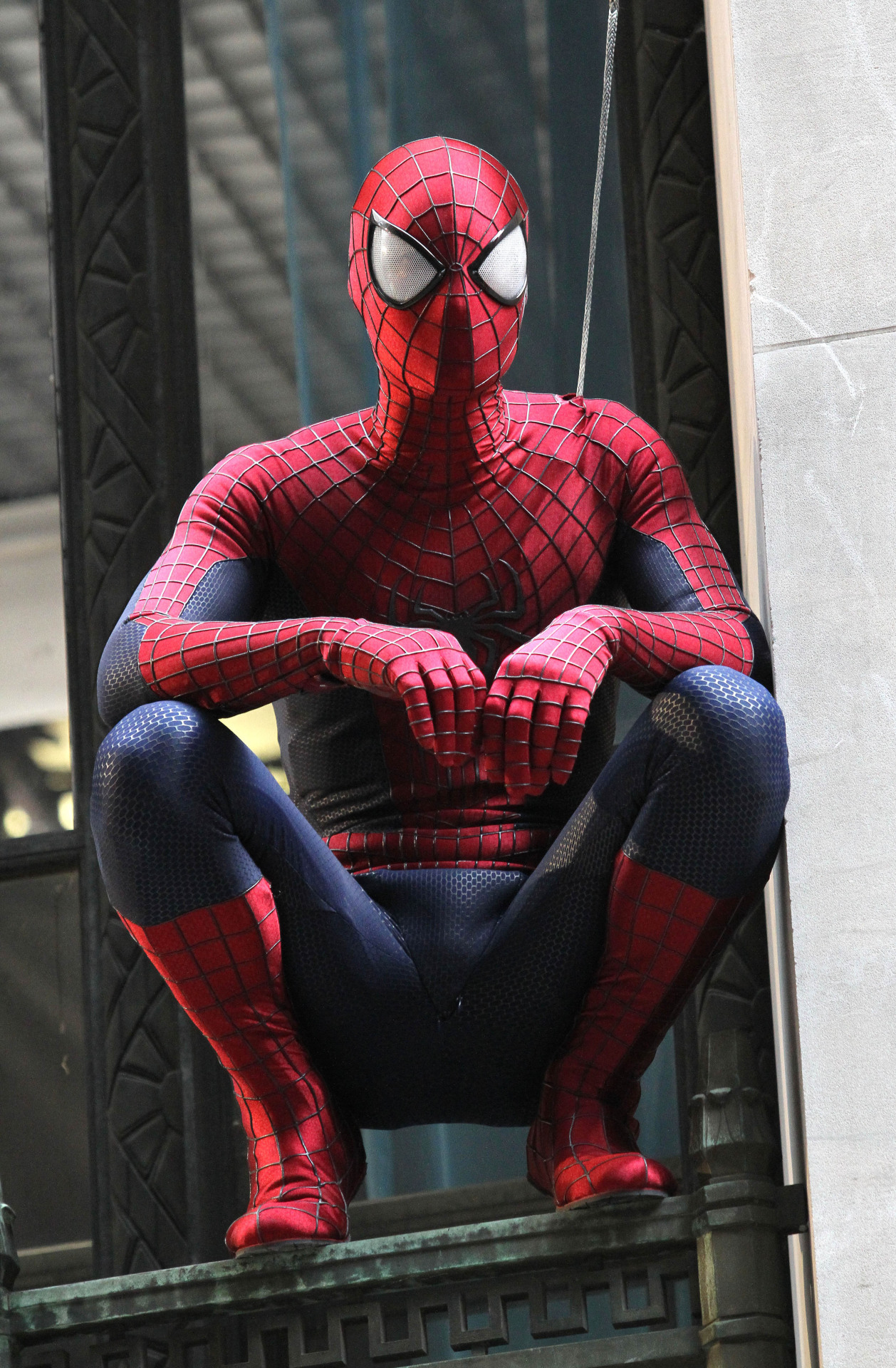
A lot of people talk about the design/the flow of it being horrendous. That the designer didn't know what she was doing. Personally...I think she knew exactly what she was doing. That costume contoured perfectly with Andrew's physique. It kind of felt like a MODERN Spider-Man costume.

I will say though, the costume was far from perfect. I personally didn't like how the web pattern wasn't consistent through out. That was one of the only gripes I had with the costume. The leg stripes grew on me as well.

Personally, I think Nathan had the right idea. They should have taken the original suit and modified it to look more "classic". I think the texture of the Amazing Spider-Man suit is what I find most appealing. Sure people can say "It looks like a basketball" but honestly, the fine details are something that made it stand out. The new texture for the new suit is kind of bland. It doesn't "pop" like The Amazing Spider-Man suit.

Granted, all we do it have spy photos. I'm going to refrain from making a final judgement call.
 
The new suit;s griwing on me. I just wish they would have made the webbing on the suit was flat and black.

Yeah that's never going to fly. Flat will make it a Halloween costume. The webbing is just not going to work flat. It works in the comics because they can play with the lighting.

Black is never going to really happen because it's a smooth raised black surface. Light is going to reflect on of it.

I think the eyes on the new costume were a mistake. They look really hoaky. They could have kept the size but I think they should have been like the lenses of the first suit.
 
I think the eyes are perfect. They sell the overall look to me more than anything else. They should have been that way all along.

I'd mention my personal preference for armpit webbing, but that's just cue the usual mob to come in and tell me how wrong I am for thinking it looks cool. Screw me for having an opinion, rite?
 
I hope there's no complaining from those who wanted bigger lens. Judging from all of those manips with excessively large eyes (way bigger than what we have), they got what they wanted now.

Personally, I would've preferred if they were a bit smaller because at this point, they definitely straddle the lines of becoming too cartoony. At the right angle and profile, they look good but the frontal shots really look too large imo.

yeah i am a bit concerned he won't look too good from all angles. the semi-focused pic behind the max dillon reveal pic didn't look too great. it didn't look bad either, but yeah...

note: the pic behind max may be an artist interpretation and not an actual photo of spider-man, so who knows.
 
VI8Y4CM.jpg


I'm actually quite fond of the new costume. Love the large eyes. Reminds me of Ultimate Spider-Man.
 
Probably the filmmakers didn't bother to look at all angles. I bet it didn't even occur to them to try out different shots.
 
The most obvious angle to look at the suit would be from the front. I mean, seriously...But other than the front which I find questionable, the mask looks good from all other angles.
 
It's not flat though, which I don't mind considering it would look too homemade.
 
And it wasn't even that ugly. Come on, does this seriously look so bad? I think it looks great. All that was needed for the sequel were a couple of tweaks here and there.


I prefer this design to the original IMO. It is a beauty. It just looks so sleek.

Everything about it worked. Well, I do have issue with the leg strips, but I got over it by the time the film came out.

IMO, if you compare the set pics of both this costume and TASM2's costume, I think the TASM suit come out on top.

If this had the belt, no silver trim and no leg strips, I honestly think you would not have as many complaints about it. But that's just an opinion.
 
If this had the belt, no silver trim and no leg strips, I honestly think you would not have as many complaints about it. But that's just an opinion.

The belt and leg stripes were the only elements I didn't like about it.

Although after seeing the new eye lenses I choose to dislike these retroactively. :p
 
The TASM had too much little things wrong with it for me to really accept it. Frankly I'm grateful that they decided to go for a much better looking suit.

The only thing I'd say the TASM suit has above the new suit is that the material of the new suit looks a bit cheap. Both the TASM suit and the Raimi suit looked like it was made of a sturdier material.

What bothered you about the TASM suit in particular if I may ask? :)

I actually think, from the set pic, this suit looks inferior (and those bigger eyes... they look goofy to me).
 
What bothered you about the TASM suit in particular if I may ask? :)

I actually think, from the set pic, this suit looks inferior (and those bigger eyes... they look goofy to me).

Changes. Any changes. :o


But seriously. My main gripe were those tracksuit style lines on his legs. The lack of a belt which to me exaggerated the the length of the red part on his chest and abs. The web pattern on the head part of the costume was too grid-like and the added flourishes on the boots just seemed superfluous. Plus the colours were a bit too dull. The eyes didn't bug me so much, but I wouldn't have went with them either.

lol. Fair enough dude :)

My only gripe with the costume personally was the leg strips. The rest I loved. The thinner red on the torso and thinner arm strips, the segmented gloves (my favourite) and the sporty looking boots. :)
 
And it wasn't even that ugly. Come on, does this seriously look so bad? I think it looks great. All that was needed for the sequel were a couple of tweaks here and there.


I think it looked phenomenal. Even weird stuff like the blue fingers grew on me towards the end. And that blue... the way it integrates the spider legs into the edge of the red chest area... Sigh. You will be missed.
 
I think it looked phenomenal. Even weird stuff like the blue fingers grew on me towards the end. And that blue... the way it integrates the spider legs into the edge of the red chest area... Sigh. You will be missed.

lol. It was actually the way the blue was incorporated into the gloves which was one of my favourite bits. Most of what the TASM costume did I thought improved over the classic design.
 
I'm sold on the costume with the new pics, looking good. Can't wait to see it in motion.
 
I take back what i said about the eyes. LQ pictures really suck for this costume. The eyes become too white and the material of the costume becomes too shiny. In HQ alone everything works. With a little post this thing kicks ass. The costume has once gain been perfected. If you have issues now, you just don't like Spider-man.
 
Status
Not open for further replies.

Staff online

Members online

Latest posts

Forum statistics

Threads
202,374
Messages
22,093,820
Members
45,888
Latest member
amyfan32
Back
Top
monitoring_string = "afb8e5d7348ab9e99f73cba908f10802"