Naite22
Superhero
- Joined
- Feb 7, 2005
- Messages
- 8,831
- Reaction score
- 4
- Points
- 58

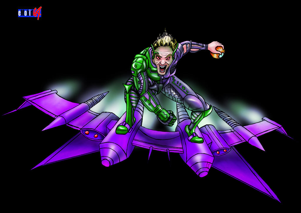
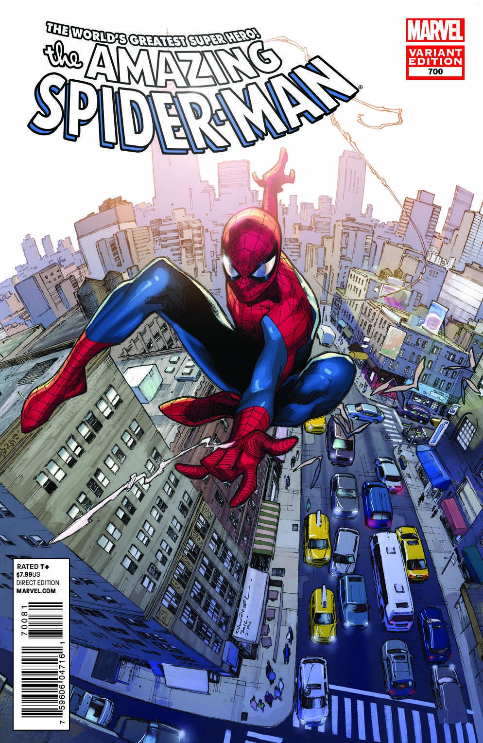
Found this beauty on Deviant Art. What do you guys think?
A few "minor" changes I'd make.
-Remove webbing.
-Have NO shades of grey in the fabric!
-Make spidey symbol much bigger.
-Turn both eyes & symbol completely white.
All for two reasons.
Nr.1
It then wouldn't be compared to Raimi's SM3 farce!
Nr.2
It'll be so much more badass and more true to the comics. Simplicity is the winner.
Last edited: