SpeterMan3
SpeterTV on YT
- Joined
- Apr 10, 2009
- Messages
- 3,569
- Reaction score
- 157
- Points
- 73
khasanovabror... Welcome.
Once again, thank you all for the positive feedback!
I did another quick work, once again just copying some comic book covers, this one is a bit lazy version obviously.


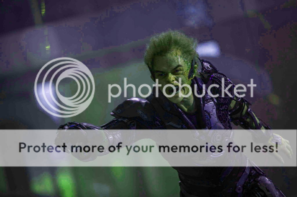
Not much, just playing around with Harry Gobby's colours.

Original


Yup...Id be happy with that! Maybe add a pointed aerodynamic helmet and we are good to go


Another go at giving Harry classic colours.
I used the new image that was released.

Here's the problem for me. The above looks like a cross between a cheesy power rangers villain, and the Grinch...
I know some of you are very passionate about that classic look, and that's cool. But I think Harrys look in this film is so cool as it is. I'm glad he's not all purple/green.
 ldrazz;
I like the green and purple some are giving tto him, but I also agree it is way too vibrant looking.
 I do have a less vibrant one, but it's not worth uploading.
Sad when fan art manips look better than what we're getting.
Good job pal.

Sad when fan art manips look better than what we're getting.
Good job pal.
Sad when fan art manips look better than what we're getting.
Good job pal.
A few "minor" changes I'd make.
-Remove webbing.
-Have NO shades of grey in the fabric!
-Make spidey symbol much bigger.
-Turn both eyes & symbol completely white.
All for two reasons.
Nr.1
It then wouldn't be compared to Raimi's SM3 farce!
Nr.2
It'll be so much more badass and more true to the comics. Simplicity is the winner.


Found this on Deviantart

Wow! Nice work.