Loden Greatstorm
Suko
- Joined
- Mar 6, 2015
- Messages
- 25,169
- Reaction score
- 4,970
- Points
- 103
Nothing satanic please!


I hereby demand batman change his moniker to the Gray Knight, so as to reflect his dominant color scheme.It's not even realism. It's that even in the confines of the story it still makes no sense for Batman to choose to wear blue. He's the dark knight, not the blue knight. And bats aren't known for being blue.
The batsuit in the comics is always intended to be black:On the topic of blue vs black: while I'm pretty much 100% certain it's gonna be black, I'm honestly cool with either. If they went with blue, I think a shade akin to Cap's Winter Soldier suit would definitely work on film.
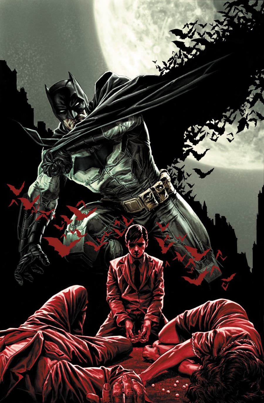
And anyone who said that blue & gray Batman can't be visually striking and fit a "gritty noir" tone:
.jpeg")
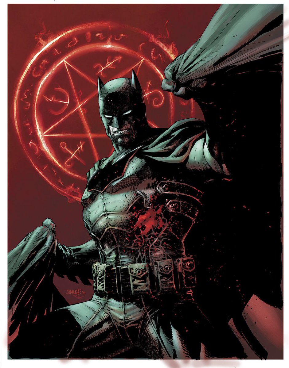
The batsuit in the comics is always intended to be black: View attachment 28778
They couldn't draw it black out of shading problem. As for the Arkham City suit, I'm pretty sure thats black as well. In the cutscenes it certainly looks black.
It doesn't look blue to me. It actually looks kinda purpleThe Arkham City suit model is 100% blue. It's a very dark blue to the point of looking black under certain lighting, but it's still blue. It was black in Arkham Asylum, however and I believe they may have made it black in Return to Arkham City. And while the batsuit was always intended to be black, that doesn't necessarily mean much. Spider-Man 2099's suit was intended to be black also, but it's now widely regarded as being blue just because that's the colour most people associate it with. Blue can still look good for Batman. Would I prefer black? I personally would, but I'd by no means be against a blue batsuit so long as it isn't too light.
It doesn't look blue to me. It actually looks kinda purple
Jesus Christ, it's blue.It doesn't look blue to me. It actually looks kinda purple
That's why the cowl in Arkham Knight looks better then!
If you are doing an all black suit then a yellow oval is a must. There is no point to having a bat symbol on the chest if you can't even see it because it just blends into the black of the rest of the suit.
All black and/or any yellow is a mistake either way.If you are doing an all black suit then a yellow oval is a must. There is no point to having a bat symbol on the chest if you can't even see it because it just blends into the black of the rest of the suit.
NahAll black and/or any yellow is a mistake either way.
I understand that some like it. I think its cartoony and silly.Nah
I love the yellow symbol and I definitely want to see it again someday.
What, in a comic book? Get outta here.I understand that some like it. I think its cartoony and silly.

The black, chest-spread- bat, like in the Arkham games and in the conventional comic batsuit just makes more sense than the oval given the purpose the symbol is meant to have. It's meant to be a target for people to shoot as it's the most armored part of the entire suit. Having it be a tiny oval in the middle of your chest implies that Bruce thinks that everyone's going to hit 100% accurately at center mass when they come face to face with something the entire city regards as a creature of the night who preys on the guilty. It's just...kinda stupid. There's just more to shoot with the Arkham style symbol which takes into account that people, especially when scared, don't exactly shoot 100% accurately all the time. Plus, it just looks better. If they HAD to incorporate any yellow or gold into the symbol, I'd rather they went with an outline like in the Rebirth suit.