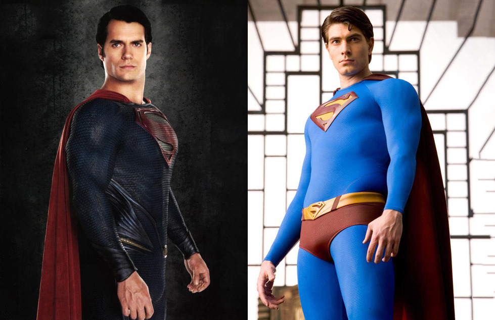
I remember back in the day before Superman Returns came out, how I grilled on the SR suit. I hated the colors, how the Blue is washed out and the red is more of a burgundy color, the manties, the symbol baby emblem.
And now, seeing the MoS suit, I don't see those faults with the SR Suit (except for the small emblem). I think it's more modern and has that comicbook feel to it.
The MoS suit, which I like and now that I'm older..... I'm more acceptable and mature about it, but the suit is too dark. If this was the suit for SR, I would have gotten a heartache.


 Lily Adler🔥 Hot Scoops 🍨
 OnTheAirWakandan Ambassador
 SwordOfMorningSuper Moderator

