• The upgrade to XenForo 2.3.7 has now been completed. Please report any issues to our administrators.

BvS Anyone else hope they change the logo?

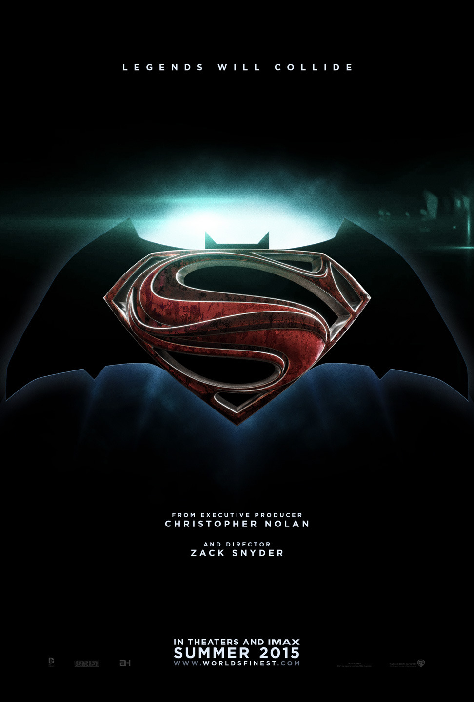
I was never in love with the Nolan films bland Bat logo in the first place. I mean it was okay. This logo is fine to me, not great but not terrible either.

Me neither.

I always liked the DKR suit logo though so I'm ok with this. I love the oval too and wouldn't mind seeing that used in marketing the movies again even if it's not on the actual costume. It's like the go to bat logo in terms of merchandising for a reason. Pretty aesthetically pleasing and distinctive.
 
i hated how small the bat logo was in the TDK & TDKR suit

personally, i loved the Batman Begins suit more
 
I liked the BB suit but I prefer the helmet cowl from the sequels to the cowl used in BB.
 
1001202_10100390537806297_1172741130_n.jpg


- Jow
 
I think the new batsymbol is blocky and hideous. I've seen much better manipped superimposed symbols here on the hype. I hope those who are calling this a placeholder are correct.
 
I think the new batsymbol is blocky and hideous. I've seen much better manipped superimposed symbols here on the hype. I hope those who are calling this a placeholder are correct.

I hated it at first but now that anjow has cleaned it up, it's kinda growing on me
 
I really love it, seems so badass and old school, honestly gets me pumped to see the whole costume
 
I do. Looks pretty butt-fugly.
 
I like it, just slim it down slightly and and curve those flat areas that lead to the points at the bottom.
 
I don't like it at the moment. I think the "old school" symbol is better such as the one easter egg in I Am Legend

zWjXlMd.jpg
 
I don't like it at the moment. I think the "old school" symbol is better such as the one easter egg in I Am Legend

zWjXlMd.jpg
Much much better than the new one. The "S" shouldn't cover up the whole bat. We need to see its head and ears.
And I'm a fan of the shape of the wings, as it is pretty close to the Burton days.
 
I don't care about the Batman logo, but I think the Superman logo needs to be changed. I don't like it, and it's my least favorite part of the new suit.
 
I like it and think its fine. Maybe a tweak or two but it does not look that bad
 

Users who are viewing this thread

Back
Top
monitoring_string = "afb8e5d7348ab9e99f73cba908f10802"