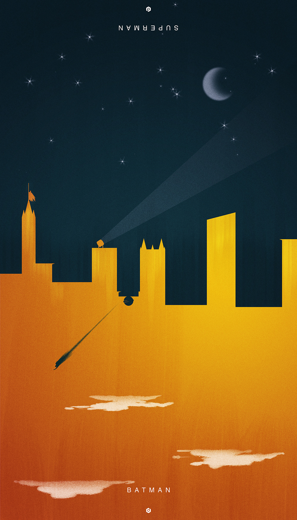
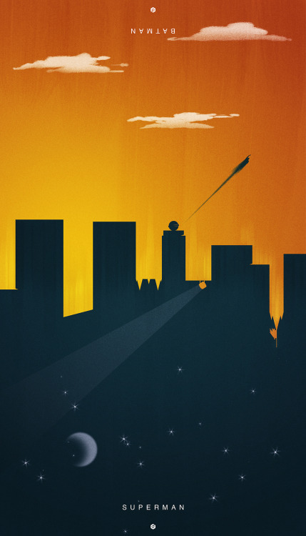
BvS Batman Vs Superman Manips & Art

Status
Not open for further replies.
Found these:
Would like this version of the cowl also
Kane_cowl_painted-1.jpg


49jo.jpg
:D
 
Still dont get the above Bat-manip. Is it ironic?
 
don't think so...i just couldn't withstand to make a joke...
 
The color scheme, the cowl and attachment, the Bat symbol. I like everything here but the rubber (again) and the belt. With a few tweaks this would be an exciting suit.
 
The color scheme, the cowl and attachment, the Bat symbol. I like everything here but the rubber (again) and the belt. With a few tweaks this would be an exciting suit.

Honestly the suit was just basically adapted from the New 52.
http://comicbook.com/wp-content/uploads/2012/08/DC-New-52.jpg

Seeing how Superman's costume in MOS sported many characteristics of the New 52 costume (the lack of trunks, the sleeves a litte past the wrist, etc.), I found it appropriate for the new Batman to be similar to the New 52 version as well.

The New 52? It's basically Lindy Hemming's design from TDKR with a larger bat symbol. Either way, I think the commonality between the New 52 suits (shown in the image you've presented) and Hemming's interpretation of Batman's costume is what I perceive as an overabundance of seams; and that's one of my biggest pet peeves with both designs. It gives the impression that what you're wearing is composed of thick, glued-on plates. :barf:
 
I honestly don't see the fuss about Batman's suit. Never did. Besides the nipples from Shumacher ive actually enjoyed every live-action bat suit. Most of the comic designs and animated designs of his suit have been fine to me as well. Im not fussy. Most of the time Batman's suit looks badass to me no matter how different they are. Keaton's, Bale's in TDK/R, the suits we've seen Conroy's version wear, the comics, etc. It's ALL good to me.

Affleck's suit design is the last thing im worrying about.

Yeah, the only one that doesn't sit well with me is the special suit he wears at the end of B&R with the blue and silver. Otherwise, I think the rest are good -- even the nipples don't bother me (the Roman's had nipples on their armor too).

Now, obviously I have some favorites but the B&R special suit was the only one that disgusted me.
 
New Fan Art. Enjoy :woot:

n6kz.jpg

Some really nice artwork, though I feel like it would look better with more subtle text, in the same font and style as Man of Steel. It's a little hard to see whats happening.
 
Yeah, the "Public Enemies" watermark kinda ruins it for me
 
that looks cool. how about putting the text on the letterboxing.
like

PUBLIC
stuff
ENEMIES
 
Status
Not open for further replies.

Users who are viewing this thread

Staff online

Latest posts

Forum statistics

Threads
200,557
Messages
21,759,366
Members
45,595
Latest member
osayi
Back
Top
monitoring_string = "afb8e5d7348ab9e99f73cba908f10802"