Superman Returns Have your thoughts about the suit changed?

ROBOCOP CPU001 said:
could it be your over reacting just a little?

but i get your point,every person has there own idea..or favourite version of the Costume,Me personally i like the new look.. but i hope the neck attachment is adjusted for the sequel.
when i see the sequel i want to see this. lets face it. routh has not such a skinny neck. the suit makes the skinny.
costumefade.jpg
 
Im getting flashbacks of the whole Batman Begins cape clasp arguments from that board last year reading this stuff about Rouths Cape and Collar. And you know what guys? The same exact damn thing is going to happen.

When the film is released, NO ONES GOING TO PAY ATTENTION TO PETTY DETAILS LIKE THAT!!!

It will be an after thought, like "Oh yeah, I guess I forgot about that. Guess it didn't really effect the movie or the story after all". Uh-huh, no kidding... :rolleyes:

This just comes from gawking at still photo's for too damn long. please, WB, show some more footage or release the trailer VERY SOON so we can get past this nit picking about the costume already!
 
I'm still not very taken with the suit, it's all the little askew details, that when taken in as a whole, just leave me with an odd impression of it. Im so used to the lower neckline, higher boots, brighter hues, and larger shield emblem, that it's very difficult to look at this suit and not notice that it's "off" the mark. Interestingly enough, The Batman Begins Suit, was just as radical of a departure from the traditional Batman Costumes but it didn't bother me in the same way that these alterations do.
 
Lujho is overreactinga little. The only visual flaw of the costume is the neckline/cape attachment. They just have to low it a little and maybe they`ll do it in the sequel. And its not that bad. When i see Routh in the costume, I see Superman and I think the costume is better than the one we see in the comics. Yes, i said it.
 
lujho said:
See, this is the perfect example of 2 things:

1) The "checklist mentality" I mentioned above - basically "well, it has all these elements, therefore it must be perfect".

2) The "Could have been a lot worse" mentality - "Gee, at least it's not pink and green with orange stripes - it's not that bad, therefore, it must be totally fine".

Some people just seem to have the bar set low (at the level of "okay") and be happy with that. Or they simply don't appreciate the subtleties of graphic/character design.

I'm just SICK of merely "okay", or "well, it's got all the right bits" or "it's nowhere near as bad as it could have been". Where's the aspiration in that? Where would we be if everyone thought that way?
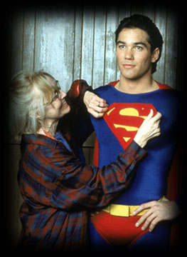


yesssssss! took, words, my mouth, etc...:up: :up: :up:
 
The suit still does nothing for me after all this time and I doubt the actual movie will chaneg that, but I just tolerate it because well....................thats the way it is.
 
I just like the suit because I think it looks cool.

Seriously, though. I did have some concerns about the color, but like I've stated before the color seen in the desaturated promo pic was not very indicative of what we'd end up seeing later on down the line. I'm willing to bet ten dollars that if the globe pic was released first, then there would've been a drastically different tone from the get go about what Supes' was to be wearing.
 
KaptainKrypton said:
I just like the suit because I think it looks cool.

Seriously, though. I did have some concerns about the color, but like I've stated before the color seen in the desaturated promo pic was not very indicative of what we'd end up seeing later on down the line. I'm willing to bet ten dollars that if the globe pic was released first, then there would've been a drastically different tone from the get go about what Supes' was to be wearing.


exactly what showtime,metropolis man and myself said.


:up:
 
Honestly the Begins costume still bothers me. The script was so good that I overlooked it.

Do like the Begins utility belt, though. Not that I want the comics to adopt it. I like the pouch belt they're using in the comics much better.
 
DavidTyler said:
Honestly the Begins costume still bothers me. The script was so good that I overlooked it.

Do like the Begins utility belt, though. Not that I want the comics to adopt it. I like the pouch belt they're using in the comics much better.


I still didn't like the rubber suit or the idea of Batman having to wear head to toe body armor, but in the context of the movie, I was too enveloped with the story to spend time dwelling on Petty Details. And besides, the cape had the suit covered throughout the movie, and the suit didn't hinder Bales movements that much. The uniform color of the suit annoyed me, but I hope Nolan does change aspects of the costume (like that) in the next film

The Superman costume was pretty damn close to what I wanted, especially because it didn't resort to obvious sculpted muscles everywhere, and the colors are dead on. I see now how the darker Red actually helps frame the suit better, and I dig the 3D S. Never could understand the people saying it's too small, but hey, lets not open that little chest nut again, shall we...
 
Saint said:
No, my feelings haven't changed. The suit still has a fundamental proportional design problem (shield, collar, briefs, boots) that makes it look weak and deflated. I won't speak on the colours until I see how they look on the screen.

I am agree a 100 % with you, the big problem with the costume, is that the proportions dont go with the proportions of the Brandon`s body and made look Routh WEAK!!!

There are only 2 points that are fundamental to change, the proportions of the costume and the hairlook, The air look that they give to Reeve is the best made yet, so I would like to give Routh a black hair and the reeve hairlook.

this two point would give Brandon a true superman look:supes:
 
And one more thing, Singer says that the colors are darker because the original colors look unnatural for a real costume of a superhero and a little childish, but the S on the belt made look the costume very childish and take of the sobriety to the suit!! Singer have some contradictory concepts!
 
At first, I didn't like it. I was adamantly against it like a lot of people were, but it just didn't fit what I had expected, esp. the belt. It's grown on me though, and when I go see the film, I doubt I'll even pay attention to the change.
 
Not much change here. The color seems better but the neckline needs adjusting for the next film and the belt could be raised about an inch or so. Lose the s buckle too. Looks tacky.
 
It just looks like the Superman suit to me, but if people want to be nit picky...
 
There are some who refuse anything less than excellence.
 
SUPERSEBAS said:
And one more thing, Singer says that the colors are darker because the original colors look unnatural for a real costume of a superhero and a little childish, but the S on the belt made look the costume very childish and take of the sobriety to the suit!! Singer have some contradictory concepts!

Even though one rendition of the suit has the S logo on the belt?
 
Whatever happened to the poster who did all these comics like this one here:

037_suit4-75.jpg


059_suit7-75.jpg
 
The collar is defnitely the only flaw with the costume. It needs to be lowered a little, that all.
 
Did Singer actually say "childish"? I know he felt that the older costume was "dated", but all in all, the new Superman costume has the main 7 attributes that a costume should have (if one goes by the supermanhomepage suit analysis).

I think he basically took the best or his favorite aspects of the costumes throughout the years and whatever would fit in with the particular style of the entire film.
 
SpiderDaniel said:
The collar is defnitely the only flaw with the costume. It needs to be lowered a little, that all.

Well yeah I see what you mean.

Superman's collar is unique to him and has been unchanged for near 7 decades... and also is one of his most recognizable though subtle features.

I don't know why it was changed. The S shield is understandable. BS just wanted to Pimp it up a little so it catches the light more. Bling bling. The neckline gives the illusion that it shrinks though. Hopefully something is done about it for the sequel. If not, then whatever.
 
I'm in agreement with Supersebas on the buckle. I think it looks tacky.

I'd like to see Singer alter the suit for the next movie but if he only makes one change.. the buckle. Lose the \S/ on it and put it back on the cape were it would look a whole lot better.
 
DavidTyler said:
I'm in agreement with Supersebas on the buckle. I think it looks tacky.

I'd like to see Singer alter the suit for the next movie but if he only makes one change.. the buckle. Lose the \S/ on it and put it back on the cape were it would look a whole lot better.
Or changing nothing on the suit in the sequel would be alright also :D
 

Users who are viewing this thread

Staff online

Latest posts

Forum statistics

Threads
200,578
Messages
21,766,287
Members
45,602
Latest member
Francuz231
Back
Top
monitoring_string = "afb8e5d7348ab9e99f73cba908f10802"