BvS Should they change the costume for the sequel?

Should they change the costume for the sequel?

  • Yes

  • No


Results are only viewable after voting.
Brighten the red, lose the two tone cape.

Some of you guys are nitpicking too much.

Briefs don't need to be larger.

Neckline is fine.

I would have agreed before I saw the film that the \S/ needed to be larger, however after seeing the film I disagree, it's fine.

Belt \S/ is redundant, but no reason to remove it.

The suit looked excellent in the movie, but to be honest it doesn't photograph that well.
 
I would take the \S/ off the belt,and put a \S /on the cape,and brighten the suit up a tad.
 
tylerdurden99 said:
One word: NO!!!

This suit is THE best suit for superman EVER

Are you ******ed?,or maybe you are joking?
 
suits fine brandons fine singers fine end of story. But if they change it 4 the seauel all i want is tyhe red a tad brighter but even if its not i dnt care cuz it looks awsome on screen anyway
 
A brighter red, yes. Probably lose the S on the belt, and maybe change the boots. I liked the suit a lot but with these small changes I think everyone will be happy.
 
Spider-Steve said:
My opinion:

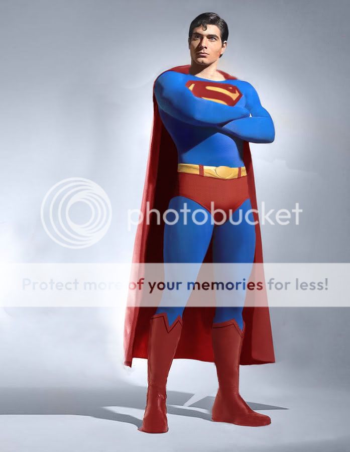
Routh has a more Kryptonian suit, Reeve has/had a more Halloween suit!

So, Superman is an alien, who wears an Kryptonian suit and Reeve played Superman with a kind of Halloween suit! Look to those boots from Reeve! Those from Routh are much better!

But i must say: Back then in 1978 they had not the materials to make a suit like they did now!

Steve


This guy has a point, but not a good one. While, yes, Supes is an alien by ancestry, the only thing about his costume that is alien is the fabric. The design was done here on Earth. In some continuities, by his adopted mother and in opthers, by himself.

However, a word to everyone reading and replying on this thread... Superman is the closest to what he is IN THE COMICS. There is no Superman series comic that features the changes made to the suit by Singer. If you want superman to look the way hes supposed to, look at him in his normal, common garb in AoS, Superman MoS, Action Cmcs, or Superman. I mean, the only difference i see in any of the comics is the precise shape of the S wich differs very very slightly on occasion. He never has an s on him boots, he never has an s on his belt and he has a \S/ symbol outline on the back of his cape that is on solid yellow. And his front \S/ covers most of his chest. Though, when Jim Lee draws him, his hair goes all over the place... its not supposed to, i mean... this guy is SUPPOSED to be perfect.. its in the name... Super.....

So, if you want to see superman look the way hes supposed to, look in the comics. I like Jim Lee's art of him, but my favorite Superman artist is Ian Churchill. The cover art for Action Comics 822 is one of my faves... too bad it has Superboy on it...


one more thing... i dont know about anyone else, but the raised \S/ on his chest was my least favorite change to the costume... its not supposed to be raised, it was the sypbol on his blanket from the ship he landed in. It is the Kryptonian sympbol for "The house of El" not to be confused with the symbol for conquerer, which is more like \8/. meh, whatever.
 
Yes

GET

RID

OF

THE

PLASTIC

ARMOR-LOOK

He looks like a toy or robot or something like in those duracel commercials.

brighten the red to atleast what spider-man's got in his movies. Take the s off the belt, put it on the cape. Widen the neckline. chop off the thick heels on the boots.

And we're good.
 
Junfan said:
Brighten the red, lose the two tone cape.

Some of you guys are nitpicking too much.

Briefs don't need to be larger.

Neckline is fine.

I would have agreed before I saw the film that the \S/ needed to be larger, however after seeing the film I disagree, it's fine.

Belt \S/ is redundant, but no reason to remove it.

The suit looked excellent in the movie, but to be honest it doesn't photograph that well.

I found it difficult to actually see the suit in the movie. It's as if it was being hidden with shadows and close crops.
 
I really didn't have a problem with the embossing of it, but I did have a problem with the small "S"s on it... instead of "S"s, they should small diamond shapes. That would make more sense to me, and wouldn't be repetitive like an "S" would.
 
you have your opinion, and I'll have mine... you get over it.
 
PSU442 said:
suit looks fine... get over it
No it doesn't. Get over telling us to get over it. You get over us *****ing about it.
 
Widen the neckline and brighten the red a little and I'm happy. :supes:
 
melfangiel said:
Widen the neckline and brighten the red a little and I'm happy. :supes:
you know, if they did this and got rid of the belt symbol, it would look just fine...
 
I'm pretty okay with the design as-is, but if some of the changes buggs discussed were made, I wouldn't mind them, either.
 
Wesyeed said:
Yes

GET

RID

OF

THE

PLASTIC

ARMOR-LOOK

He looks like a toy or robot or something like in those duracel commercials.

brighten the red to atleast what spider-man's got in his movies. Take the s off the belt, put it on the cape. Widen the neckline. chop off the thick heels on the boots.

And we're good.

ok dude you lost me there. plastic armour look? :confused:
 
F yeah. Get rid of that stupid Singer/Mingen-hack P.O.S.
 
No changes needed. The current suit is the best rendition by far. Reeve's suit was terrible with the almost pink looking cape, the granny panties and those knee high leather hooker boots. I have seen better fan costumes than the suit from the Reeve movies.
 
make the \s/ thiner and about 5% bigger and little more open neckline so it does not look like it is choking him and \s/ on cape (in 2009 im sure witht eh advancements in cgi it wont be a problem) and boot a litter higher but keep the red scheme make the blue less teal and raise the speedo a tiny bit and amke the boot less like basketball shoes
 
like this except
1. dark brown hair
2. boots lower
3. singer red scheme
4. diamond on belt not oval
5. boot are singers withd esigns and such
6. cape tighter
7.put the on \s/ the cape(in09 the better have the technology in cgi to do tha)
supes_shoulda_look_like.jpg
 
...can someone please contact Bryan Singer and tell him to watch very carefully the Special Features dvd of Spider-Man 2...??

specially the part of making the costume ??

those ppl were dedicated to bring to screen a very special and respectful version of the Spider-Man costume...i give them 10 thumbs up...it's just amazing all the work they did...

someone should tell him to contact those guys to help him on giving us THE Superman suit back...
 

Latest posts

Forum statistics

Threads
202,328
Messages
22,086,621
Members
45,885
Latest member
RadioactiveMan
Back
Top
monitoring_string = "afb8e5d7348ab9e99f73cba908f10802"