
You are using an out of date browser. It may not display this or other websites correctly.
You should upgrade or use an alternative browser.
You should upgrade or use an alternative browser.
BvS Should they change the costume for the sequel?
- Thread starter Dave Kocher
- Start date
Super Kal
whatever
- Joined
- Sep 8, 2004
- Messages
- 47,991
- Reaction score
- 66
- Points
- 73
like what?
- brighter color scheme
- lose the abundant use of "S"s
- lower neckline
- get rid of the ridiculous symbol on the belt
- make the trunks actual trunks and not a fashion statement
Dark Knight
Avenger
- Joined
- Feb 21, 2001
- Messages
- 15,490
- Reaction score
- 0
- Points
- 31
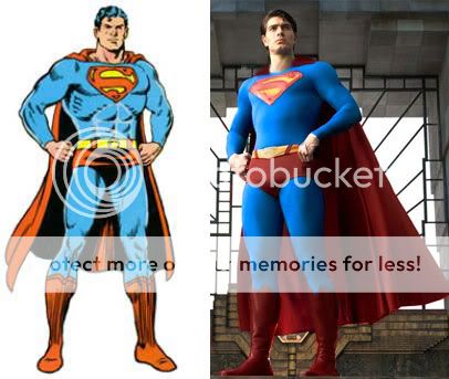
I've always liked Jim Lee's Superman... I wish someone if the future could get something similar to this
I'm all for using Jim Lees designs as the concept design for the suit in MOS!
Clark Kent
Superman
- Joined
- May 13, 2008
- Messages
- 5,053
- Reaction score
- 0
- Points
- 31
Isn't there already a thread like this in the spoilers section?
ANTOINE X
FLY
- Joined
- Apr 23, 2007
- Messages
- 2,718
- Reaction score
- 0
- Points
- 31
- brighter color scheme
- lose the abundant use of "S"s
- lower neckline
- get rid of the ridiculous symbol on the belt
- make the trunks actual trunks and not a fashion statement
I Don't remember and I dont know why I ask you that question. I do agree that superman returns suit needs to be changed but more especially that brownish red'
For the love of all things good, ditch those stupid trunks already. Those things really do look ******ed on live-action actors. Someone else nailed it when they compared the trunks look to a "cross-dressers' convention." The trunks serve ZERO purpose other than a colour-breakup, but that can be achieved other ways that DON'T look asinine.
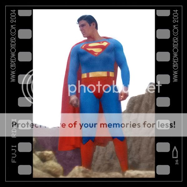
yes. Change the damn suit to an updated materials of the classic one:
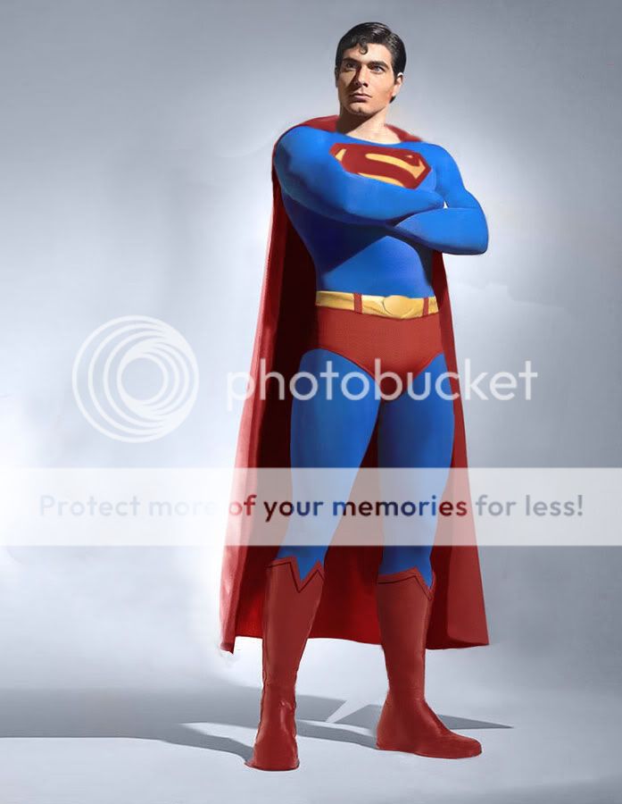
THAT pic looks fine (other than the trunks, which are ridiculous). But THIS one....
[/quote]
. . . this has got to be one of the most ******ed-looking Superman photos of all time.

Gosh, you mean something like . . . Superman. Who woulda thunk it??
Clark Kent
Superman
- Joined
- May 13, 2008
- Messages
- 5,053
- Reaction score
- 0
- Points
- 31
. . . this has got to be one of the most ******ed-looking Superman photos of all time.[/quote]
Why?
Nightwing1977
I'm Batman....I wish.
- Joined
- Aug 20, 2005
- Messages
- 5,851
- Reaction score
- 0
- Points
- 56
. . . this has got to be one of the most ******ed-looking Superman photos of all time.
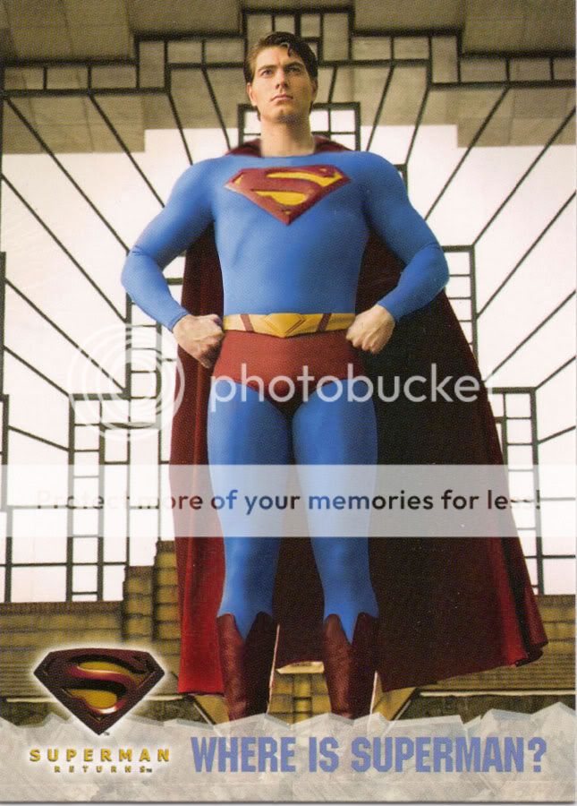
I disagree. That is how Supes normally pose. I wish they released that first instead of the original one that was first release. It wasn't a flattering pose. The one you post was much better.
Clark Kent
Superman
- Joined
- May 13, 2008
- Messages
- 5,053
- Reaction score
- 0
- Points
- 31
The one you post was much better.
Agreed, even though the cape looks funny, IMO.
honest george
The People's Friend
- Joined
- Nov 30, 2007
- Messages
- 316
- Reaction score
- 0
- Points
- 11
Meh, the only change I'd make is to brighten up the colors just a wee bit. Not too much. The buckle I can take or leave.
I agree, the muted colors remind me of the 40's Superman color scheme, which I like. The neckline can change but I really prefer the smaller "S" shield; it bugs me when artists like Alex Ross draw it bigger than the character's chest.
ad101867 said:

. . . this has got to be one of the most ******ed-looking Superman photos of all time.
Why?
Come on, are you serious?? Look at the stance, and look at how his thighs swell wider than his upper body. He looks like a complete dufus. Hardly heroic. Hardly commanding. Hardly the colossal presence Superman is supposed to be.
Nightwing1977 said:I disagree. That is how Supes normally pose.
You mean he normally poses like a dork?
I wish they released that first instead of the original one that was first release. It wasn't a flattering pose. The one you post was much better.
You've gotta be kidding me. If that was the release pic, fans would've thought it was an ad for Superhero Movie.
Really, just the costume design alone is enough for WB to reboot the franchise minus Bryan Singer.
The Shadow
Civilian
- Joined
- Jun 17, 2008
- Messages
- 619
- Reaction score
- 0
- Points
- 11


NUFFSAID2004
Civilian
- Joined
- Oct 2, 2004
- Messages
- 323
- Reaction score
- 0
- Points
- 11

yes. Change the damn suit to an updated materials of the classic one:
Take out the damn muscle suit and let him get as big as Reeve did at the end of filming for STM
I say the top and bottom pics look perfect. I'm with you, brother. Superman's such an iconic character that doesn't need all this stupid tweeking. Leave well enough alone. He's timeless!
The son becomes
Civilian
- Joined
- Jun 8, 2008
- Messages
- 45
- Reaction score
- 0
- Points
- 1
I thought the costume looked great in the movie but felt it didn't work so well in the promotional photography. I assume the suit was designed to work with modern filming techniques but perhaps they need to have an adjusted suit for still photographs. There's something about the red, yellow and blue that strikes a chord with people and these should be brought out for the marketing shots, in order to work best with this medium.
Ultra Lantern
In Darkest Night!
- Joined
- Jan 4, 2011
- Messages
- 5,225
- Reaction score
- 1
- Points
- 31
I don't think they need to change the costume for the sequel.
El Payaso
Avenger
- Joined
- Jun 10, 2005
- Messages
- 15,262
- Reaction score
- 9
- Points
- 31
I don't think they need to change the costume for the sequel.
Me neither. BUt the thread was actually talking about SR's sequel.
Btw, on that very note...
they need to make it more like the classic suit
- get rid of the ridiculous symbol on the belt
- make the trunks actual trunks and not a fashion statement
Oh, the mirth.
 t:
t:Similar threads
- Replies
- 18
- Views
- 2K
- Replies
- 1K
- Views
- 88K
- Replies
- 1K
- Views
- 120K
Staff online
-
 DKDetectiveElementary, Dead Robin (he/him)
Members online
Total: 5,152 (members: 12, guests: 5,140)