The amazing thread of Uniforms and Logos part 1

Status
Not open for further replies.
FF_412487_xl.jpg

:barf:
 
I like the New Uni's the Air Force Hockey team is sporting.

5356585497_db9052dab5_o.png
 
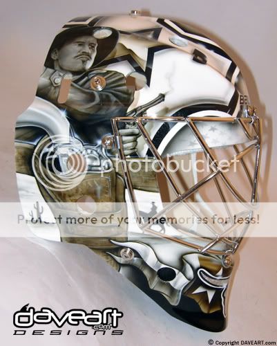
Yet another new mask for Kari Lehtonen. Wyatt Earp.

5361441504_68fbb34e37.jpg
 
Yet another new mask for Kari Lehtonen. Wyatt Earp.

5361441504_68fbb34e37.jpg

You sure that's Wyatt Earp? It looks like Doc Holliday (Val Kilmer) from Tombstone

Another odd thing is that neither Earp nor Holliday really had no significant history in Texas.
 
Last edited:
You sure that's Wyatt Earp? It looks like Doc Holliday (Val Kilmer) from Tombstone

Another odd thing is that neither Earp nor Holliday really had no significant history in Texas.

Yeah I just put what was in the article. It does look like Kilmer.
 
Tampa Bay Lightning's new uniforms sound as if they will include a simple, classic design

The Tampa Bay Lightning has filed the paperwork with the league in order to change their colors and logo for the 2011-12 season. Here is what you might expect when the uniforms are unveiled, perhaps as soon as this week:
The primary colors apparently will be blue (close to what is used now with the third jersey) and white. Sounds as if the color black, which has been the team's prominent color, and the silver trim will be gone. The logo on the home jerseys is expected to be just a prominent lightning bolt without the words Tampa Bay that are used now. The road jerseys are expected to have the lightning bolt and the words Tampa Bay, though no immediate word on how the design will look. It is believed there also will be the classic strings at the front of the collar.
It also is unclear whether the third jersey will be retained as its color is believed to be so close to that of the home, dark jersey.
Anyway, sounds as if GM Steve Yzerman had a lot of input into the details or at least into the idea of trying to create a classic look that will endure for a long time.
From Tampa Bay.com

Uniwatchblog.com says they will be very similar to the Leafs. I just wish they would keep either the black or the silver. Plain blue and white sounds lame. Stop copying teams and go with your own colors. I am all for classic looks, but lets see some originality.
 
Who knew? The Steelers "Terrible Towel" is made in Wisconsin.
 
Status
Not open for further replies.

Users who are viewing this thread

Staff online

Latest posts

Forum statistics

Threads
200,559
Messages
21,759,762
Members
45,596
Latest member
anarchomando1
Back
Top
monitoring_string = "afb8e5d7348ab9e99f73cba908f10802"