The amazing thread of Uniforms and Logos - Part 2

Status
Not open for further replies.
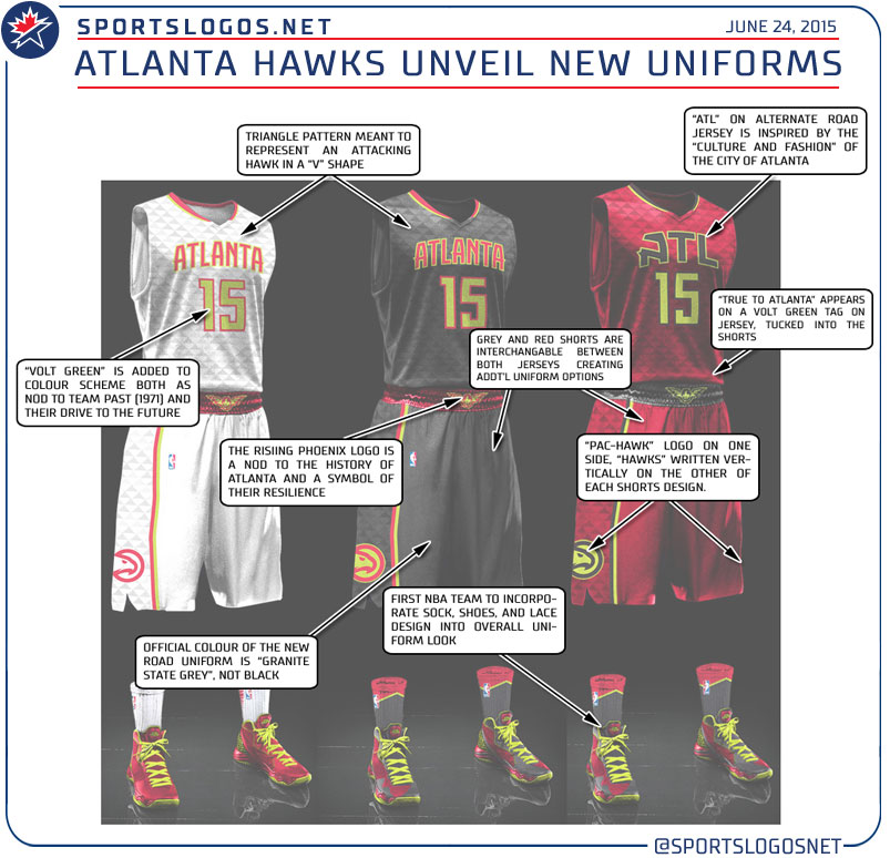
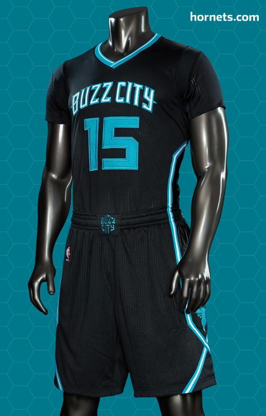
I'm caught off guard by all these redesigns/new uniforms this offseason for NBA. Any others after Atlanta?

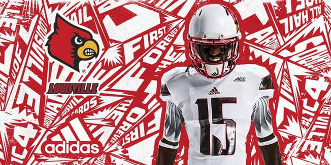
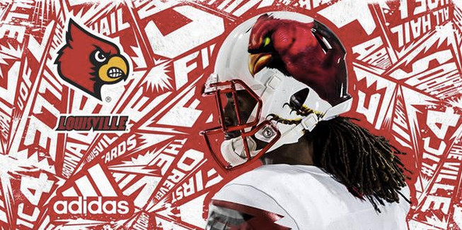
What about NFL uniforms? Any new ones coming?
 
The only other one I know of in the NBA that hasnt come out yet is the Raptors.

NFL redesigns are already out and it was really just the Browns.

NHL will show off a couple slightly altered jerseys and a new look for the Coyotes on Friday.
 
Not a clue. I assume tomorrow during the official unveiling that there will be some sort of "brand speak" to explain that sublimated triangle pattern.

At least you've got the historic Hawks colors back. Sort of. ;)
Yeah, red and black are nice. Teal is better.
 
Yeah, red and black are nice. Teal is better.

And here you go 'Fire. The triangles are supposed to represent the V pattern of an attacking hawk!

:loco:

More brandspeak!

Atlanta-Hawks-New-Uniform-Explained.jpg
 
And here's Louisville's "Angry Bird" inspired look for this season. (I'm guessing this is just an alt) Featuring "Screechy the Cardinal of Satan!"

Screen_Shot_2015-06-25_at_4.34.27_PM.0.png


screen1.0.png


Adidas needs to be stopped!
 
Last edited:
And here's Louisville's "Angry Bird" inspired look for this season. (I'm guessing this is just an alt) Featuring "Screechy the Cardinal of Satan!"

Screen_Shot_2015-06-25_at_4.34.27_PM.0.png


screen1.0.png


Adidas needs to be stopped!

Helmets are a little generic looking perhaps? But i actually like them..
 
i'd like it better without the sleeves. can we drop those?
 
I dont know, maybe I'm colorblind but the "volt green" looks more like yellow to me than anything.
 
And here's Louisville's "Angry Bird" inspired look for this season. (I'm guessing this is just an alt) Featuring "Screechy the Cardinal of Satan!"

Screen_Shot_2015-06-25_at_4.34.27_PM.0.png


screen1.0.png


Adidas needs to be stopped!

I'm a Louisville fan, went to school there and worked for the football team, that being said I hate the helmet. The rest of the uniform is sick, they just need to get rid of the that cardinal bird. Either use the "L" on both sides or stick with our traditional cardinal bird. Thankfully this is just an alternate jersey for the opening game against Auburn
 
Caps have a new alternate jersey taken from the old school one.

O1H53Ss.jpg


Though, they really should use the eagle logo as the main part of the jersey. It fits perfectly.

D5AzApq.jpg
 
I'm not sure what the hell a "Yard Goat" is? (is this a thing people in CT have?) But I do dig this logo for their new AA baseball team.

CJaEJsgWIAACzwz.jpg


Whalers colors too!
 
Status
Not open for further replies.

Users who are viewing this thread

Back
Top
monitoring_string = "afb8e5d7348ab9e99f73cba908f10802"