
Captainhulk
main-man
- Joined
- Aug 29, 2008
- Messages
- 222
- Reaction score
- 0
- Points
- 11
What Bane Almost Looked Like in The Dark Knight Rises
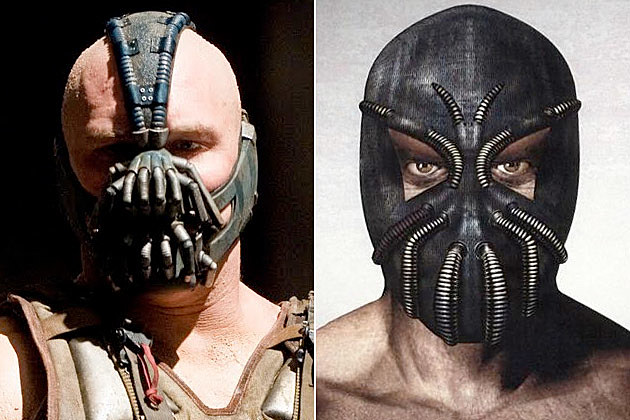
The Dark Knight Rises hits DVD and Blu-ray on December 4th (just in time for the holidays!) and a few early copies have leaked in advance of the official release. One of the behind-the-scenes documentaries included on the discs shows off some behind-the-scenes photos of Tom Hardy as Bane plus some concept art on what Bane almost looked like.
Because of his trademark mask, Bane was always going to be a difficult character to adapt into Christopher Nolans universe. (Remember how he looked like a Mexican wrestler in Batman and Robin?) But with all the options they had, it looks like Nolan and crew made the best choice.
None of the options below look like they would translate well and both of the hood designs look downright silly. You can also see the early sketch for the design they did use in the film to see how it evolved over development.
Another interesting photo is the shot of Tom Hardy as Bane before they digitally removed all of Hardys tattoos. It might not have made sense with the character, but the tattoos actually make him look even more menacing.


http://screencrush.com/bane-dark-kn...tm_medium=referral&utm_campaign=zergnet_37226


