
You are using an out of date browser. It may not display this or other websites correctly.
You should upgrade or use an alternative browser.
You should upgrade or use an alternative browser.
Zack Snyder's Visuals, Amazing or Trash?
- Thread starter ManWithNoName18
- Start date
Consona
Superhero
- Joined
- May 4, 2015
- Messages
- 6,961
- Reaction score
- 1,134
- Points
- 103
There's this great section in JL main thread about this, where we, funnily enough, made it to the conclusion that Snyder's visuals are actually much more "reality-like" than tv-show quality MCU visuals, which most people reagard as "this is how things really look because it looks "normal"". It was really interesting to see the comparison of the real world skies, which truly look rather unreal, with Snyder-style visuals and it was very surprising to me.
http://forums.superherohype.com/showpost.php?p=35004007&postcount=798

To me, it's like a pinnacle of CBM visuals. It really looks like some classical art, a mixture of...
Baroque painting, "characterized by great drama, rich, deep colour, and intense light and dark shadows"* (this description fits perfectly), which wants to show "the most dramatic point"* (the heat vision battle with the most important scene of Superman being engulfed by DD's heat... the "devil's" flames and fire around the messianic figure, a.k.a. devil did win, he's more powerful, yet Superman takes the spear and want to fight him nonetheless. And the "this is my world" + death/sacrifice of Superman, the most defining moments for the character.), "As opposed to Renaissance art, which usually showed the moment before an event took place"*. Again, this totally fits. Plus the "Baroque painting often dramatizes scenes using chiaroscuro light effects."*, jsut total Snyder.
...with a 19th century impressionism, those thick strokes, https://www.artfund.org/assets/what...e-river-at-lavacourt-winter-effect-1880-2.jpg, https://upload.wikimedia.org/wikipe...Monet,_Saint-Georges_majeur_au_crépuscule.jpg, https://upload.wikimedia.org/wikipedia/commons/1/13/Guillaumin_SoleilCouchantAIvry.jpg
BvS really feels like a mixture of both styles.
*https://en.wikipedia.org/wiki/Baroque_painting
And I cannot wait for the JL visuals!
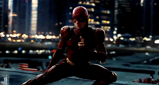
The Flash stuff is f***ing piece of pure art.


And again, look at the real sky, the JL stuff does not feel artificially lit, it truly feels like you're there, at dusk, with those heroes. It's so stylized, it looks natural. Hehe.


In the end I'm not saying Snyder's style is this or that. In some aspects it can look more realistic than what people consired to be realistic looking stuff, in some aspects it looks stylized, in some it looks really artistic and unreal in the larger-than-life sense. You may not like it, I dig it. It's a weird mixture of you feel like you're watching real things yet it's somewhat out there, other-worldly, mythical, like you're watching some ancient mural or mediaval stained glass window that came to life.
http://forums.superherohype.com/showpost.php?p=35004007&postcount=798
Honestly, if you think those visuals are ugly then I don't know how to react to that... I know everyone has his own tastes, so... "ok....."A nice showing of how bad his visual are.
To me, it's like a pinnacle of CBM visuals. It really looks like some classical art, a mixture of...
Baroque painting, "characterized by great drama, rich, deep colour, and intense light and dark shadows"* (this description fits perfectly), which wants to show "the most dramatic point"* (the heat vision battle with the most important scene of Superman being engulfed by DD's heat... the "devil's" flames and fire around the messianic figure, a.k.a. devil did win, he's more powerful, yet Superman takes the spear and want to fight him nonetheless. And the "this is my world" + death/sacrifice of Superman, the most defining moments for the character.), "As opposed to Renaissance art, which usually showed the moment before an event took place"*. Again, this totally fits. Plus the "Baroque painting often dramatizes scenes using chiaroscuro light effects."*, jsut total Snyder.
...with a 19th century impressionism, those thick strokes, https://www.artfund.org/assets/what...e-river-at-lavacourt-winter-effect-1880-2.jpg, https://upload.wikimedia.org/wikipe...Monet,_Saint-Georges_majeur_au_crépuscule.jpg, https://upload.wikimedia.org/wikipedia/commons/1/13/Guillaumin_SoleilCouchantAIvry.jpg
BvS really feels like a mixture of both styles.
*https://en.wikipedia.org/wiki/Baroque_painting
And I cannot wait for the JL visuals!
The Flash stuff is f***ing piece of pure art.
And again, look at the real sky, the JL stuff does not feel artificially lit, it truly feels like you're there, at dusk, with those heroes. It's so stylized, it looks natural. Hehe.
In the end I'm not saying Snyder's style is this or that. In some aspects it can look more realistic than what people consired to be realistic looking stuff, in some aspects it looks stylized, in some it looks really artistic and unreal in the larger-than-life sense. You may not like it, I dig it. It's a weird mixture of you feel like you're watching real things yet it's somewhat out there, other-worldly, mythical, like you're watching some ancient mural or mediaval stained glass window that came to life.
- Joined
- Mar 17, 2003
- Messages
- 15,480
- Reaction score
- 9,865
- Points
- 103
Looks a video game cut scene.
That's hideous.
hitmanyr2k
Resident Lurker
- Joined
- Mar 19, 2003
- Messages
- 3,576
- Reaction score
- 47
- Points
- 58
Out of all the gifs posted this was the only one that actually looked good. The rest look sub-par to me. I really can't believe you posted that Cyborg clip and thought that would be a good example of an amazing visual. Granted that shot isn't finished yet (I hope) but he doesn't blend in with his surroundings at all. He looks like he was pasted over another scene.
Flint Marko
Bring me Thanos 🦉
- Joined
- Oct 10, 2006
- Messages
- 18,791
- Reaction score
- 6,496
- Points
- 103
I'd actually argue that the worst shots in the trailer are of Aquaman on the Batmobile, which he also posted. It doesn't look good at all let alone even remotely convincing. The sky, which he points out as realistic, is actually distracting. That shot would be drastically improved if they just put a regular black night sky.
FunkMiller
Failed Experiment
- Joined
- Mar 26, 2016
- Messages
- 8,676
- Reaction score
- 3,842
- Points
- 103
Looks a video game cut scene.
A bad one from the mid 2000s. Probably an Ubisoft game.
Samuron
Reprint
- Joined
- Dec 14, 2016
- Messages
- 708
- Reaction score
- 44
- Points
- 38
Looks like something out of the original Tron
- Joined
- Dec 27, 2012
- Messages
- 19,985
- Reaction score
- 28,313
- Points
- 103
I'd actually argue that the worst shots in the trailer are of Aquaman on the Batmobile, which he also posted. It doesn't look good at all let alone even remotely convincing. The sky, which he points out as realistic, is actually distracting. That shot would be drastically improved if they just put a regular black night sky.
That'd be the worst for me too. Just...awful. I don't know how they thought that'd be a good ending 'money shot' moment.
OutOfBoose
#ReleaseTheAyerCut
- Joined
- Feb 6, 2012
- Messages
- 18,162
- Reaction score
- 3,980
- Points
- 103
Somehow they made even the real part of Cyborg's face look CGI. Ugh. But I love everything I saw with Barry and Flash. The casting choice is great (as far as I can see) and Flash effects are wonderful.
The Endless
WE are Groot
- Joined
- Oct 5, 2013
- Messages
- 8,009
- Reaction score
- 661
- Points
- 103
Visually the JL trailer is garbage. Even the big "money shots" are kinda... bland and unimaginative. Which is truly surprising. There really is no "holy ****" moment in the trailer.
Tacit Ronin
Avenger
- Joined
- Aug 12, 2009
- Messages
- 20,527
- Reaction score
- 8
- Points
- 31
Yeah I don't know why Consona used THE WORST SHOT IN THE TRAILER to show off Snyder's prowess.
To him they are the best shots. Not dumpster fire.
Zarex
Avenger
- Joined
- May 16, 2012
- Messages
- 10,816
- Reaction score
- 4,445
- Points
- 103
The one shot in the trailer I really didn't care for was Aquaman's 30 foot plus power leap at approximately twice the speed of a charging Batmobile. I know these guys are supposed to be more powerful than their Marvel counterparts, but it looks like a scene from a video game. Folks complain about Thor being depowered in the MCU, but it's wise to avoid scenes like that.
That'd be the worst for me too. Just...awful. I don't know how they thought that'd be a good ending 'money shot' moment.
It looks like the action takes place in chernobyl. It doesn't even look like a place that is lived in.
I don't think the CG looks bad or the movie looks ugly, but I do feel like it looks way too dark for too much of the trailer (meaning most of the movie will look that way) It all looks shadowy and dark blue, with not enough color for a JL movie. The color scheme looks similar to TDK, but doesn't fit the movie and subject matter as well. And I'd like to see more practical effects and practical backgrounds
Tacit Ronin
Avenger
- Joined
- Aug 12, 2009
- Messages
- 20,527
- Reaction score
- 8
- Points
- 31
JL wished it looked as good as TDK.
idiot09
Living in a society
- Joined
- Jun 15, 2016
- Messages
- 14,172
- Reaction score
- 2,881
- Points
- 103
There's this great section in JL main thread about this, where we, funnily enough, made it to the conclusion that Snyder's visuals are actually much more "reality-like" than tv-show quality MCU visuals, which most people reagard as "this is how things really look because it looks "normal"". It was really interesting to see the comparison of the real world skies, which truly look rather unreal, with Snyder-style visuals and it was very surprising to me.
http://forums.superherohype.com/showpost.php?p=35004007&postcount=798
Honestly, if you think those visuals are ugly then I don't know how to react to that... I know everyone has his own tastes, so... "ok....."
To me, it's like a pinnacle of CBM visuals. It really looks like some classical art, a mixture of...
Baroque painting, "characterized by great drama, rich, deep colour, and intense light and dark shadows"* (this description fits perfectly), which wants to show "the most dramatic point"* (the heat vision battle with the most important scene of Superman being engulfed by DD's heat... the "devil's" flames and fire around the messianic figure, a.k.a. devil did win, he's more powerful, yet Superman takes the spear and want to fight him nonetheless. And the "this is my world" + death/sacrifice of Superman, the most defining moments for the character.), "As opposed to Renaissance art, which usually showed the moment before an event took place"*. Again, this totally fits. Plus the "Baroque painting often dramatizes scenes using chiaroscuro light effects."*, jsut total Snyder.
...with a 19th century impressionism, those thick strokes, https://www.artfund.org/assets/what...e-river-at-lavacourt-winter-effect-1880-2.jpg, https://upload.wikimedia.org/wikipe...Monet,_Saint-Georges_majeur_au_crépuscule.jpg, https://upload.wikimedia.org/wikipedia/commons/1/13/Guillaumin_SoleilCouchantAIvry.jpg
BvS really feels like a mixture of both styles.
*https://en.wikipedia.org/wiki/Baroque_painting
And I cannot wait for the JL visuals!
And again, look at the real sky, the JL stuff does not feel artificially lit, it truly feels like you're there, at dusk, with those heroes. It's so stylized, it looks natural. Hehe.
In the end I'm not saying Snyder's style is this or that. In some aspects it can look more realistic than what people consired to be realistic looking stuff, in some aspects it looks stylized, in some it looks really artistic and unreal in the larger-than-life sense. You may not like it, I dig it. It's a weird mixture of you feel like you're watching real things yet it's somewhat out there, other-worldly, mythical, like you're watching some ancient mural or mediaval stained glass window that came to life.
Great post

The cyborg gif looks like someone put an unnatural filter over it. Here's a comparison :
Original :

But I have to say, my favourite Cyborg shot is this one :

AVEITWITHJAMON
Badass Cloud
- Joined
- Mar 5, 2003
- Messages
- 42,549
- Reaction score
- 8,055
- Points
- 103
Even as someone who liked the JL trailer, I thought Cyborg looked poor. I am not a huge fan of the character, and this doesn't make me look forward to him.
By comparison I am nit a huge Aquaman fan either, but do look forward to seeing more of him after the trailer.
By comparison I am nit a huge Aquaman fan either, but do look forward to seeing more of him after the trailer.

idiot09
Living in a society
- Joined
- Jun 15, 2016
- Messages
- 14,172
- Reaction score
- 2,881
- Points
- 103
Even as someone who liked the JL trailer, I thought Cyborg looked poor. I am not a huge fan of the character, and this doesn't make me look forward to him.
By comparison I am nit a huge Aquaman fan either, but do look forward to seeing more of him after the trailer.
I love Cyborg's design. I think its very smart, how "alien"-y he looks, and it doesnt just look like armour on top of him. Also it could tie-in to themes of alienation and acceptance in Cyborg's arc in the film.
However I do agree that in some shots his vfx needs more work. Others it looks fine. I think the finished product in the theatre will look much better as it always is with these vfx heavy movies.
AVEITWITHJAMON
Badass Cloud
- Joined
- Mar 5, 2003
- Messages
- 42,549
- Reaction score
- 8,055
- Points
- 103
I love Cyborg's design. I think its very smart, how "alien"-y he looks, and it doesnt just look like armour on top of him. Also it could tie-in to themes of alienation and acceptance in Cyborg's arc in the film.
However I do agree that in some shots his vfx needs more work. Others it looks fine. I think the finished product in the theatre will look much better as it always is with these vfx heavy movies.
Hopefully it does look better in the final product, I am sure it will. I think the design does look a bit too Transformers-ish. The design is too busy if you see what I mean? I think something simpler would have been more effective.
Greens
I am Danny DeVito
- Joined
- Dec 20, 2011
- Messages
- 16,459
- Reaction score
- 804
- Points
- 103
Visually the JL trailer is garbage. Even the big "money shots" are kinda... bland and unimaginative. Which is truly surprising. There really is no "holy ****" moment in the trailer.
There are no conventional money shots because it's a compilation of overblown noise.
Remember when a truck flipping over was a money shot?
Similar threads
- Replies
- 31
- Views
- 5K
- Replies
- 987
- Views
- 62K
- Replies
- 168
- Views
- 18K
- Poll
- Replies
- 350
- Views
- 37K
Staff online
-
 SwordOfMorningSuper Moderator
 -
 squeeknessI'm a poor lost puppy
 -
 Lily Adler🎄 Peppermint Mocha 🍫
Latest posts
-

-
 🌎 Discussion: Climate Change, Global Warming, Emission Standards, and Other Environmental Issues - Part 1 (2 Viewers)
- Latest: blueharvest
-
🌎 Discussion: Illegal Immigration, Immigration Reform, and Other Citizenship Issues II (4 Viewers)
- Latest: blueharvest
-
-