BvS Batman Vs Superman Manips & Art - Part 1

Status
Not open for further replies.
Awesome. Love the rappelling harness add on. A few suggestions:

Love the big Bat symbol but try to connect the cloak to it

Get rid of the briefs completely

Make the gloves longer

Darken the blue

Ok made some changes with two different takes. One based on his original costume and the other one on the more classical. Sorry but can't stand him without trunks :o


^ I prefer the cowl on the bottom right, the trunks on the left, the symbol on the bottom right (surprising, I know) the structure on the left, and they eyes/facial expression on the right. And the color on the right as well.

Mix em all together and-bingo.
 
Ok made some changes with two different takes. One based on his original costume and the other one on the more classical. Sorry but can't stand him without trunks :o


I can't get over how much he looks like Zachary Quinto in those pics. Alex, I love your stuff, and your skills are off the charts dude, but I just think the base pictures are horribly ugly. Kind of bat like though, which should be commended, and I normally am down with wrinkles, but that suit just rubs me wrong in every way and screams cosplay.
 
I can't get over how much he looks like Zachary Quinto in those pics. Alex, I love your stuff, and your skills are off the charts dude, but I just think the base pictures are horribly ugly. Kind of bat like though, which should be commended, and I normally am down with wrinkles, but that suit just rubs me wrong in every way and screams cosplay.

lol yeah, I kinda hate this "vampiric" wrinkled look of the original costume. I tried to reduce some of that stuff though, but anyway.
 
lol yeah, I kinda hate this "vampiric" wrinkled look of the original costume. I tried to reduce some of that stuff though, but anyway.

As far as I'm concerned, you're the king of manips!

I took a crack at improving my favorite of your vamp-man pics. I added a new cowl, did a bunch of stuff with the shading, etc. - to me, this looks more like Ben Affleck, and more like Batman, than previous Vampire-Quinto-Man.

spidermanip.jpg


and one for the 1% of us (I think you may be one, Spider) who like this old look......

spidermanip3.jpg
 
Last edited:
GREAT SHOT.

A conversation I JUST had with my fiance' a few days ago:


"Hey babe, you know what would of been a cool scene to shoot in Man of Steel?"

"Oh, here we go...:whatever:"

"When he's walking in the arctic before his first flight, they should have made the snow and ice melting around him because of the warmth from Earth's yellow sun radiating in his..."

":whatever:STOP.."

True story:woot:
 
Sorry for the super low res pic, the source material was very small... But I'm pretty stoked on it. Supes eyes are a bit weird. If anyone likes this and wants to take a crack at it, I've got a version without his red eyes.

But I do dig it...

batandsupes.jpg


and here's a version with some tweaks to the Batsuit/Batphysique to make it a little less Alex Ross-esque, and to fit more with Superman's outfit.

batandsupes3.jpg
 
Last edited:
and another one I used in one of my videos..starring Christopher Reeve...
 
Sorry for the super low res pic, the source material was very small... But I'm pretty stoked on it. Supes eyes are a bit weird. If anyone likes this and wants to take a crack at it, I've got a version without his red eyes.

But I do dig it...

batandsupes.jpg


and here's a version with some tweaks to the Batsuit/Batphysique to make it a little less Alex Ross-esque, and to fit more with Superman's outfit.

batandsupes3.jpg

I dig it too. Well done. I prefer the second one.
 
Do you think you could add the Wonder Woman logo behind your Superman/Batman logo images?
 
eh honestly I want her to stay away from this movie, no offense to anyone lol
 
I dig it too. Well done. I prefer the second one.

Glad you like it. I found higher res source files, so I redid it, but big. I've got eyeless and logo-less versions if anyone wants to play around.

It's splitting hairs, but I prefer my smaller ones. I missed some stuff while recreating this, plus it's super late and I am zonked. I do think it's rad though. :word:

bvsmanip2.jpg
 
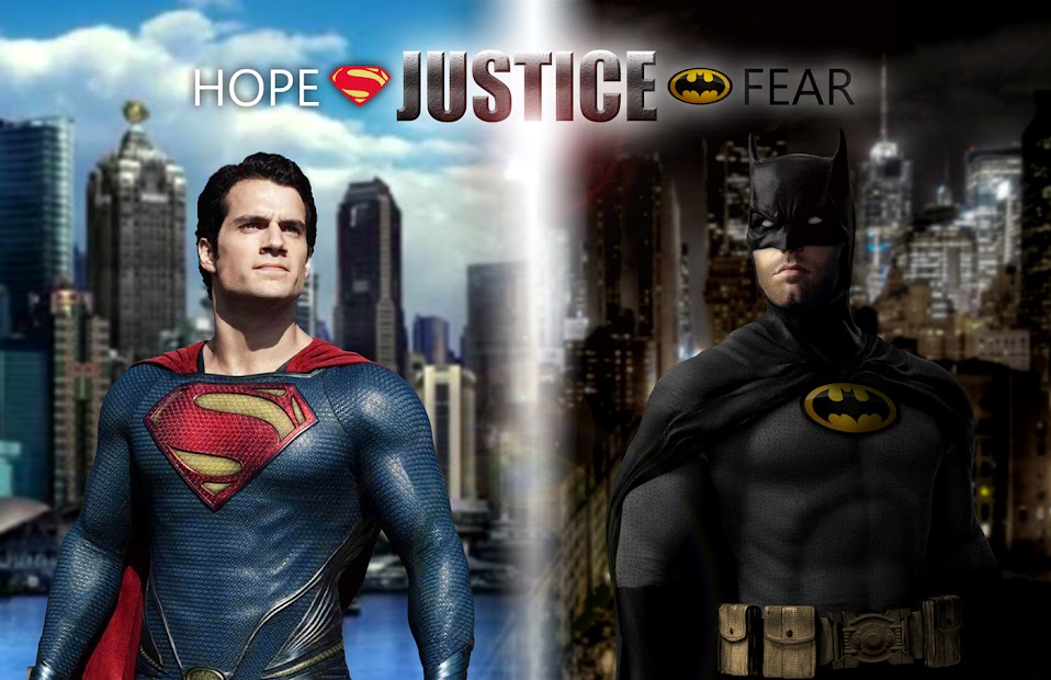
I know I posted this image previously, but I finally got around to making some adjustments (separation lens flare, text changes, increased Batfleck's head a bit, and changed out the Batsymbol).

It seems that the suit's Batsymbol has been a consistent topic of discussion as it pertains to what may be used on the new suit, so I decided to see how the classic oval looked. Critiques welcome.

MOS2_2.jpg
 
BattleAngel...well done. I like it. If I like something, it's really good.
:dj
 
I know I posted this image previously, but I finally got around to making some adjustments (separation lens flare, text changes, increased Batfleck's head a bit, and changed out the Batsymbol).

It seems that the suit's Batsymbol has been a consistent topic of discussion as it pertains to what may be used on the new suit, so I decided to see how the classic oval looked. Critiques welcome.

MOS2_2.jpg
Sick! Great job. :up:
 
Status
Not open for further replies.

Users who are viewing this thread

Latest posts

Forum statistics

Threads
200,614
Messages
21,772,846
Members
45,612
Latest member
kimcity
Back
Top
monitoring_string = "afb8e5d7348ab9e99f73cba908f10802"