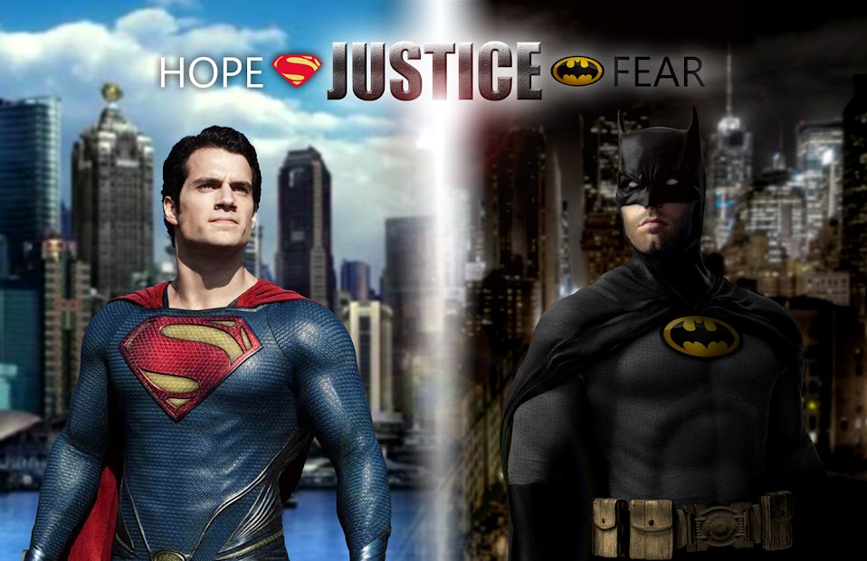
I know I posted this image previously, but I finally got around to making some adjustments (separation lens flare, text changes, increased Batfleck's head a bit, and changed out the Batsymbol).
It seems that the suit's Batsymbol has been a consistent topic of discussion as it pertains to what may be used on the new suit, so I decided to see how the classic oval looked. Critiques welcome.


 I really LOVE IT! That's the Batsuit I always wanted. Could you do the same to this one with the panda eyes?


")
