BvS Batman Vs Superman Manips & Art - - Part 11

Status
Not open for further replies.
Added the Batfleck neck and enlarged Supes ;)
Empire_Cover.jpg
 
:yay: I did some changes, pic 1
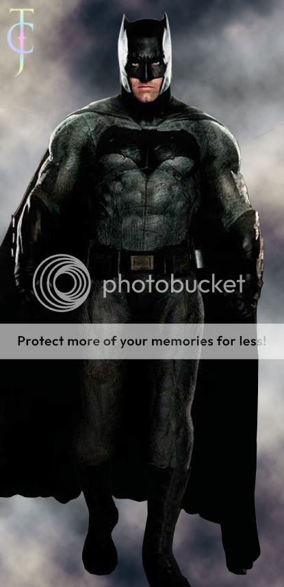
10668686_1118598028153889_1286558577960990915_o.jpg


11703457_1005339352824071_8095366624501610043_o.jpg

MessyPandas:
 
Last edited:
The Empire one doesn't have his chin, jaws, lips, eyes, or brow.
[BLACKOUT][/BLACKOUT]Okay. I'm sure you know better than me who has obsessively ogled at thousands of images of the man from past to present. :cwink::oldrazz:
 
MessyPandas on DeviantArt made a Textless version:


And I added my tweaks to it:

C1sK2r.png
 
Last edited:
Why must everyone make these incessant edits after official pics come out?
 
Why must everyone make these incessant edits after official pics come out?

Because people want to make them look like their comic book counterparts? And in this case, the cowl looks weird in the Empire cover... Oh, and in both cases (EW and Empire), we didn't receive textless versions.

Also, this is the manip thread....
 
Because the official pics look like **** and are not good impressions for what the characters will look like in the movie, especially compared to footage that has been shown in trailers.

Batman's neck area is atrocious and needed fixing. Whoever did the Empire cover seriously needs to be fired.

BTW, kudos to whoever found the textless versions. :up:

Agreed! I just saw this for the first time a few minutes ago and I was insulted! I mean, even the "bad" leaked image of batman that they used to make the IMAX poster was better that the Empire's Neckless Wonder! As people have said, the on-set costume looks so good- I wonder why they insist on stunting Batfleck's neck and making him look so odd in photoshoots?
 
Because people want to make them look like their comic book counterparts? And in this case, the cowl looks weird in the Empire cover... Oh, and in both cases (EW and Empire), we didn't receive textless versions.

Also, this is the manip thread....

Because the official pics look like **** and are not good impressions for what the characters will look like in the movie, especially compared to footage that has been shown in trailers.

Batman's neck area is atrocious and needed fixing. Whoever did the Empire cover seriously needs to be fired.

BTW, kudos to whoever found the textless versions. :up:

My apologies after seeing all the edited versions I realized I hadn't even seen the true official version and so I looked it up... Needless to say I understand completely why you did the edits.
 
My apologies after seeing all the edited versions I realized I hadn't even seen the true official version and so I looked it up... Needless to say I understand completely why you did the edits.

Yeah. Empire screwed up.

Another edit.

8EZaxU.png
 
How about putting Wonder Woman between them from the previous cover.
 
Agreed! I just saw this for the first time a few minutes ago and I was insulted! I mean, even the "bad" leaked image of batman that they used to make the IMAX poster was better that the Empire's Neckless Wonder! As people have said, the on-set costume looks so good- I wonder why they insist on stunting Batfleck's neck and making him look so odd in photoshoots?
It's not even the lack of the neck that bothers me, the head is so hugely out of proportion with the rest of his body. It's like the DK Mode cheat in Goldeneye/Perfect Dark 64
My apologies after seeing all the edited versions I realized I hadn't even seen the true official version and so I looked it up... Needless to say I understand completely why you did the edits.
lol It's all good. It took me a bit of searching to find the unedited, original cover as well.
THANK YOU :D Yay.
This one reminds me of Nite Owl :) But it's a great improvement :)
This is the best edit of the Empire abomination I've seen. Terrific work :up:
Thank you. :woot:
"Fixed" lol
affleck_in_bale_suit_by_arrowverse-d92ygwg.png
:lmao:
 
Although I did say "Fixed" as a joke because lets face it...Bale's suit sucked...the proportions of the head to the body seem to fit better with the bale suit on affleck
 
Why does Cavill look so small compared to Batfleck? -.-

Come on Superman was always the more muscular one!
 
Eh, Superman doesn't need all the muscles really. Batman can have all of the muscles he wants, he still loses. :yay:
 
My final manip of this Empire cover. I'm much more satisfied with it now.

T3OtLL.png


Updated my Court of Owls manip as well:

5P3bfW.png
 
Last edited:
Superman almost looks like hes smiling in that cover
 
I had to fix Batman, it was irking me way too much.
fixedbatman_zpsivq3n46n.jpg
That neck is exaggerated and in the comics he doesn't look like that except for the TDK suit :p

So yeah, I tried to improve it, because Batman's head just looks weird. Superman's too, but especially Batman. They shouldn't have Photoshopped these.

44xIxd.jpg
Here batman's face looks like a fish.
 
Status
Not open for further replies.

Users who are viewing this thread

Back
Top
monitoring_string = "afb8e5d7348ab9e99f73cba908f10802"